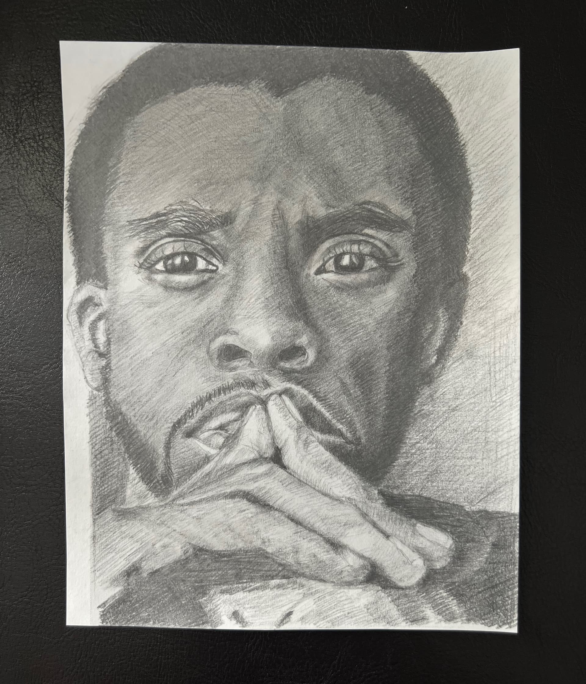
Hello, everyone. I’m seeking some advice on my shading and the tones I am currently applying in my drawing. I’m working from a black and white publicity photo that offers quite a bit of detail on both sides of his face. The light is primarily coming from his right side but the left is not significantly darker. I’m just beginning to work on the hair, which is the darkest part of the portrait, and wonder if it’s better advised to work on the darkest part first and then to go back to the left side of his face to darken it up a bit for more contrast to the right. I’d also welcome a critique of my facial feature proportions as well as the over all facial proportions. To give you an idea of my background, this is what I consider one of my best works so far in my 5 years of community college drawing and life drawing classes. Where I live now there are no classes and, hence, I welcome input as I am open to learning. Thank you.

Greetings Katherine!
I am thrilled to see that you chose to share an effort with our critique corner. I am also very pleased that I absolutely recognize the subject of your drawing, the late Chadwick Boseman. I would think that my recognition is a testament to your drawing skill as the subject was immediately recognized. Cold(ish) critiques (which means critiques without an agreed-upon rubric) of any work can be rather difficult as I must assume a great deal. However, since you did introduce some aspects of your focus (specifically value/contrast) I would like to offer something that may help.
Very often, representational work can seem incredibly difficult. One of the big reasons for that perception is that our concepts about what something “is” can overwhelm the types of observations that we are trying to make, For example, take for example the scleras in a portrait (what we colloquially call the white of the eyes.) These areas are almost never bright white—yet it is very common to see this in drawings. In addition, we tend to enlarge our eyes overall due to just how much information we garner from the eyes of another in conversation or other engagement. We also tend to overshoot the application of hard lines in an effort to emphasize where one thing “ends” and another “begins”, etc… These are all conceptual issues that invade our process that can observational representationalism a real challenge.
But let’s just focus on general contrast as you mentioned the hair, asking if you should start with the darkest dark in a drawing like this. The short answer is yes. I often establish those anchors in the beginning (darkest dark, lightest light, highest chroma (in painting) and go from there. Each mark we make establishes a context by which we judge everything else. Having the first few blocks of the context be super reliable is an absolute game-changer in subsequent judgments throughout the work.
If you were sitting in my studio right now, and I knew that your goal was to get closer to the representation of Mr. Boseman that you are (I assume) using as a reference, I would walk you through a process of darkening much of it–something like this:

Here is a closeup of your drawing with two sample circles from the last image in the above progression so you can see just how much darker that right side can be.

So this is where I would focus if your goal is something akin to my assumptions.
I hope this is helpful! ![]()
Oh, my, Mr. Waichulis. I am so honored that you recognized the subject of my drawing and have replied with such a generous amount of helpful information. I understand the role perception plays in our work; and yet, I’ve not used that as a consideration in my efforts. Your explanation of the size of the eyes in particular helped me to review my submission with a better comparison to my reference photo.
Shading has always been my nemesis and my past instructor (for five years) had been encouraging me to break away from my tendency to avoid delving into the darker areas first. I’ve always been concerned that there’s no eraser effective enough to remove those dark marks once I’ve placed them there. But your examples here of the process of darkening explains the gradual working of the shading and the building up of the darker areas as they compare to the lighter ones. What was especially helpful was the example with the two circles. I can see how my perception of “dark” has been hampered by my unwillingness to experiment with it.
I will take this information to the easel and begin work on this process.
And thank you for sharing your expertise as though I were fortunate enough to be sitting in your classroom,
Katherine
It was truly my pleasure Katherine! Again, thank you for sharing your work here. I look forward to seeing your continued progress!!!
![]()
![]()
Hello, Mr. Waichulis,
I’m working at my shading and would appreciate it if you could take a peek at it to offer some feedback. As I’ve said previously, I have an inclination not to go very dark; but in this case, I may have gone too dark on the left side of his face. I feel I could make the hair darker, for sure, and will work towards that, as well as his sideburns and small beard. I made an attempt at lightening the deep lines around his left eye and I feel I blended a bit too much in that area, making the shades too uniform. Any thoughts?
Again, thank you for taking time to review my work. It means a great deal to me and has re-energized my passion for my work.
I look forward to hearing from you,
Katherine

Hi @KatherineC , One thing that I would also recommend is to use a softer pencil to achieve your darks. I was an HB and HB only kinda guy in college. Darker meant pressing harder which really just destroys your surface. Try at least a 2B until you get more comfortable psychologically with darker. It’s a matter of getting past the fear of not being able to erase something that keeps us from matching the value sometimes. So HB is great to use if that’s a comfort zone, but after you’ve really looked at your piece and reference and made your accuracy adjustments then go for it with a softer pencil and start working on your values. The squint technique is perfect for this. And never limit yourself by thinking that you’re not good enough. You already are, you just have to mentally give yourself permission to be as good as you want. This is often the part of leaning that most of us don’t focus on. Hope I wasn’t repetitive of anything Anthony said and that I made sense and was helpful.
Cheers, Mark
Thank you, Mark, for your kind reply. Unfortunately, for me, I WAS using a 2B pencil! LOL! I typically use H pencils for the light lines in the whites of the eyes or on highlights. But thank you for sharing this. I especially appreciate your comments about limiting myself and giving myself permission to be as good as I want. For a while, I’d stopped drawing because I couldn’t find classes in my new hometown. Then someone said that with the skills I already demonstrated, I just needed to keep drawing. And that’s why I’m here. Because someone like you, took the time to care.
Thanks,
Katherine
Good morning Katherine!!!
I’m so sorry I couldn’t get to this sooner, but I was determined to wrap up that latest painting, so I let much of my correspondence go unanswered for a few days.
Your pushing of the darks here is SOOOOO much better. The differences (or contrasts) that you are pushing between the lights and darks is a big step in the right direction where such representations are concerned. If you feel you may have gone too dark in an area, as you mentioned, consider this before you remove material: check that the context around said the area is “dark enough.” Many times, artists will keep themselves in an “under-modeled” realm in which the darkest darks are not established as usefully as they can be—with resulting judgments leading to applied values looking non-committal at best.
Before you change anything—make that hair dark as you already stated. THEN, see if the slightly lighter darks next to it are “dark enough.” Continue in this way until you get to the light regions that you currently think may be too dark—and you might find you are not that dark at all (in a more developed context.)
When I work, I engage in a good deal of dynamic squinting. This is different than the traditional method of squinting to see general light-dark patterns better. It helps me to evaluate certain values in their respective context more effectvely. You can read about it in this entry here:
Looking forward to seeing more Katherine!!!
Anthony
Thank you, Anthony, for responding with so much intriguing information. I appreciate it. I fail miserably at squinting at all and am working on building that skill. For the majority of the time during my art lessons, I found it difficult to squint secondary to strabismus, which led to increased double vision. But just a few months ago, I was fortunate to have had surgery to correct it and am now able to squint without seeing double (or see double at any time:) Hence, it’s a WIP! But I’m definitely working on it. I used it to see the definite differences between my “darks” and the darks in the reference photo. I think I’ve done quite well at enhancing those areas. I’ve not changed anything in the face relative to the areas which I felt were too light. I have worked on adding some more shadows to them, however, and would welcome your feedback.
I’ve begun to work on his hands and I never dreamed they would challenge me so much. I’m usually much better at hands than I’ve done here and feel that I’m erasing much more than I’d admit out loud. But the hands in the reference photo, although they are closest to the viewer, are faded out, to draw attention from them to the face. Would my recreating that effect in my drawing cause confusion, as it’s not a photo where photographic nuances are familiar to the viewer? I’d like them to be lighter than the face if it would be creative without being out of sync with the rest of my drawing.
I appreciate your taking time from your very active schedule and I know that you are preparing for a presentation. So please don’t apologize for not responding as quickly as you’d like. I am honored to have you sharing feedback with me.
Thank you,
Katherine

Wow Katherine! I’m thrilled to see you leaning into the darks so much more. It makes such a huge difference. (I’m also elated to know that your strabismus was corrected, alleviating any disadvantage it may have caused.)
I see apprehension with commitment to dark values all the time. It’s often an early domino is a cascade of issues. Specifically, since value judgements are inherently contextual, I advise artists to establish anchors (“given variables) first. The simplest anchors are darkest darks and lightest lights. With these variables established, artists can move to adjacent variables using the givens as contextual informants. Without anchors, the underdeveloped context is leads us to some problematic judgements that cascade into significant value relationship issues.
So, my advice is to try to push yourself to establish those darkest darks first. I know it might seem a bit scary initially—but with experience (and successes) you be will grow more and more comfortable with it. Start with small simple subjects to do this so that the complexity of a subject is not compounding apprehension in this regard.
As to the hands, I don’t think that emulation of the photographic abstraction would be confusing to the viewer. I borrow many such cues from photo reference all the time and I find it dues not cause confusion. I be would consider each new drawing a potential gold mine of learning experiences so be adventurous. It’s a great way to learn!
Looking forward to more Katherine!
Hello, Mr. Waichulis, Thank you for your insights and encouragement. I have worked this drawing to the point where I feel I’m working it too much. I’m not entirely satisfied with it but feel that it’s at a point where it might be better to let it be for a while and go forward with another project. But, I am very interested in your feedback on it, as I’ve attempted to work on the darks/lights, but also using shading as simple outlines for the hands. I’m afraid I’ve worked the darks around the left hand too much and confused the issue. But it is, as you say, a learning experience; and I can’t go wrong with that.
I’m also thinking that my paper may have been too rough. I’m using Strathmore Sketch recycled with fine tooth surface. But my pencil marks seem to be indistinct. I sharpen my pencil quite a bit; but perhaps its not enough. I wonder what your thoughts are on the paper I’m using? What do you recommend to your students when they are doing graphite pencil sketches?
I will take your advice to push myself with darks and work with some simple subjects to grow my skills there.
As always, thank you so much for taking the time to share your thoughts and expertise with me.
Katherine
Wonderful Katherine! I think the piece was indeed a success. I agree that a big take away is the issue with darks. I think that a greater willingness to commit to those dark values will serve you well!
As far as paper textures or “tooth”, the right surface is the one that matches the dynamic of your tools, manner of application, and desired finish.
A good starting rule of thumb is to try and balance tooth and material binder. For example, a “high-binder” material like a hard grade H graphite pencil requires little tooth to hold to the surface whereas a low binder material like vine charcoal would require a more significant tooth to behave similarly. If you are working on a tooth that is too rough for your materials you will be battling it constantly—often resulting in surface marring. However, if your tooth is too smooth, you will likely face problems with quick over saturation, subsequent adhesion, and a certain types of manipulation. It’s also important to remember that the latter situation also means that your ability to “work” an area is often significantly limited.
For example, if I am using an uncompressed charcoal pencil and working on a relatively smooth surface, my ability to manipulate a value passage may be severely limited as the amount of material that can be held is greatly reduced and the likelihood of a burnish (a scenario in which tooth is diminished to the point of being unreceptive) increases. This is where considerations of application come in to play.
The best course of action if you are concerned about your surface is to carry out some simple tests like a value scale that spans the full range of the tools or a gradation block that does the same on your chosen surface with your desired materials. If you find you are battling to cover or saturate the tooth too much, or that most of the material “falling off” you may want to adjust materials, material grades, surfaces, or any
combination/all of the above.
Looking forward to your next piece!