I’ve been lately immersed in painting large portraits in oil on canvas primed with acrylic primer and i added a layer of oil titanium white primer to minimize absorption a little and to even the surface when painting smallest details in the subjects i’m painting. It looks that painting any surface like the skin for example is easy when i give a general value and a color as accurate as possible, i try to paint the texture of the skin next and here is the problem lies, i know it takes some dedication and patience to get these details as exactly as possible and possibly the frustration that comes when trying hard to give a general sense of skin pores and then involving in detailing these little mountains and hills and subtle change in colors, the problem is that i didn’t draw these little details at first whether the image or photograph of it transferred to canvas or drawn by doing measurements, in the sight size method, and even if they were determined first by graphite for example, which seems to be a boring process, when using projectors, one might choose to paint over them and the result is that they disappear and one must have to paint them over the layer already painted, call it a ballpark layer or under layer or whatever, i saw my subject contains these many details and it’s the skilled artist duty to paint them exactly as they are and may be not to miss a number of them, especially in the areas facing the light, because doing the opposite may result in the failure to convey the sense of a believable skin, for such a large portraits. So, my question is whether there’s a guide to paint details, such as the skin, so that i avoid over painting areas and building up excess paint ( if this is a problem in oil painting, because i saw many artists also focuses on making the surface even to not build unwanted surface topography) and whether you are also lost when tracking these details and found a problem in determining their sites on the form. Also, i want to know if you choose to alter in your subject some of its tiny details and found that the surface failed to give the wanted perception that this form is a wood or skin, especially when painting in hyperrealist way, or if it’s a miniature, trompe l’oeil, tiny subjects.
I also want to know if this can be learned by looking at a video of artists doing them, could you Anthony produce such a video? Or teach us some of your patience when doing them, if this is all what’s required🥴
Thank you.
I’m not an expert on this, but let me say some things I know from studying pencil drawing.
I know that the pencil artist JD Hilberry always used to teach that for tiny details, you should learn to mimic the essential patterns, but never copy them verbatim.
Similarly, the hyperrealist Dirk Dzmirsky has a very similar philosophy. I think he said something along the lines of, once he has taken the facial proportions from his reference, he then just draws from inspiration. Something like that.
I think the bottom line is that these two artists seem to say that you should work with some kind of intuition, rather than painstakingly copying detail to the nth degree. Paul Cadden said something similar.
Here is a good example. I bet the model’s skin was not nearly as wrinkled as this, but that Dzimirsky exaggerated it for love of the effect.
I’m sorry that it took me so long to get to this. It’s another great issue to tackle.
Generally speaking, the information hierarchy that most representational painters hold to is often not super conducive to high-definition representational efforts. Most “block-ins” or “lay-ins” focus mostly on larger general color/value abstractions which are often the averaged basis for additional visual information. This is usually not a problem when the averages are divided into sub-units of relatively high granularity (relatively low resolution). However, when the granularity is low (high-resolution), a foundation of such generalized averages can hold some pitfalls.
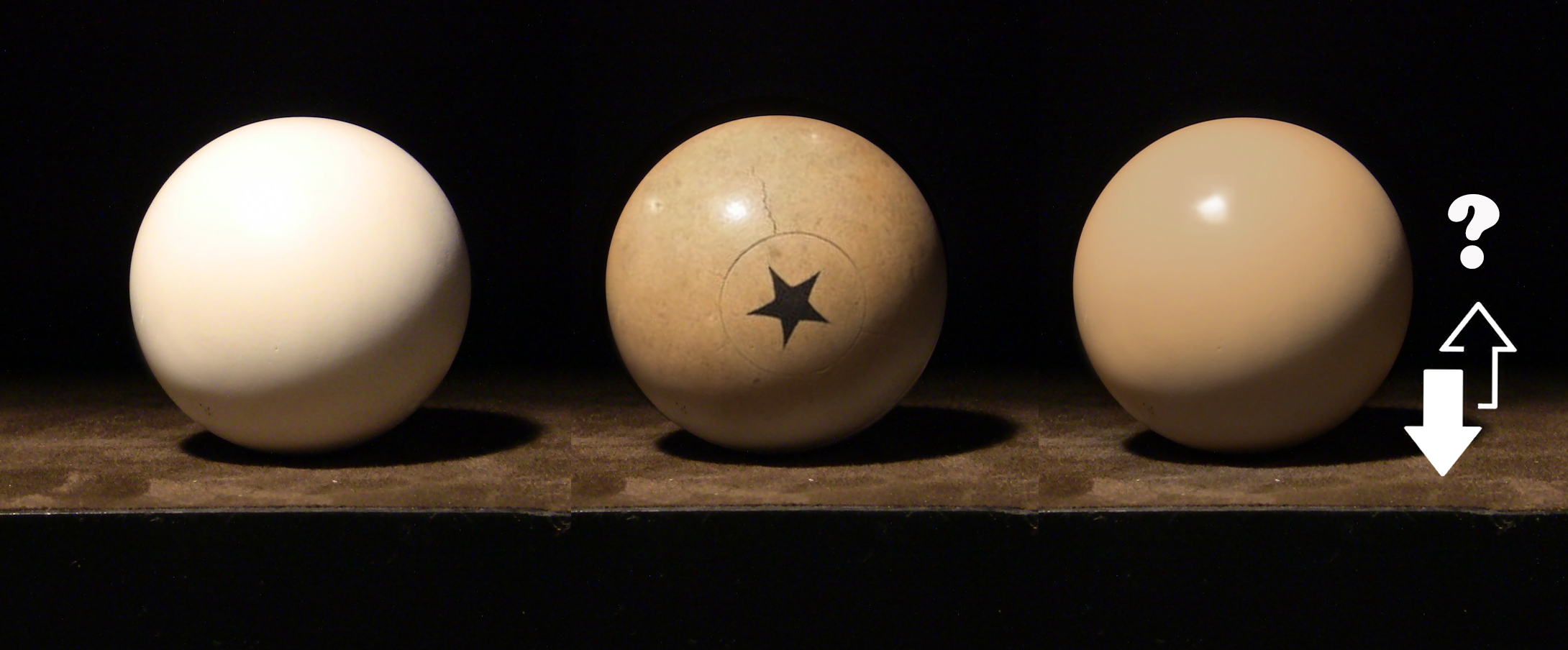
Take for example, the sphere in the middle of this image. It has a great deal of “detail” (small scale variations relative to the whole.) Now many, in an effort to build an effective context for the full painting will establish some visual average of the subject (here represented by the sphere on the right.) However, which direction do we go from here? Many artists (for a large myriad of reasons that I won’t go into here) will default to anchoring the ground (or previous layer) as a color/value ceiling and augmenting towards dark. This often leads to the entire object moving away from the general context (as the subject tends to grow increasingly dark-shifted) established in the block-in/lay-in stage. Many ignore the fact that you cannot work in one direction from an average. For every dark you add, you must add a light that optically maintains the perception of the average that fits your overall context. Both sides of the equation must stay balanced! However, again, most do not work that way–often cognitively establishing a new ceiling anchor at the average and working away from it towards dark. If you feel that you work in one direction (as most do) you should start with a foundation that truly reflects the ceiling (the sphere on the left.) However, this type of anticipatory approach leaves you with a compromised context for the “whole” of the painting.
Another issue that involves context and a sort of “cognitive anchoring” is our ability to accept the appearance of a transnational phase of the piece when small scale subdivisions are being carried out.
Adding a series of subdivisions into averaged regions can sometimes look horribly out of place as the larger context (again, averaged version) holds the role of the governing standard. In this phase, even the slightest directional deviations (as mentioned above) can make the entire attempt seem completely wrong. Building experience getting over this hurdle often requires a great deal of commitment and perseverance towards your goal. You have to get used to what your representation “should” look like during these transitional phases.
I deal with all of this by trying to get as much information down as I can in the first phase. I try to get as far away from larger averages as I can using my initial ground as a global ceiling. Here’s the start of the skull from my painting Storyteller and the later refinement. You can see how much I was able to get in initially. (on the left image you can see the ground to the right of the skull.)
When you’re seemingly finishing as you go - do you pay a lot of attention to starting with the colours spot on to your reference or are you going with a best approximation and keying subsequent colours in from that initial hue? and do you do a revision pass or anything once the canvas is filled or are you controlling the finish right from the outset?
Thanks Martin! Yes–it’s definitely the latter. I seldom chase anything close to a “perfect match” to a reference–rather I just start with material anchors that are calibrated to my palette.
A material anchor is a “perceptual match” between a perceived target color and a simple baseline colorant (ideally, paint straight from a tube). For example, the darkest dark in your painting may be perceptually equivalent to the black that is on your palette. It does not require you to modify it, so it is an ideal material anchor and an ideal starting point for your painting. You can apply that material anchor like a puzzle piece that begins to build the context for more complex matches. This can be done with your lightest lights, highest chroma colors, or any match that is based on a physical gamut limitation requiring little (preferably no) modification. Such anchors may be used early on as reasonably certain variables that can be effectively used to “solve” for more complex mixtures. As such, a reasonably helpful heuristic here is that early context building blocks (colors) should be constructed from mixtures with fewest component parts possible (ideally even as few as one).
Understand that even early material anchors may need to be altered as the entire context of a painting begins to develop, but you can be reasonably confident in those earliest stages with a “color-comparison scaffolding” built in this manner.
And yes—another layer or two is often required for some drawing adjustments, color value-shifts, or surface maintenance after the entire canvas is populated.
I appreciate your question. I too have crossed paths with your concern and challenge which being “how do you rekindle the drawing after you’ve painted over it?” There are many fine solutions described above and each deserves practicing.
A few years ago, I attended an écorhé class and we had to make drawings of bones and muscles each week. I’m not a good drawer and so I found the homework daunting. In the course of my travails and searching for a way to define discreet points quickly chance gave me a solution. It is surely to be rejected quickly by those who have free-hand mastery. And for sure it is a bit rigid. However, it does deliver very accurate discreet point position.
You’ll need a drafting board or a board with at least one straight edge, a tee-square, and a square, drafting tape, two prints of the art and a blank panel. The technique aligns the two prints with a blank panel. Using the tee-square to assist alignment set the prints one above and one to the left of the centrally located blank panel. Register these as well as you can and secure with tape. Select some point that you want to define. Align the tee-square with it. The tee-square to yields horizontal lines and the square placed on it yields vertical lines. Where two lines cross yields a discreet point mark this. Continue marking points and then and connect with lines. In this way one could redraw accurately at any time since you’ll never paint over the adjacent prints. Of course, it’s easier to make a pressure transfer first and then refine with this technique. To do this make a third print for use to make a pressure transfer onto a piece of paper or panel. Place the transfer panel centrally.