(CONTINUED FROM PART I)
While we are on this color issue, exploring the counterintuitiveness of our vision system, and examining the comparison between a camera and the eye, I’d like to take a moment to share an interesting argument that I encountered not too long ago from, believe it or not, a professional artist who was absolutely convinced that color is indeed part of the environment. (I explore this idea in the above mentioned 2017 article.) No matter what evidence I was able to put forward to demonstrate that this was NOT the case, he would not budge from his position. When I asked him to present the evidence that justified his position, he stated that color MUST be a physical property of the environment “ because a camera can record it. ”
Now I am sure that a good number of you reading this have already realized the glaring fatal flaw in this argument, but for many individuals unfamiliar with the fundamentals of color vision and color photography, the argument definitely seems to have some teeth. However, like most intuitive arguments for a flat-earth, young earth, or intelligent design, such arguments quickly deteriorate with an increase in scientific literacy and critical thinking. Just to be clear though–with color photography, electronic sensors or light-sensitive chemicals respond to specific aspects of electromagnetic radiation at the time of exposure. The recorded information is then used to create a percept surrogate by mixing various proportions of specific light wavelengths (“additive color”, used for video displays, digital projectors and some historical photographic processes), or by using dyes or pigments to remove various proportions of the particular wavelengths in white light (“subtractive color”, used for prints on paper and transparencies on film). The color you are perceiving in a surrogate, like a traditional photograph or digital image, is being generated by the wavelengths of light emitting from the surrogate-not because the camera “captured” color like some fairy in the garden.
What might wrapping our head around this even easier is if we take a moment to clearly define two basic terms concerning the manner with which we interact with the environment, sensation and perception. These terms are often used synonymously–but they indeed describe two different aspects of what we normally understand as “sensory experiences.” Sensation describes a low-level process during which particular receptor cells respond to particular stimuli. At the level of sensation, our sensory organs are engaging in what is known as transduction (or in our case, as we mentioned earlier, phototransduction), or the conversion of energy from the environment into a form of energy that our nervous system can use
Perception , on the other hand, can be simply defined as the assignment of “meaning” to a sensation.
So what is actually happening when we visually encounter something that we might understand or describe as “blue”?

Putting aside scenarios in which the object may be an actual source of light, or a structural configuration that is bending light, it is likely that the surface of the object is absorbing all of the available wavelengths of the visible spectrum except for some that are relatively short. Now the standard human observer has a specific type of photoreceptor cell in the retina that is “tuned” for such short wavelengths. That means that when this particular cell type encounters this type of wavelength, it responds by initiating a complex cascade of electrochemical events that will eventually lead to more and more complex processes along a particular “route” we are currently exploring–the “visual pathway”. This low-level cascade initiation is what we could define as a sensation .
The cascade of events initiated in the retina will eventually lead to specific activity in other, “higher”, or more complex processing regions of the brain such as, but not limited to, the lateral geniculate nucleus of the thalamus, the striate and extrastriate cortex of the occipital lobe, and the temporal lobe (regions which we will be heading to soon in our visual pathway when our walkthrough continues). It is through the aggregate activity of these brain regions that we find a perceptual response–in our case here–”blue.”
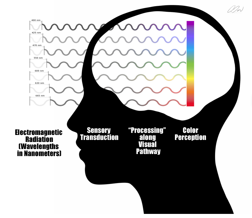
So as you might already be starting to suspect, in this example, the object in the environment is NOT physically blue, the wavelengths reflected off the surface of the object are not physically blue, nor do the photosensitive cells referenced here “sense” blue. Blue is not a sensation–rather, it is a perception . We assign “blue” to a particular sensation that is a biological response to a certain wavelength.
Hopefully that makes some sense, clears up a few more counterintuitive factors, and allows us to continue our glimpse at a few key points on the visual pathway.
From the retina we will jump to what is often referred to as the main relay station of the brain known as the thalamus, or more specifically, a region of the thalamus called the lateral geniculate nucleus, or LGN. Information from both motor and sensory systems (with the exception of the olfactory system) relay signals through the thalamus where they are processed before being sent off to a myriad of cortical regions. Yet, the LGN does seem to be much more than a mere relay station or gateway to the visual cortex. It is a multi-layered array of sophisticated microcircuits that would seem to suggest a region of very complex processing. What makes this area even more fascinating is that only 10% of the inputs to this region are coming from the retinas. The other 90% are inputs from a number of cortical and subcortical regions including significant input from the primary visual cortex itself. With what we can observe anatomically, it would seem that this region might be a major site of top-down influence. In other words, it appears that the visual cortex may play a very large role here in controlling what is actually sent on to… the visual cortex. (Hopefully, at this point, many of you are starting to better appreciate just how unlike a camera this system really is.)
From here we will exit the LGN via a large fan of axons radiating outward, appropriately dubbed optic radiations, and land on the banks of (and somewhat within) the calcarine sulcus (or fissure) of the occipital lobe. The noticeably striated region of tissue is home to what is called the primary visual cortex. Here we find the most studied part of the visual brain.
The part of the occipital lobe that receives the projections from the LGN is known as the primary visual cortex (also referred to as visual area 1 (V1), as well as the striate cortex.) Immediately surrounding this region, above and below the calcarine sulcus are what we dubbed extrastriate regions. These regions consist of visual areas 2 (V2), 3 (V3), 4 (V4), 5 (V5 or MT) and 6 (V6 or DM). Now before you shudder expecting me to go into a large series of complex processes here–don’t worry. I am not. What I am going to do is jump forward to the cascades of neural activity that unfold from here furthering our understanding of this elaborate “pathway.”
So where do things go from here? Each V1 (remember that we have two halves to the entire lobe here) transmits information to two distinct pathways or processing “streams”, called the ventral stream or “what” stream, and the dorsal or “where” stream. The information that is relevant to these two pathways is separate but remains physically integrated through much of the visual pathway. It is when this integrated information reaches “higher” levels that we see physical separation.
Anatomically, the ventral stream begins with V1, goes through V2, through V4, and then on to regions in the inferior temporal cortex (IT). This stream is often referred to as the “what” pathway as it is associated with form recognition and object representation. As such we find neurons in this stream that respond selectively to signals that might represent particular wavelengths of light, shapes, textures, and at the “highest” levels of this pathway, faces and entire objects. There are a number of regions within the inferior temporal cortex (ITC) that work together for processing and recognizing neural activity relevant to “what” something is. In fact, discrete categories of objects are even associated with different regions. For example, the fusiform gyrus or fusiform face area (FFA) exhibits selectivity for incoming activity patterns linked to faces and bodies while activity in the parahippocampal place area (PPA) helps us to differentiate between scenes and objects. The extrastriate body area (EBA) aids in distinguishing body parts from other objects while the lateral occipital complex (LOC) assists in discrimination tasks regarding the separation of shapes and “scrambled” stimuli. These areas all work together, along with the hippocampus, a dynamic memory region that is believed to be significantly involved in object “compare and contrast” tasks, in order to create an array of understanding of the physical world. This pathway also holds strong connections to the medial temporal lobe ( long-term memories), the limbic system (emotion), and the aforementioned dorsal stream. This stream has a lower contrast sensitivity compared to the dorsal and is somewhat slower to respond. However, it does have a slightly higher acuity than its counterpart and carries all information about what will eventually yield an experience of color.
The dorsal stream also begins with V1 and goes through V2, but then travels into the dorsomedial area (V6/DM), middle temporal region (V5 (MT)), and onto the posterior parietal cortex. The dorsal stream, often referred to as the “where” or “how” pathway is associated with motion and location. As such, within this stream one would find neurons that show selectivity, not for signals representing shape or light wavelength, but rather for signals that represent location, direction and speed. This stream is essentially “colorblind”, but has greater sensitivity to contrast, is quicker to respond (albeit more transient), and has a slightly lower acuity.
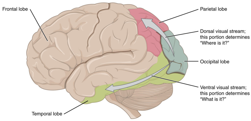
Illustration of the ventral processing stream, of “what” pathway, and the dorsal processing stream, or “where” pathway.
So, like with our blindspot, blood vessels, and the spatial imprecision of our periphery, can we see some demonstration of how these two streams process things differently?
You betcha.
One of my favorite examples for this is to introduce a stimulus that sort of pushes the two streams out of balance. If we could make an object or image visible to only ONE of the streams then we might experience something quite interesting. And indeed we can–with color.
Remember that we stated above that the “where” stream is essentially colorblind. As such, we can present a stimulus that contains two or more colors that are perceived as reasonably equiluminant (appears to be of the same level of lightness or brightness.) Here is one such example:

Do you notice an odd visual shimmer, jitter, or vibration when trying to read the letters here? This is because while your “what” system can easily process the color contrast, the colorblind “where” system cannot. In other words, your “where” system is having a heck of a time trying to determine where the boundaries of those letters actually are.
One of the most famous examples of an artist exploiting this issue is Claude Monet’s Impression Sunrise. In the piece, many reported that the sun within the image appeared to “vibrate.”
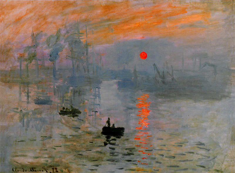
Impression, Sunrise by Claude Monet 48 cm × 63 cm (18.9 in × 24.8 in), Oil on canvas, 1872

Grayscale version of Impression, Sunrise by Claude Monet. Notice how the sun is nearly invisible due to its equiluminance with the surrounding clouds.
Neurobiologist Margaret Livingstone explains the peculiarity of Monet’s equiluminant sun in her book Vision and Art: The Biology of Seeing . She writes, “T he sun in this painting seems both hot and cold, light and dark. It appears so brilliant that it seems to pulsate. But the sun is actually no lighter than the background clouds, as we can see in the grayscale version. It is precisely equiluminant with–that is, it has the same lightness as–the gray of the background clouds. This lack of luminance contrast may explain the sun’s eerie quality: to the more primitive subdivision of the visual system (which is concerned with movement and position) the painting appears as it does in the grayscale version; the sun almost invisible. But the primate-specific part of the visual system sees it clearly. The inconsistency in perception of the sun in the different part of the visual system gives it this weird quality. The fact that the sun is invisible to the part of the visual system that carries information about position and movement means that its position and motionlessness are poorly defined, so it may seem to vibrate or pulsate. Monet’s sun really is both light and dark, hot and cold.”

Equiluminance (left) can indeed be a powerful device for achieving a sensation of vibration or pulsation–however, specific variations in contrast, color and element orientation can give rise to even more powerful perceptions of motion such as those created by psychologist Akiyoshi Kitaoka to demonstrate the effect of “Perceptual Drift” (right).
And while you can find countless visual demonstrations in textbooks, classrooms, and websites (often labeled as illusions) demonstrating that what we see does not accord with an objective reality–I couldn’t pass up an opportunity to share one of my favorite, canonical examples for experiencing it–the simultaneous brightness/lightness contrast demonstration.

Demonstration of simultaneous lightness/brightness contrast. A target (grey square) with a lighter surround (left) is perceived as being darker than an identical target with a lighter/brighter surround (right). If our visual system operated via objective samplings, one might suspect that there would be no such perceived disparity here.
So at this point–with this limited glimpse at the mountain of interdisciplinary evidence available to us–I hope that you can better evaluate the claims that visual perception can be objective. And if that claim is false–so are those built upon it . I am hopeful that you, the reader, may consider using this paper as a reference when needed to better grasp some features of the visual pathway as well as some basic ideas about the nature of visual perception.
Before closing, I would like to briefly address two additional issues that are connected to the topics discussed here thus far. One is the idea that learning observational representationalism is in fact, “learning to see.” You will remember that our aforementioned artist and author, Virgil Elliot, continues to promote this idea. Unfortunately (or fortunately depending on how you might like to consider the idea), this is indeed not the case. While your perceptions can indeed be molded by experience and assumption, the practice of observational representationalism will not fundamentally change the nature of your vision system. What the practice CAN do is cultivate the relationships between specific visuomotor responses and specific types of visual information that are conducive to representational efforts. The second is an intuitive argument that was put forward in the online thread I started that I did not address adequately. I felt that the answer really needed to be in the context of the more robust explanations and insights that I hope I have provided here. The argument was that photograph (a percept surrogate) should be considered a “less objective” reference source due to the fact that a surrogate is one step removed from the actual subject (the live percept.) And while this may initially sound like a solid argument, it contains a fatal intuitive error. You see, the idea of objectivity in this context is describing the nature of the perceiving entity–not the subject of the perception. This is almost like arguing that the closer you are to a live piano being played, the more objectively you will perceive the sound. In actuality, you will respond to any perceptible, appropriate pressure waves in the manner that you and your species have cultivated. No perceived sound originating from a piano, whether you are 10 feet away from a Steinway or listening to a CD of your favorite ivory-key hits, will be more or less “accurately” objective. I hope that is clear enough now.
Again, as I stated in the 2015 article I mentioned, There are definitely problems to contend with when utilizing photography in the pursuit of representational painting or drawing. However, the points that are often put forward to argue against the use of photography in representational painting communicate more of a general misunderstanding of visual perception than anything else. Now I agree that there are some truly GREAT reasons not to use photography in specific painting and drawing scenarios. However, you must be aware of the goal or intention of the artist before you can effectively determine the advantage of any reference source. Yes, some photographic processes may have specific limitations—but those limitations may not exceed the advantages in all cases, across all contexts. .
I hope that you have found this paper to be informative. I know some parts of it are very dry–but I wanted to offer a more robust resource than what I have been able to provide in a flurry of comment fields on social media. Please let me know if you find any factual errors in what has been provided here. I would also like to invite anyone that was referenced in this paper to feel free to submit any corrections, clarifications and/or refutations for inclusion here.
Best wishes all!
WRITTEN BY

Anthony Waichulis
is a contemporary Trompe L’oeil painter whose works have been published in major art publications including The Artist’s Magazine, Fine Art Connoisseur, American Artist, American Art Review, American Art Collector, Art News, as well as many others.
 . Definitely need to remember to reread it again soon though.