I still have some gold leafing to do on the uncials (for “U”), the unicorn horn and some stars on the night zodiac. However, I’m unhappy with the dollar bill and the Queen of Hearts/Spades and the writing on the ink bottle. I can’t seem to get the lines sharper and thinner. I’m also not sure if there’s anything I’m not seeing that should be improved upon or fixed. I know the wood on the object sides could be more detailed but I’ve spent an entire year on this (180 2"x2" paintings) and I could spend my entire life if I don’t let go at some point. Still, I’d like to fix the things I mentioned and anything else that’s blatant that I can’t see.
Wow! What a great idea! And very challenging undertaking! Bravo!
Regarding the extra items, I’ll take a stab:
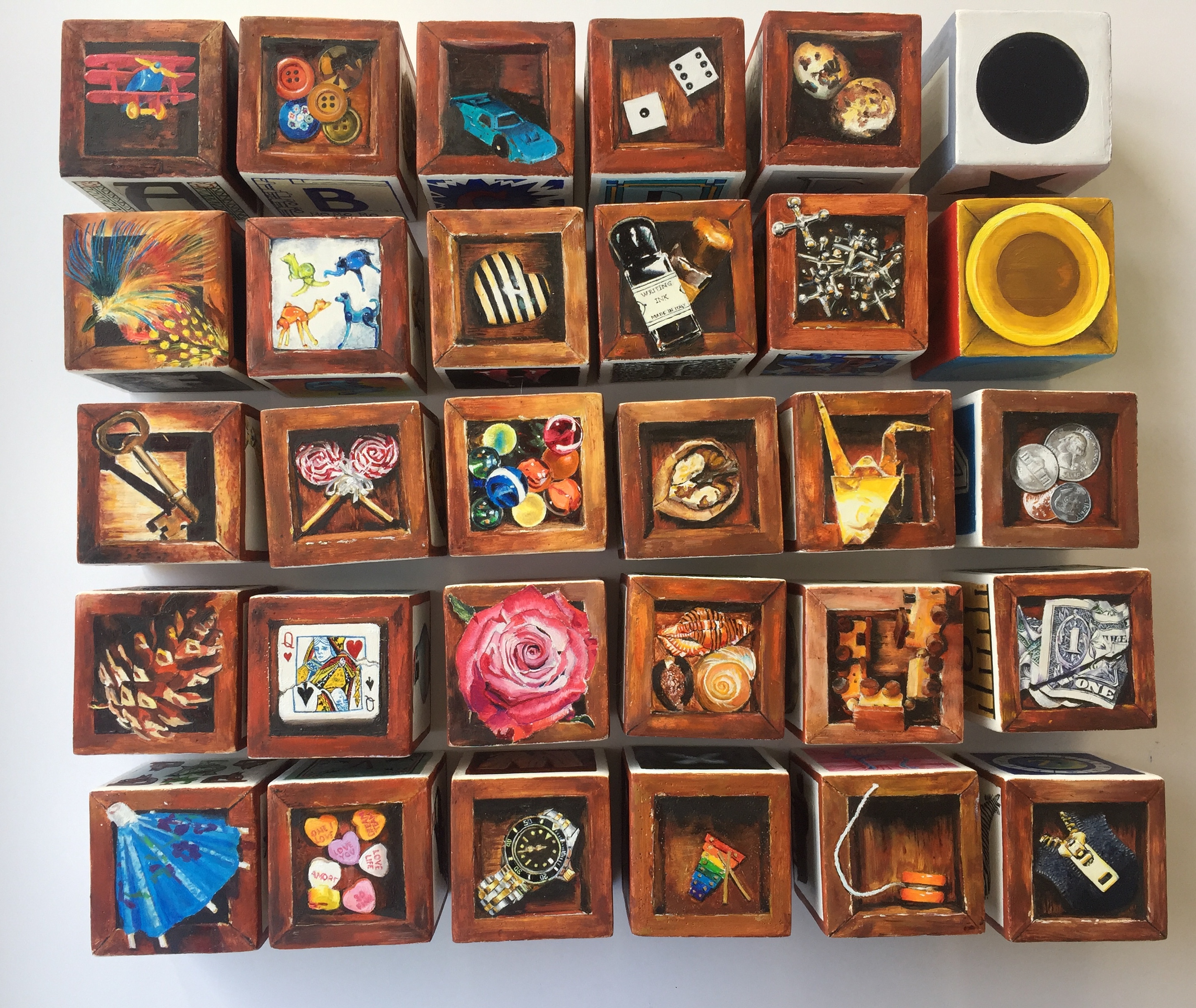
This painting contains mostly letters, the building blocks of words, which are some of the first symbols you learn. Therefore, the other spots are filled with the building blocks of 2D shapes and 3D shapes, numbers, and our currency system; i.e. the first things you learn in each of those categories.
For the rightmost column…
Spot 1 / Spot 2 / Spot 3 / Spot 4
2D shapes / 3D shapes / Digit / Digit
star / sphere / 1 / 6
triangle / sphere / 3 / 8
square / cone / 2 / 7
rectangle / cone / 4 / 9
oval / cylinder / 5 / 0
circle / cylinder / one of each coin / $1
Also: Uppercase/lowercase, front/back
Am I on the right track? Such a great concept! Love it!
The idea was this: 26 letter blocks, 2 number blocks, 2 visual language blocks. Each letter would have upper and lower case, the front and back of the animal, and an object “on top” and “inside” the block (trompe l’ceil style). The letters are done in a style evocative of the letter: A is for Arts & Crafts, B is for Blueprint, C is for comic book, and so on. The numbers are done in a context in which one finds numbers: a ruler, a varsity jersey, a clock, a billiards ball, etc. The object sides of those are currency. There are two visual language blocks: 2D shapes all done in a value scale from black to white and 3D shapes done as a color wheel. The orange side is opposite the blue, the red opposite the red, the purple opposite the yellow. Just as we have the circle, square, and triangle with their counterpart variations of oval, rectangle, and star on the 2D block, we have the concave and convex versions of the sphere, cylinder, and cone on the 3D block (with the cube, the last of the four 3D basic shapes, being the block itself, of course!) So yes, you got it right.
Oh man, talk about commitment. Well done on them all, they look great.
Are you allowed to use anything other than paint, I’m wondering if a fine technical pen with ink would allow you to get the fine lines your after, though that may break some cardinal rule I’m not aware of .
There are various ways that very fine lines can be achieved in paint. I used to be terrified of moving from pencil to paint because I thought I wouldn’t be able to do fine lines. I marvelled at artists who were able to do fine lines in paint.
However, there are some tricks that can be used to get round the problem. If you’re interested I can mention a few.
I don’t think the ink would work over oil paint but regardless I’d like to be able to achieve the fine lines like Anthony does with paint. It seems like a good skill to have if you are going to continue to paint trompe l’œil! Thank you for the kind words. I dont think I will ever be this ambitious again!!!
Haha Alexandra I’m sure you yourself must know what the tricks are given that you’ve done such detailed work on the blocks. I can’t imagine that you didn’t employ one or other of these in order to accomplish your artwork and I’m sure you don’t need any advice from me!
Anyway, what I was going to say is that it’s important to at least ask the question why we apply paint with a brush when we apply ink through a specialised release system known as a pen.
One of the big realisations I made was that you can apply the paint anyway which way you choose.
Originally I thought about putting paint mixed with mineral spirits/medium into a pen that has had its ink removed. This is not a terrible idea and probably could be made to work but the practical problems are numerous, namely that the paint/medium mixture is too weak and runny and that ink residue from the pen always contaminates it.
The two methods that do work though are: i) use of a stylus like a nail head or pin head, that reveals a paint layer below the one in which you are etching; and ii) painting on a piece of paper, allowing it to dry somewhat, and then drawing over it with a pencil.
Don’t say that, it’s great that you have ambition and even better that you have put in time to finish it. I probably would have given up after the first block or before .
This suggestion probably won’t work as haven’t tried it or you may already know it if you have; it is black your using isn’t it, I find you can mix in quite a bit of medium and retain a lot of opacity, so if you can get it runny enough whilst retaining the opacity what about using a fine long haired rigger brush as I found they worked great when I dabbled in watercolour though not sure you’d have enough flow and not sure how fine they go.
I tried using a rigger brush once and was disappointed to find the control was so hard to come by. Then again, I’m not the most skilled when it comes to using brushes.
I think they look fantastic Alexandra. I know how much work you have been putting into these are they look just wonderful. Sorry it took me so long to respond to this but I have been incredibly swamped here at the studio. But again—bravo!


 .
.