Hi,
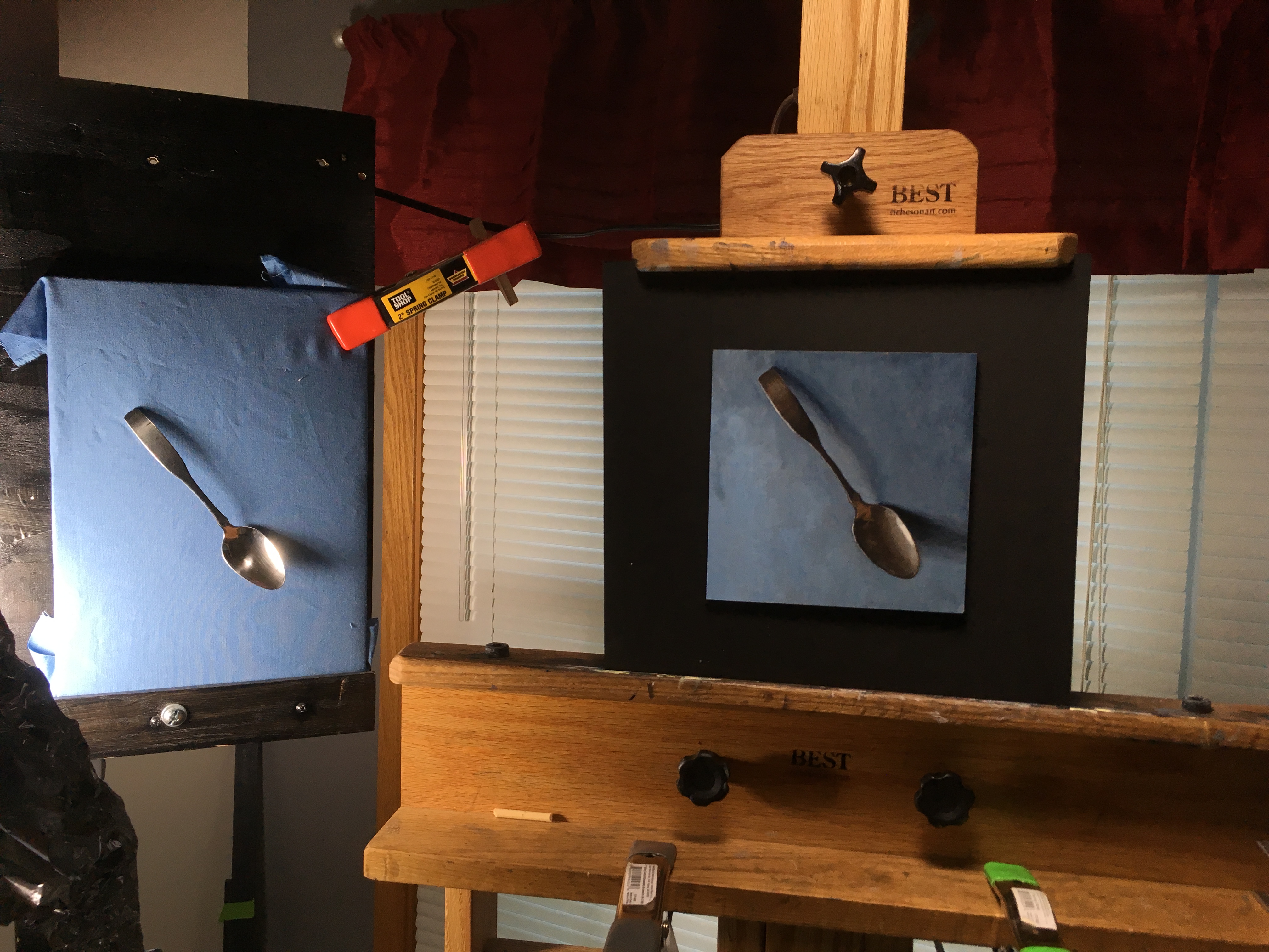
Any advice on how to deal with a highlight that is so bright it makes looking at the still life difficult. (Other than changing the lighting scheme.) I want to capture the brightness of the spoon but it is hard to evaluate value changes when looking at the set up.
Thanks.
Dan
1 Like
First off Dan—what a great job. Really nice illusion of depth and form. Bravo my friend.
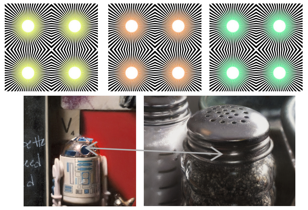
As to the “hyper-lightness/brightness” observed in your subject. While contrast and topography effects (changes in the perception of materials due to orientation) are commonly deployed by many across the board—one additional way I have employed over the years is to occasionally play up or add light-shedding/highlight-bleeds or flaring effects. By adding context-appropriate tapered augmentations to highlights I am often able to add an extra “bump” to the perception of how bright a highlight is. The downside is that occasionally such tapers and augments can have an unwanted impact on how certain geometries or contours are communicated. However, with some careful experimentation, you can find a “Goldilocks Zone” that provides that brightness boost without too much impact from unwanted distortions.

(left: A detail from a “Favorite Pieces,” (20x24”, Oil) which uses a number of subtle highlight augments and a light-shedding effect demonstration from Akiyoshi Kitaoka. The central white areas surrounded by tapered yellow and the white found in the surrounding patterns are identical, yet the central circles can appear far brighter.)
5 Likes
Thanks for the kind words and replying to this inquiry. The information and illustration you provided is so helpful. It’s amazing how bright the illustration looks. It is almost hard to look at. This gives me a real direction of study to pursue.
Thanks again,
Dan
4 Likes
Can you clarify this a little? Pretend you’re explaining it to a 10 year old. ![]() I’m assuming that just adding a pale cad yellow around a highlight won’t work for everything (or does it?), so how do you choose the color around the highlight?
I’m assuming that just adding a pale cad yellow around a highlight won’t work for everything (or does it?), so how do you choose the color around the highlight?
1 Like
Hi Amanda~~~
What I meant by “context-appropriate tapered augmentations” are highlight tapers that are appropriate for the context that they are included in. For example, while a strong color taper may work very well within one lighting/subject context—it may not be as successful in another. I would think that the color would be based upon the color of the lighting of the scene as well as the surface properties of the objects reflecting the light. As such, these highlight tapers (or highlight swells) could work with colors other than the cad yellow shown in the above example—however, depending upon context, they may work to differing levels of success.
4 Likes
Just had to stop in to say that’s a darn good spoon! Wow!
2 Likes
I know right?
Holy cow that is some good painting in your example Anthony! Hats off! So impressed.
2 Likes