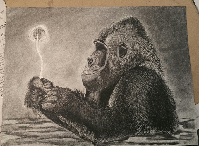
This is the first one I’ve felt good enough to request a critique on. I really liked how he turned out. Based off a picture from national geographic. Charcoal and graphite, I think 9x12. Hope you enjoy him as much as I do.
Wonderful Elizabeth. To make a critique more productive—what are some aspects that you struggled with in particular or wish could have turned out differently?
I struggled with the hands and the leaf mostly. In the reference photo (below) the gorilla is in a pond, and the hands are wet and are very reflective with the water. Initially, the water just didn’t look right, so then I erased and redid it several times to make the hands not look like a person wearing gloves!
The leaf I struggled with making it as realistic as the gorilla, mostly due to the lightness of the values I was seeing. I kept trying to develop the detail but then it would be too dark, and I’d lighten it back up using a kneaded eraser but then tone variation would get to flat and I’d try to erase out back to white in some spots but could only do that with a rubber eraser (plastic?? the square tan erasers) but they couldn’t get me the detail… it was an ugly cycle. I think I spent about 4 hours on the hands and another hour on the 1.5" leaf.
Hi Elizabeth—
I am so happy to finally be getting caught up on these posts. I was deeply invested in a commission work that held a tight deadline over the past few weeks. Now that it’s wrapped up I have so many things to get to here on smartermarx.
As to the issues that you mention: Well I have to say that the hands are really defined by their context here. When looking at them in isolation it is difficult to tell that they are even hands. The scenario though brings up an absolutely crucial issue in representational drawing and painting that arises again and again–difficulty associated with head/hands/feet. One of the big reasons that people find heads, hands, and feet so incredibly difficult to draw is the amount of categorical information that we keep bound to them. Those areas are so rich with articulation/information that abstraction tends to be linked to diminishment. Therefore, we often go the other way—instead of abstraction, we engage in “expansion”–often trying to cram in so much information that it quickly goes into a deep quagmire of over-explanation.

(hands slightly abstracted become nearly indiscernible without context)
It is important to always be mindful of what we are trying to communicate with our efforts. You can always exaggerate the available visual information but it may often bring with it frustration as the effort can have us drift from our context. It’s one of those challenging decisions that we face again and again throughout our artistic life.
As to the leaf struggle—I would think it difficult as much of the weight of its dark surround had been removed from the drawing. This is fine to do but it often leads us grappling from a transposing effort without adequate anchors. Here’s what I mean by that:
If we look to this simulation of a cast drawing exercise we can see one of the most common scenarios of context influence on lightness perception. Figure (b) demonstrates a somewhat common process seen in many cast drawing exercises. The form of the subject is established and modeled often with a context (surround) that varies greatly from the observed subject (a). If we compare figures (a) and (b) we may be quick to judge that the value structure of figure (b) is noticeably darker than (a). As such, the artist may be tempted to lighten the value structure ©. If the value structure is lifted evenly © than the outcome may be perceived as successful as long as the surround (background) present during value judgements is maintained. However, when surround values vary greatly we often find that relationships are skewed most near the outer edge of a subject. What this means is that while inner value relationships may be maintained with systematic observational comparisons—the regions nearer the varied surround may prove problematic as the context is completely different. When these out regions are married to inner regions we may tend to see the emergence of a ‘luminance chimera’ in which judgements have been made from multiple-contexts.
In addition, if the observed surround is added post subject-modelling—as most developing artists tend to do—-you will be quick to notice that the entire value structure will appear significantly light-shifted (d). This is an extremely common experience for many.

Changing the context may significantly change the appearance of the leaf wheras lifting the entire value structure evenly may also diminish the “spirit” of what one is trying to communicate.

So again–as we make value judgements we look to the influence of surrounding context factors (circles of green arrows). Notice that the translation of value relationships further from the subject’s overall surround may translate just fine if the nearby value relationships reasonably correlate. However, value translations between areas of differing contextual surrounds (as in the shoulder area) may present a potential problem.
Anyhow—I know I’m probably rambling here as I could go on about these issues for hours. It’s something I contend with every day. In any case I hope this is helpful moving forward!!! And again—great job Elizabeth!
Keep on rambling, Anthony! You got yourself a listening audience 

