Follow the Rule-of-Thirds to find an ideal focal point placement.
WHY: “The rule of thirds dictates that if you divide any composition into thirds, vertically and horizontally, and then place the key elements of your image along these lines or at the junctions of them, the arrangement achieved will be more interesting, pleasing, and dynamic.” –Chris Legaspi, Creativebloq.com
An illustration depicting a compositional arrangement using the ‘rule of thirds’
The rule-of-thirds can be found in just about every contemporary resource involving pictorial composition. As we can see in the chosen “why” above, this “rule” proposes that an image should be imagined as divided into nine equal parts by two equally spaced horizontal lines and two equally-spaced vertical lines, and that important compositional elements should be placed along these lines or their intersections for aesthetic advantage.
SIMPLIFIED: Adherence to the rule-of-thirds (ROT) will cause a pictorial spatial arrangement to be more interesting, pleasing, and dynamic (i.e., a “positive” aesthetic response)
Regarding clarity, the majority of this rationale is presented in reasonably clear terms, with the exception of the reference to “interesting, pleasing, and dynamic.” Just like with Monet’s dynamism, the language here can become problematic. However, for this paper, I simplified the latter trifecta into a clearer but slightly broader term by substituting “positive aesthetic response.”
Concerning fact and fallacy here, let’s take a glance at the origin of this concept. The earliest known articulation of the “rule of thirds” appears in the 1797 publication Remarks on Rural Scenery by British painter, engraver, and writer John Thomas Smith. In a chapter titled Of Light and Shade, Smith outlines a principle of visual harmony based on unequal distribution, arguing that two equal areas of light (or form) create visual tension, while unequal parts naturally guide the viewer’s attention. He writes, “Two distinct, equal lights, should never appear in the same picture: One should be principal, and the rest subordinate, both in dimension and degree: Unequal parts and gradations lead the attention easily from part to part, while parts of equal appearance hold it awkwardly suspended…”
Smith then introduces a proportional framework, stating: “Analogous to this ‘Rule of thirds’ (if I may be allowed so to call it)… I have presumed to think that… in a design of landscape, to determine the sky at about two-thirds; or else at about one-third, so that the material objects might occupy the other two.” He extends the idea beyond landscape, applying it to form, color, line, and shadow, and concludes that the two-thirds-to-one-third ratio is more visually harmonious than equal or extreme divisions.
While Smith makes no reference to specific artists or works, including Rembrandt, some modern scholars have speculated that paintings such as Rembrandt’s The Holy Family at Night (c. 1642), with its asymmetric light distribution and compositional balance, embody the principles Smith was attempting to codify. Such associations, however, are interpretive and not based on any direct documentation.
To be clear, what happened here is exactly what we saw with the reasoning put forward to avoid black. John Thomas Smith likely observed what he believed were “strong” works, noting particular light and dark ratios. From this observation, he concluded that this ratio was indeed a “harmonizing proportion.” And just as with the clarity issues regarding Monet’s dynamism and sense of life, I am not entirely sure what “harmonizing proportion” is supposed to communicate.
I must confess that I could not locate the origin of the later augmentation (after Smith’s 1797 publication) regarding “placing the key elements of your image along these lines or at the junctions of them,” but I am not too worried about that mystery moving forward. As we will soon see, the modern augment, which I would argue currently overshadows Smith’s initial focus on proportion, is fatally undermined by modern research.
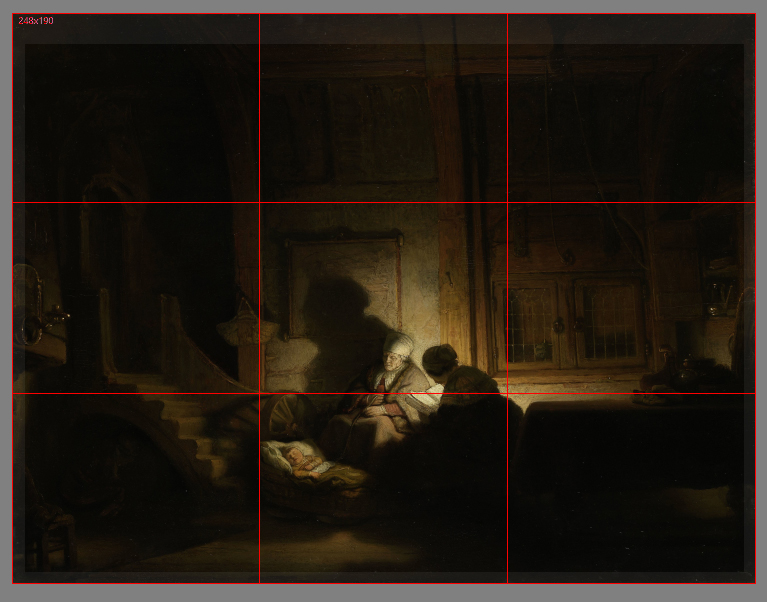
“De Heilige Familie bij Avond” (The Holy Family at Night)-formerly titled “The Cradle” by Rembrandt Harmenszoon van Rijn.
Fortunately for contemporary artists, some brilliant minds are using scientific methodologies and current technologies to test many of the long-standing traditions in the realm of Artmaking. In 2014, Psychologists Stephen Palmer and William Griscom, and research assistant Yurika Hara presented “Why the “Rule of Thirds” is Wrong” at the Vision Sciences Society Annual Meeting. Here is the abstract from that effort: “Perhaps the best-known prescriptive rule of pictorial composition is the “rule of thirds” (ROT), which posits that: (a) the best positions for the focal object within a rectangular frame lie along the vertical and horizontal lines that divide the frame into thirds, with maxima at the four intersections of these third-lines, and (b) the worst positions lie along the vertical and horizontal axes of symmetry, with the minimum being at the frame’s center. We tested these predictions by measuring people’s preferences for placement of a single object at the nine points defined by the 3×3 grid of intersections among the horizontal and vertical third-lines and symmetry-axes. We measured forced-choices between two pictures of the same object (fish/dog/eagle) facing in the same direction (forward/leftward/rightward) at all possible pairs of positions in the 3×3 grid. The results strongly contradicted both of the ROT’s main claims.“
In 2012, researchers Stephen E. Palmer and Stefano Guidi studied what they called “goodness-of-fit ratings” with circles at different positions in rectangular frames. Their experiments demonstrated that the “best-fitting” position was reported at the center, followed by positions along the global symmetry axes. The next “best” was along local symmetry axes located at the corners of the frame. The poorest fit was at asymmetric positions, like those that are deemed “ideal” with the contemporary application of the ROT.
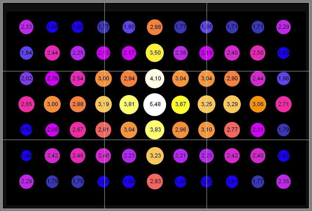
Adapted from the 2014 VSS Poster (How the “Rule of Thirds” is Wrong: Let us Count the Ways) by Stephen E. Palmer, Yurika S. Hara, & William S. Griscom. Experimental results by Palmer and Guidi (2008) using a “goodness of fit” rating task show that the structural skeleton of a rectangular frame is the preferred location, with the center being the most potent location (the point of intersection of its vertical and horizontal axes of symmetry). The rule-of-thirds armature is shown in white.
Can it be shown that adherence to this ubiquitous rule can cause a pictorial spatial arrangement that will be more likely to elicit a positive aesthetic response? Simply speaking, no. The ROT pictorial armature, independent of contextual factors, cannot be shown to be necessary or sufficient to provide an aesthetic advantage. Application of the ROT is not sufficient in that it does not guarantee in any way an aesthetically pleasing spatial arrangement independent of contextual factors (factors that we will discuss momentarily). Nor can it be shown to be necessary independent of contextual factors, as countless works of art with spatial arrangements described as “interesting, pleasing, and dynamic” can be shown to have no adherence to the ROT whatsoever.
With that said, adherence to the rule can be a contributing factor if it happens to align with certain pre-existing biases coincidentally. So yes, that’s right–the ROT can be considered a useful heuristic even though it seemingly is at odds with all modern research. Let’s look at two relevant biases that can lead to the ROT appearing quite successful:
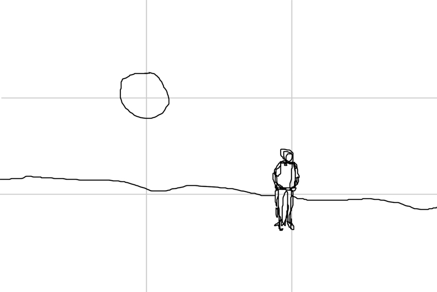
Inward Bias: Studies have demonstrated that when an object with a salient “front” is placed nearer the border of a frame than a center, observers tend to describe an image as more aesthetically pleasing [attractive/comfortable] if the object faces inward (toward the center) than if it faces outward (away from the center) [tense] (Chen et al., 2014). I believe that this may have much to do with the idea of understanding our brain as a “prediction machine.” Again, “A still photograph of an object in motion may convey dynamic information about the position of the object immediately before and after the photograph was taken (implied motion)” -(Kourtzi and Kanwisher, 2000). If we can see more of where an object may be “headed,” we can make a better prediction about a future state of the objects being observed. This bias can sometimes seem to reconcile with the rule of thirds, just as it appears to in the above picture of a figure in a snowy field.
Center Bias: In studies regarding front-facing subjects, an aesthetic [attractive] preference was greatest for pictures whose subject was located at or near the center of the frame and decreased monotonically and symmetrically with distance from the center (Palmer, Gardner & Wickens, 2008). The reason that people prefer the object’s salient front region to be as close to the center as possible may result from a number of factors. The greatest influence MAY come from how we usually engage with what we see as a front-facing subject (i.e., ecological fluency). This center bias may reflect an advantageous viewing position for extracting information from such scenarios. I would like to note here that center bias is not the same as central fixation bias. They may be related in some way, but not in a way that I can show support for at this time. Central fixation bias is a tendency for observers to begin an exploration of a visual scene at the center. Numerous visual perception experiments have borne this out (e.g., Buswell, 1935, Mannan et al., 1995, Mannan et al., 1996, Mannan et al., 1997, Parkhurst et al., 2002 and Parkhurst and Niebur, 2003). The prevalence of central fixation bias suggests that it is a key feature of scene viewing, but the basis of this effect remains poorly understood. In any case, the center bias contradicts the effect claims attached to the ROT.
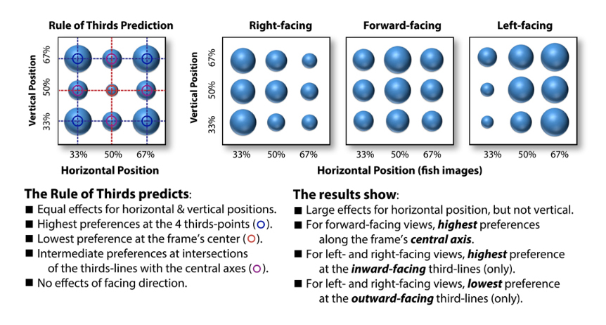
Adapted from the 2014 VSS Poster (How the “Rule of Thirds” is Wrong: Let us Count the ways) by Stephen E. Palmer, Yurika S. Hara, & William S. Griscom.
I should also note that research has shown both center and inward biases to influence preferences in the vertical dimension as well (Sammartino and Palmer, in press). Additionally, vertical preferences have been shown to be consistent with an ecological bias toward its viewer-relative position in the environment (Sammartino & Palmer, 2011).
For those interested in the research referenced here, I would recommend these additional studies related to the Rule-of-Thirds (ROT):
Sammartino, J., Palmer, S.E. (2012). Aesthetic issues in spatial composition: Effects of vertical position and perspective on framing single objects. Journal of Experimental Psychology: Human Perception and Performance, 38(4), 865-879.
Palmer, S. E., & Gardner, J. S. (2008). Aesthetic issues in spatial composition: Effects of position and direction on framing single objects. Spatial Vision, 21, 421-449.
Palmer, S. E., & Guidi, S. (2011). Mapping the perceptual structure of rectangles through goodness-of-fit ratings. Perception, 40(12) 1428-1446.
Artists should not “Paint from Photos.”
Why: “The camera cannot see like the eye can when it comes to color accuracy, depth of field, and the warms and cools of highlights and shadows. There’s a lot of distortion that comes along with photographs.” -Mark Haworth, artistsnetwork.com.
SIMPLIFIED: Avoiding photography will result in more accurate reference (in terms of color, depth-of-field, warm/cool highlights/shadows) and less distorted reference material.
Unfortunately, while the language here is crystal clear, the author of the rationale is clearly communicating some significant misrepresentations regarding concepts of accuracy, color, distortion, and visual perception.
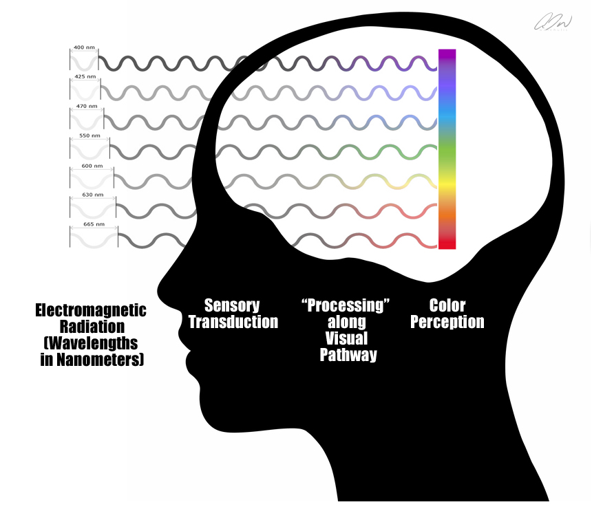
It is a fact that the eye (vision, perception) is often compared with a camera (or any comparable imaging technology). This comparison or association is very understandable, as we (humans) tend to build understanding through the cultivation of cognitive associations. We compare, contrast, associate, and apply metaphor in a concentrated effort to process the unknown (into something useful) in terms of the known. The basic idea behind photography is to record a projected light pattern with an electronic sensor or light-sensitive plate that can be used to generate an image. Doesn’t that sound similar to what we think an eye does?
In reality, aside from some low-level similarities in optics and photosensitive materials, the kinship is almost non-existent. With regard to digital photography, each pixel in a camera sensor’s array absorbs photons and generates electrons. These electrons are stored as an electrical charge proportional to the light intensity at a location on the sensor called a potential well. The electric charge is then converted to an analog voltage that is then amplified and digitized (turned into numbers). The composite pattern of data from this process (stored as binary) represents the light pattern that the sensor was exposed to and may be used to create an image of the light pattern recorded during the exposure event. Additionally, a Bayer mask or Bayer filter (a color filter array) is placed over the sensor to collect wavelength information at each pixel in addition to information regarding light intensity.
Visual perception, on the other hand, is not an objective recording or sampling process of any kind. Yes, we do have photosensitive tissues that absorb photons, but the cascade of neural activity that follows that absorption is nothing like the photon collection-electron generation-voltage chain that we find with today’s cameras, even though some may argue an additional similarity between camera voltages and the characteristics of a neuron’s action potentials. Modern research informs us that the percepts that we experience may not reflect the objective features of our environment at all. In a 1709 publication titled An Essay Towards a New Theory of Vision, Anglo-Irish philosopher George Berkley pointed out that sources underlying visual stimuli are unknowable in any direct sense. And while this observation did not stop many brilliant minds from arguing or assuming that our vision system evolved for veridical function (Marr, Pizlo, Gibson, etc.), far fewer champion the idea today as growing evidence across multiple fields of scientific inquiry continues to point to the fact that Bishop Berkley had it right all along. (For those interested in an overview of the visual system, please visit my paper here: Regarding Perception, Photography, and Painting… | Art and Articles
Another problematic intuitive implication embedded in our selected rationale here is the idea that color is a property of the environment, and as such, can be experienced more or less “accurately.” The fact of the matter is that color is no more of an environmental property than is the experience of pain or sound. Color is a term that we use to describe a set of particular visual experiences that arise upon visual exposure to various wavelengths of visible light. For example, the standard human observer has a specific type of photoreceptor cell in the retina that is “tuned” for short wavelengths. That means that when this particular cell type encounters this type of wavelength, it responds by initiating a complex cascade of electrochemical events that could eventually result in an experience that we might describe as the color “blue. The experience of blue is no more an accurate representation of the encountered visible wavelength than is the resulting knee-jerk an accurate representation of the reflex hammer that is tapping on a patellar tendon. With this in mind, I am not entirely sure how to address the idea that colors will be “more accurate” if experienced with a live percept instead of a photograph. The term accuracy refers to the closeness of a measured value to a standard or known value. For example, if in the lab you obtain a weight measurement of 3.2 kg for a given substance, but the actual or known weight is 10 kg, then your measurement is not accurate. In this case, your measurement is not close to the known value. But since color is a biological response occurring within a non-veridical perception system (not using any form of objective measurement), I do not think that “accuracy” is an applicable term here. It is true that the experiences of color with a live percept can differ significantly from what may be found with a corresponding surrogate—but neither would be considered a more or less “accurate” measure of nature itself in this context. (I believe that we can fold the claims about warm and cool highlights and shadows in with this as well.)
I am not sure how Mr. Haworth is using the idea of depth-of-field here. As I understand it, depth-of-field is the distance between the nearest and the farthest objects in “acceptably sharp focus” within a percept or image. What may be intended here is a reference to our ability to shift our focus when observing a live percept in a way that is not possible with a two-dimensional surrogate. With this ability in play, we can have access to certain experiences that may inform our decisions about the strategic application of defocus blur. However, the utilization of photographic references may also provide information (like a representation with a very narrow depth of field) that cannot be easily experienced with a live percept. Either way, the bottom line is that the usefulness or magnitude of such advantages would still be relative to the artist’s goals.
Unfortunately, our selected rationale here boils down to a number of problematic representations in regard to visual perception, accuracy, color, and distortion. As I argued in a 2015 article titled The “Pitfalls” of reading about Photography “Pitfalls,” there are some genuinely GREAT reasons to conclude that photography should be avoided within certain painting and drawing practices. However, these reasons are always context-dependent, taking into account the artist’s intentions and goals.
So let’s put aside some of the misrepresentations here, bust out the lens of causality once more, and see how the “why” here holds up in terms of necessity and sufficiency.
Is avoiding photography within an observational painting or drawing context necessary to achieve “accuracy”? The simple answer is no. Again, the nature of the visual system makes the idea of accuracy here highly problematic. If, though, we perform some cognitive gymnastics and interpret the term “accuracy” in this context to describe the similarity or “closeness” of an experience to itself (e.g., the experience of a live percept is a more accurate experience of that percept than a surrogate of that percept), then I would agree that incorporating an unnecessary surrogate could be problematic. However, even with an interpretation this absurd, the same argument can then be flipped in favor of the “accuracy” of a percept surrogate like a photograph. (e.g., the experience of a surrogate is a more accurate experience of a surrogate than is the experience of the live percept that the surrogate represents.)
Additionally, considerations of “access” should be taken into account in the context of this rule. Certain factors, like motion, time, adaptation, etc., may prohibit an observer from perceiving all that the artist may deem necessary for what he or she understands as accuracy. The consideration of such factors can indeed lead an individual to conclude that surrogacy, in certain scenarios, is necessary to achieve a form of accuracy when compared with what information is available with a corresponding live percept.
And what of sufficiency? Again, if we look to the nature of visual perception, the short answer is still no. Even if we grant the uber-generous interpretation of accuracy found with our consideration of necessity here, there can be many more factors that may prohibit what we might deem an accurate experience. We may find successful arguments to earn the rationale here, a contextually dependent contributory badge, but even that would require the aforementioned uber-generous interpretation.
The bottom line here is that there can be many advantages found with avoiding photography within observational, representational drawing or painting. But as we so often see in cases like this, those advantages are context-dependent and should not require any misrepresentation for justification. To be clear, certain types of misrepresentation are absolutely “forgivable” in the service of a heuristic. However, such misrepresentation should never serve as the basis for a supporting rationale. Keep that in mind when you are considering “Is it true?”
Remember–when you are presented with that new piece of information or that new set of instructions—take a moment and practice the ask. Ask the provider of that information, “Why?” Ask them why any given rule or practice should be followed. Ask them what evidence or rationale they can provide to show that adherence will yield an advantage.
And when we find our deployment of why met with an appropriate reason or rationale, we can begin to consider:
Is it (the reason or rationale) clear?
Is it useful?
Is it true?
Does it utilize any logical fallacies?
Does it put forth a causal relationship that I can verify? (in necessary, sufficient, contributory terms)
Happy Learning and Artmaking All!