Painting hybrid reflection

Hey all!

Any tips on painting hybrid reflection? I’ve realized that my painting ability isn’t matching my conceptual understanding :slight_smile: . Most of my training in the past amounted to “And then you put the highlights in at the end, and vary the edges”.

A few questions:

  • Are there times when it’s easier to paint the specular reflection indirectly, over the diffuse reflection?
  • If painting directly, are there gotchas with the gradients? I find I have a bit of trouble controlling the chroma as it transitions into the reflection.
  • I also often have trouble making it feel like the specular reflection feel like it’s sitting over the diffuse reflection. It often ends up feeling instead like a change in local color in the diffuse layer. Any tricks for that?

Any other advice would be greatly appreciated!

Thanks!

1 Like

Hey Tim! What an interesting question. I think that most highlights are a form a spread, or hybrid, reflection as I would argue it is very uncommon to find a truly diffure (Lambertian) or purely specular (image-forming mirror) surface. Do you have any examples of a surface reflection that you painted that you feel does not communicate well? I just want to make sure that I am addressing the question as best as I could.

1 Like

Hey Anthony!

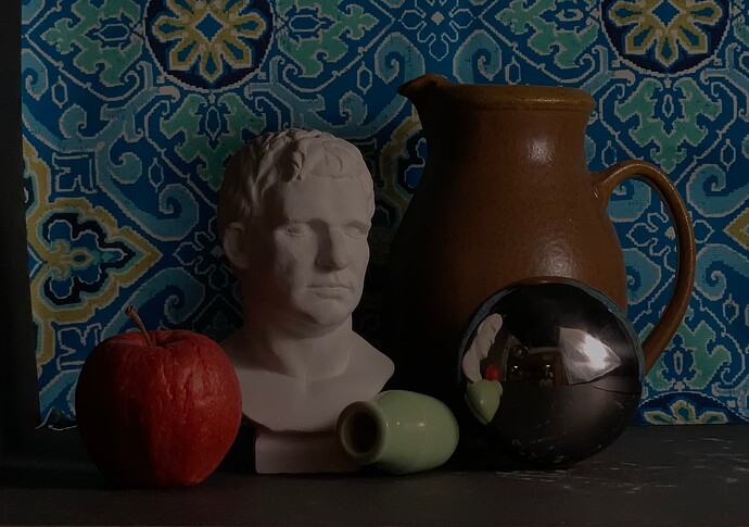
Sure thing. Here’s a piece I’m working on right now with a lot of hybrid reflection. Especially this brown vase is giving me trouble. My teacher recommended leaving a lot of the texture and color changes out and just focus on modeling the form. I think that’s lending a bit to my confusion—I’m having to figure out a lower frequency representation of the highlight and I realized I can’t seem to execute it very well. I’m also ignoring a lot of the subtler reflections right now (e.g. the reflection of the cast, and the Fresnel reflections towards the edges), but ultimately I’d like to be able to approach those as well.

Here’s a part of my piece:


You can see some parts are sunken in. Also, I’ll admit to getting frustrated on the highlights. The top one I bailed on a bit, and the bottom one I’ve painted twice.

Here’s a reference shot of the pitcher:

And here’s a shot with a mirror ball so you can see the lighting:

Thanks!

1 Like

This is a great topic. Give me a little bit to prepare an appropriate response. I want to gather some content.

1 Like

I was thinking about this a bit—maybe it’s clearer to say I’m having trouble with executing the specular component of hybrid reflection in paint. So much of what I’ve been taught or found in books just talks about diffuse reflection. Specular is often ignored. And hybrid isn’t really mentioned beyond a tiny bit about highlights.

Anyway, I’m really looking forward to your response. As you mentioned—it’s pretty rare to have just diffuse or specular. So I realized I’m anticipating trouble in a lot of situations!

Sorry for the delay on this Tim. I have been swamped these past weeks and realize that I really need to hire some help for the Academy. Ugh!

Anyway—let me address the questions as they were first presented here:

  • Are there times when it’s easier to paint the specular reflection indirectly, over the diffuse reflection?

I never do this. For me, those specular highlights define a very important value ceiling that I use to judge subsequent values (or colors.) I would argue that putting them off until later would deprive me of a very important piece of functional information.

  • If painting directly, are there gotchas with the gradients? I find I have a bit of trouble controlling the chroma as it transitions into the reflection.

There are always “gotcha” moments when dealing with the changes in HVC from one point on a painting to another. To effectively “juggle” physical properties (opacity, pigment “strength”, paint body/fluidity, varied drying/absorption rates, etc…) and perceptual dynamics (brightness and color contrast, adaptation, Mach-banding, perceived hue, chroma and value synergy, etc.) takes a lot of practice. There are no easy tricks or shortcuts that I am aware of or utilize. I handle the colors and values around a specular highlight the same way I handle those darkening halftones as they near a terminator or attached shadow accent.

Generally speaking, I try to include a good range of varied surfaces and forms in my work (I believe the juxtapositions help “sell” the visual, textural experience of each surface.) Pieces like this ( Detail of Lamoraal Vanitas, 14×11″, Oil) have varied spread reflections throughout. The vase is approaching specular—but it is not a “perfect” homogenous, image-creating mirror. There are many surface variations (not to mention distortions due to form orientations.) The skull leans much more toward diffuse, but it still has some semi-isolated highlights that keep it from earning that true Lambertian badge.

Here’s another with quite a few varied hybrids throughout ( Lunch Break II, 11×14″, Oil):

  • I also often have trouble making it feel like the specular reflection feel like it’s sitting over the diffuse reflection. It often ends up feeling instead like a change in local color in the diffuse layer. Any tricks for that?

I remember the large “specularish” highlight here taking some time. There were a ton of hue and chroma variations as it moved from the center to the periphery (Detail from Well-played, 13×19″, Oil.)

Honestly, Tim, I don’t think I worried about the highlight “sitting over” the “local surface” as much as I did the communication of the idea that the texture in the highlight, and what was immediately around it, held information that communicated a kinship with the surface elsewhere.

Overall, I think you might just be overcomplicating your conceptual framework. Transitions from hybrid reflections to adjacent areas are really no different than any other A to B transition. It will remain much more difficult than it has to be if your conceptual framework is getting in the way.

I hope that helps a bit. Let me know if there are still some specifics here I could walk you through. (And again, sorry about the delay. I had to wrap up a piece for a Holiday exhibition and the studio had one issue after another that need immediate attention.) :smiley:

1 Like

On a more pragmatic note, in regard to your work in progress of the vase. It is important to keep in mind (again, without overcomplicating) the simple idea that the area catching the specular highlight is also populated by the actual forms that define the surface. The range of values or colors that communicate these forms might be highly truncated due to the location in visual space (in a highlight so to speak), but I would argue that this still would need to be communicated for the effects that I believe you are after. For example, look at the structure of this hybrid highlight on this wax apple in my Orchestrating the Drama piece. There isn’t just a spattering of paint that emulates the brightest components of the hybrid–rather, there is the attention given to the actual structure of the surface in that area. In fact, I might even argue that I give even more attention to this structure due to how powerfully highlights communicate texture.

2 Likes

OK, first off—thanks so much for your detailed response. And don’t even think twice about any “delay”—I feel lucky as hell to be able to get any response at all! I’m pretty sure your time is worth more than I’m paying for my monthly membership :slightly_smiling_face:

There’s so much for me to go through here! It’s a gold mine, thank you. I’m going to digest a bit and will respond later. But in the meantime I can definitely say I appreciate the challenges about my conceptual model getting too complicated—it’s certainly something I’ve done many times in the past!

1 Like