after a couple of weeks of LOP exercises I stopped to do a painting. It is 8x10 and actually the brushes that Beverly suggested were basically what I used for the whole
Aside from any constructive criticism which I would love, my big question is what color do you think I should do the background. I still need to paint the stem and work on some more highlights. But have really no clue on background. Any suggestions would be greatly appreciated. Thx.
A great question and a wonderful representation thus far! Your choice of background for any object is often best determined by which attributes of the subject you are wanting to emphasize. Do you want the color to see to “vibrate”–then I would suggest something close to the blue-green perceptual opposite of the red here. Do you want the red to stand-out but without the potential vibration of an antagonistic compliment—then perhaps something low chroma–or even a neutral. Do you want the subject to look brighter? --Then perhaps a darker background will suffice. Darker? —well then light is the way to go. The background has a great deal of influence on how the subject will appear. Consider how a background will best “serve” the subject relative to your intent and the answer will often reveal itself.
Even subtle changes in a background can have a noticeable affect on the perceived hues, values and chromas comprising the representation. Here’s an example I have used in the past. Notice how the shifts in background alters the look of each apple.
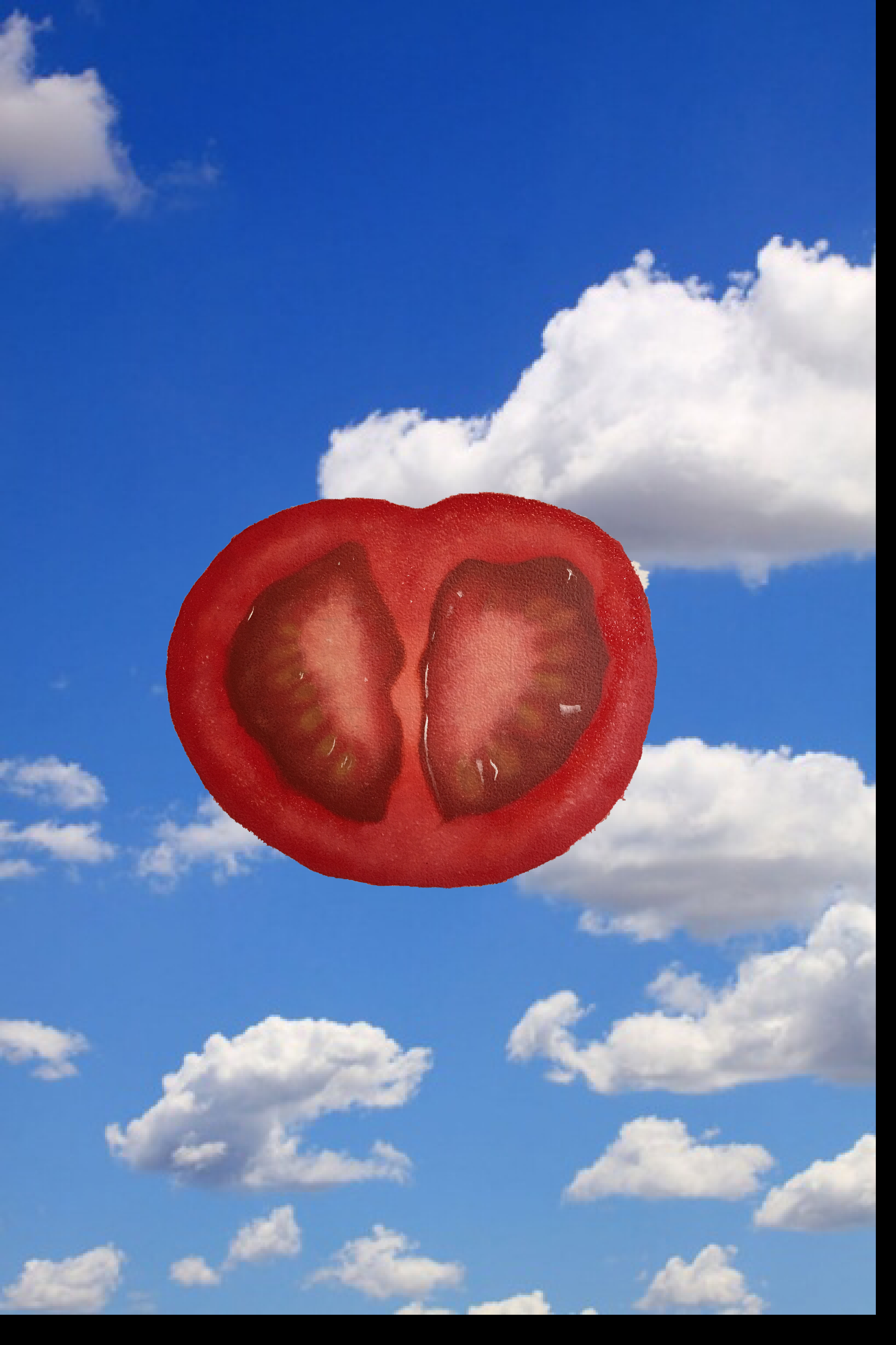
that is super helpful anthony. thanks so much. part of me likes the black. Its funny bc my wife (who is good at a lot of things, but art isnt one of them) suggested i paint the sky behind it. Kind of a fun idea. Thx again. I might do the black to make the highlights pop.