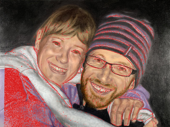
I was trying to put a painting together for my mums birthday early last month. It didn’t happen in time due to health issues but didn’t manage to get it finished a week ago. Not completely happy but couldn’t figure out why so just had to consider it done. Any feedback would be great.
Old Holland oil on board, 16x12".

4 Likes
What a spectacular Mother’s Day gift. I love the matching colors in the sweatshirt/coat and hat. What were some things that bothered you in particular? Or rather—what area(s) left you “not completely happy?” Maybe we can suss out some things that you can be aware of for the next go 'round?
There’s a definite similarity in features between both of you there, so I can only assume you’ve got a good likeness. Super painting, I bet your mum was thrilled with it. Anything you struggled with or you’re particularly pleased with?
I thought I should upload a reference photo, that should make it a touch easier to critique  . I worked from a transfer as I knew I wouldn’t be able to make it look like us without.
Not sure if you know of the Evolve program but this was done using Kevin’s speed painting process just in case you are.
Looking at it with fresh eyes the issues I think I’m noticing are:
- I think I went too light in the moderate lights and mid tones.
- Something doesn’t look right with my sisters nose and/or eyes (I think the nose having issues is a given, not sure about the eyes).
- I ran into so much trouble with the fingers, you’d think faces would be harder but nope, not for me. Even with a tracing I cocked it up, guessing I lost a lot of the tracing lines after pass 1 (it was a 3 pass process).
As for the purple Anthony, stage two was done in several stages with the jumper and beanie being seperate days and I don’t recall saving any paint so I must of mixed them separately. Having said that, I probably remembered the colours I used from the beanie so using the same base colours whilst the ratio might be different most likely gave me two colours that marry and seem the same. I would have chosen to use the same base colours on purpose for that reason, though matching exactly was not an intent (and I doubt they do).
Sorry about the delay in responding and thanks for the feedback.

3 Likes
I think a lot of the trouble you may have run into could be explained by the angle of the photo - the faces are not oriented straight up and down. So looking at the direction of the lines between teeth for example, comparing the photo to your painting I think you’ve been ‘correcting’ them subconsciously and pushing them nearer true vertical, but taking into account the whole composition the X/Y axis is rotated slightly!  This same phenomenon could affect the alignment of facial features which could be why you’re also not happy with the nose. if you like the jaunty angle you have to keep in mind the various tilts involved, or play safe and rotate the reference before transfer. Obscuring the underdrawing will have helped all of this happen a lot more easily though no doubt
I don’t think your colours are so bad, but one thing I learned from Anthony’s last video was to start with a higher chroma than you really want to end up with, as all your refinements are going to dilute that colour in a whole bunch of less chromatic directions. You could push the value range more certainly, I’m a massive chiaroscuro fan - but this is a matter of taste really. Having said that I think the shadow shapes you’ve designed in your sisters hair are great and definitely a better choice than in the photo. Well done.
2 Likes
Thanks Martin. I hadn’t even noticed the teeth angle, but now I have I can’t not see them .
As for the chroma, I think I’ve always pushed it too far, then get to the next stage and realised I haven’t pushed it anywhere near far enough.

Sometimes it helps to scan the photo and painting and flip them in photoshop to see what might bother you. Here is what I notice in terms of IF YOU ARE TRYING FOR REALISM as opposed to APPROACHING IT WITH ARTISTIC STYLIZATION IN MIND.
- Your tones in the painting are more yellow. Both you and your sister have more reddish tones in your skin throughout which creates darker contrast in terms of values. Especially in the lips and the noses. Even your sister’s hair is a little more golden and orangey in the highlights which would warm the waiting up a little.
- The eyes in the photograph pop more because they are (a) larger in the photograph (not by much but by a little) and (b) the irises are darker brown.
- You are pulling focus a bit with the patch of purple between the faces in the painting. In the painting, you’ve given the lights a lighter highlight and the darks by contrast look darker so there’s a lot more detail than what you see in the photograph.
- Hands are hard. One thing that makes them hard is that they are cylinders with bumps and those bumps (the knuckles) have planes. There is a greater contrast in the photo between the top of the hands (darker, redder) and the part that is bent over the white ruff (yellower, lighter). You have a suggestion of the knuckles midway up the hand, but you can improve them by capturing the planes of their geometry.
- The teeth in the painting are going up and down to the painting and not up and down to the heads. You can see this because they tend to go at an angle in both the painting and it’s reverse.
- By pulling the coat seam down further on your sister’s arm way to the left, you’ve given her linebacker’s shoulders.
- You’ve increased the shine in your sister’s cheeks as compared with her skin so the contrast pulls my eye there instead of to her eyes where I want it to go.
- One thing that might help as you go along is, after transferring the sketch to the canvas, create the hemispheric lines around the head. Right now your sister’s eyes are not quite placed right on the axis which makes her gaze seem “off.” Doing this will also help what the other critique said about you correcting the head “up” instead of having it tilt down as in the photograph.
Those are the nitpicky things that may help your process. However, the painting is definitely a likeness, it’s a really lovely picture of the two of you and you definitely have a sense of both the textures/fabrics and the overall volume/geometric forms of all the moving parts.
Hope this helps.
Alexandra
2 Likes
I placed these images on my desktop as well to go over Craig. I had to button up a few projects over the past few days but I’d like to contribute something to this in the morning. 
No rush, thanks for letting me know.
These are some very helpful insights and observations Alexandra! Thank you~~~
1 Like
Hey Craig! Sorry again about my delay. I had so many projects to wrap up before Friday it was ridiculous! LOL! Anyway—let’s take a closer look at the work:
First, I have to say that you are pretty spot on with your drawing in terms of basic delineation and proportion. A quick overlay from your reference shows this. So I don’t think there is any significant issue in this department.
(I would also like to add here that you seem to have a really good handle on the material. So it doesn’t look like there is any major handling problem.)
Second, I would say, overall, that the biggest issue that you might want to consider deals with perceptual anchoring. Not to be confused with the anchors I talk about when discussing calibration to available pigments, this type of perceptual anchoring is more akin to what we understand as a “white balance” in the arena of photography. You see, we have an amazing ability to adapt to new illumination scenarios so as to maximize useful visual information. However, this adaptation can often work against us in representations like this if we are not aware of it. Furthermore, we also have a tendency to exaggerate—even slightly. I do it, you do it, just about everyone does. Unfortunately, this tendency often pushes the impact of perceptual anchoring even further.
In other words, we often “reset” or “re-assign” brightest lights and darkest darks in every section we work in (setting new anchors so to speak.) rather then trying to hold them in the context in which they seem to occur. (Those that work towards “tight” or hi-resolution products often work in smaller sections and may be even more prone to the negative impacts from such adaptations.) Many deal with this by stepping back often, or walking away from the work for a while. You may have heard some talk about taking a break to come back with fresh eyes. I would argue that most mean they are trying to reset some perceptual adaptation that is causing them to spin their wheels. Others cope with this and related issues by occasionally employing some type of isolator or color checker (https://www.smartermarx.com/t/the-color-checker/926.)
Now even though this image is font-lit-(a scenario in which, arguably, such adaptations may be least impactful—they still can aggregate into a degree of unwanted stylization that we just can’t put our finger on.)

For example–here I sampled the left cheek of your sister in both the reference and the painting (A, B). You can see in these isolated form samples that while your delineation is very similar–your transition has a higher rate of change than the reference ©. This, I would argue, is a product of adaptation and the aforementioned exaggeration. The problem exacerbates as this “resetting” or “re-anchoring”, coupled with common exaggeration, recurs throughout the painting. Left unchecked, these issues can leave forms looking disconnected from the unity that is being promoted by other aspects of the representation.
So how do we deal with it? As with many such issues—awareness does the heavy lifting where a solution is concerned. As I mentioned earlier you can look to isolators to check from time to time, explore dynamic squinting from time to time (Scan, Stereo and Squint), or even just step back often to examine the context as a whole more often (through the lens of awareness of this common issue)—or however you would like to approach it. Just be sure to ask yourself: is this light or dark relationship actually as extreme as I am making it relative to the rest of the image. Taking the time to consider this can give you a massive advantage in the overall unity of your representation.
I hope this makes sense! Let me know your thoughts on this when you have time.
3 Likes
Not nitpicky at all. It’s very helpful as they were all things I didn’t see.
Not quite sure what you mean in point 8 though. When I look closely comparing the photo to the painting I realise that her face has encroached into the beanie (face has widened), is that what you mean or something else?
Thanks for this Alexandra it’s very much appreciated.
1 Like
I knew I had gone wrong on the fingers as the gaps were completely different but couldn’t figure it out. Looking at your overlay I’m wondering how the hell I got it so wrong .
I have read that color checker article a couple of times since joining, I’m really going to have to find the time to make one. I do occasionally use a grey card with a hole in it for comparing colour though sometimes I forget to use it and other times I push through without it hoping to improve my skills (that theory is possibly completely wrong).
Thank you for all the info Anthony. A lot of it I have read previously but as it never seems too get put into practice soon enough after reading it seems to go in one eye and out the other. I will need to put a piece into practice and remember to come back and read this again later for the next bit.
Thanks again.
2 Likes
Hi Craig, Sorry for the delayed reply. No, I mean that when you draw a head, it has volume. It has hemispheric lines that traverse the volume. Right now the eyes feel like they are set on a straight line and not on a curved, hemispheric line. Andrew Loomis demonstrates this in drawing on the head. How the features curve around with the face. One of the things that can happen in transferring details from a photograph to a drawing/painting is that these lines can sometimes flatten with the two dimensionality of the photograph–something that doesn’t happen when the head is drawn from scratch. Does that make sense?
1 Like
It does. More of that theory I read about and lost because I never used it (Loomis).
Yes, I think I rely too much on tracing and don’t notice if I get the tracing wrong as if I paint from It I stick to the drawn lines rather than looking at the painting itself.
Thanks for the feedback.
1 Like
Great stuff Craig and bravo for having the ■■■■■ to run the gauntlet of the critics. I think we’re at about the same stage and so all the expert criticism here, was also very useful for me. You took one for the team so to speak. 
In my experience it takes me years to properly respond to criticism. I require huge lengths of time to understand what the critics are saying – usually at first I don’t get their points – , to understand why it is important, and then finally to try and make the necessary changes in future works.
Like I say for me it’s a hell of a long process, maybe on the scale of 5 or 10 years, and sometimes I worry I won’t ever get to where I want to be. Anyway, I think your painting is really good, and if you’re willing to listen to criticism you can only get better.
As a side note, I have an idea for a new reality TV show: budding artists bring their works before master artists for criticism. Like Dragons Den or Shark Tank!
1 Like
In the past any critiques would hurt severely but I was also pretty ■■■■ at the time (I’m still ■■■■ but it’s all relative ). This one was way easier to handle critiques on though as I could see it wasn’t good enough but also couldn’t figure out for the life of me what was wrong with it so I was more relieved than freaked out by the review. The hard part is most of the advice made sense and I had learnt in the past an never put into practice so forgot it, that’s what hurt the most, knowing I had the knowledge buried but was unable to utilise it.
I spent years dabbling in art but not really improving until I started the course at Evolve (sorry @AWaichulis). It fitted me perfectly as you don’t need to perfect each stage you just need to improve and I look back and realise how far I have come. If I had to put in more effort at the start I would still be were I was years ago. This isn’t a plug for the program by the way, just that it took 40+ ‘easy’ paintaintings for me to stand back and realise, hey I’m a pinter and I can do this, as I used to believe you either had it or you didn’t. This course showed me that if you had enough desire to put in the time and someone can show you the way, anyone can do it. Mind you if I had put in more time on my own I doubt I would have got any better as likely would have just kept giving up thinking I could never paint.
Unfortunately that show wouldn’t find a big enough audience to get the mega bucks required , nice idea though.
Sorry about the rambling @Thomas.
1 Like
Lol, well I know exactly what you mean. You make mistakes, they are pointed out to you, you understand. And then you forget and make the same mistakes again. As I said before, it takes a long time for things to ram home, at least for me anyway.
Yes I too used to believe that art was only for the naturally gifted. Now it seems to me that the best artists are always simply the most hard working.
1 Like