Hey Craig! Sorry again about my delay. I had so many projects to wrap up before Friday it was ridiculous! LOL! Anyway—let’s take a closer look at the work:
First, I have to say that you are pretty spot on with your drawing in terms of basic delineation and proportion. A quick overlay from your reference shows this. So I don’t think there is any significant issue in this department.
(I would also like to add here that you seem to have a really good handle on the material. So it doesn’t look like there is any major handling problem.)
Second, I would say, overall, that the biggest issue that you might want to consider deals with perceptual anchoring. Not to be confused with the anchors I talk about when discussing calibration to available pigments, this type of perceptual anchoring is more akin to what we understand as a “white balance” in the arena of photography. You see, we have an amazing ability to adapt to new illumination scenarios so as to maximize useful visual information. However, this adaptation can often work against us in representations like this if we are not aware of it. Furthermore, we also have a tendency to exaggerate—even slightly. I do it, you do it, just about everyone does. Unfortunately, this tendency often pushes the impact of perceptual anchoring even further.
In other words, we often “reset” or “re-assign” brightest lights and darkest darks in every section we work in (setting new anchors so to speak.) rather then trying to hold them in the context in which they seem to occur. (Those that work towards “tight” or hi-resolution products often work in smaller sections and may be even more prone to the negative impacts from such adaptations.) Many deal with this by stepping back often, or walking away from the work for a while. You may have heard some talk about taking a break to come back with fresh eyes. I would argue that most mean they are trying to reset some perceptual adaptation that is causing them to spin their wheels. Others cope with this and related issues by occasionally employing some type of isolator or color checker (https://www.smartermarx.com/t/the-color-checker/926.)
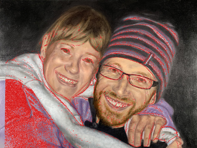
Now even though this image is font-lit-(a scenario in which, arguably, such adaptations may be least impactful—they still can aggregate into a degree of unwanted stylization that we just can’t put our finger on.)

For example–here I sampled the left cheek of your sister in both the reference and the painting (A, B). You can see in these isolated form samples that while your delineation is very similar–your transition has a higher rate of change than the reference ©. This, I would argue, is a product of adaptation and the aforementioned exaggeration. The problem exacerbates as this “resetting” or “re-anchoring”, coupled with common exaggeration, recurs throughout the painting. Left unchecked, these issues can leave forms looking disconnected from the unity that is being promoted by other aspects of the representation.
So how do we deal with it? As with many such issues—awareness does the heavy lifting where a solution is concerned. As I mentioned earlier you can look to isolators to check from time to time, explore dynamic squinting from time to time (Scan, Stereo and Squint), or even just step back often to examine the context as a whole more often (through the lens of awareness of this common issue)—or however you would like to approach it. Just be sure to ask yourself: is this light or dark relationship actually as extreme as I am making it relative to the rest of the image. Taking the time to consider this can give you a massive advantage in the overall unity of your representation.
I hope this makes sense! Let me know your thoughts on this when you have time.