I was writing up some workshop notes for my pupils on drawing still lifes using charcoal. I decided to make some images to illustrate my ideas when I made a surprising discovery! (see attached image)
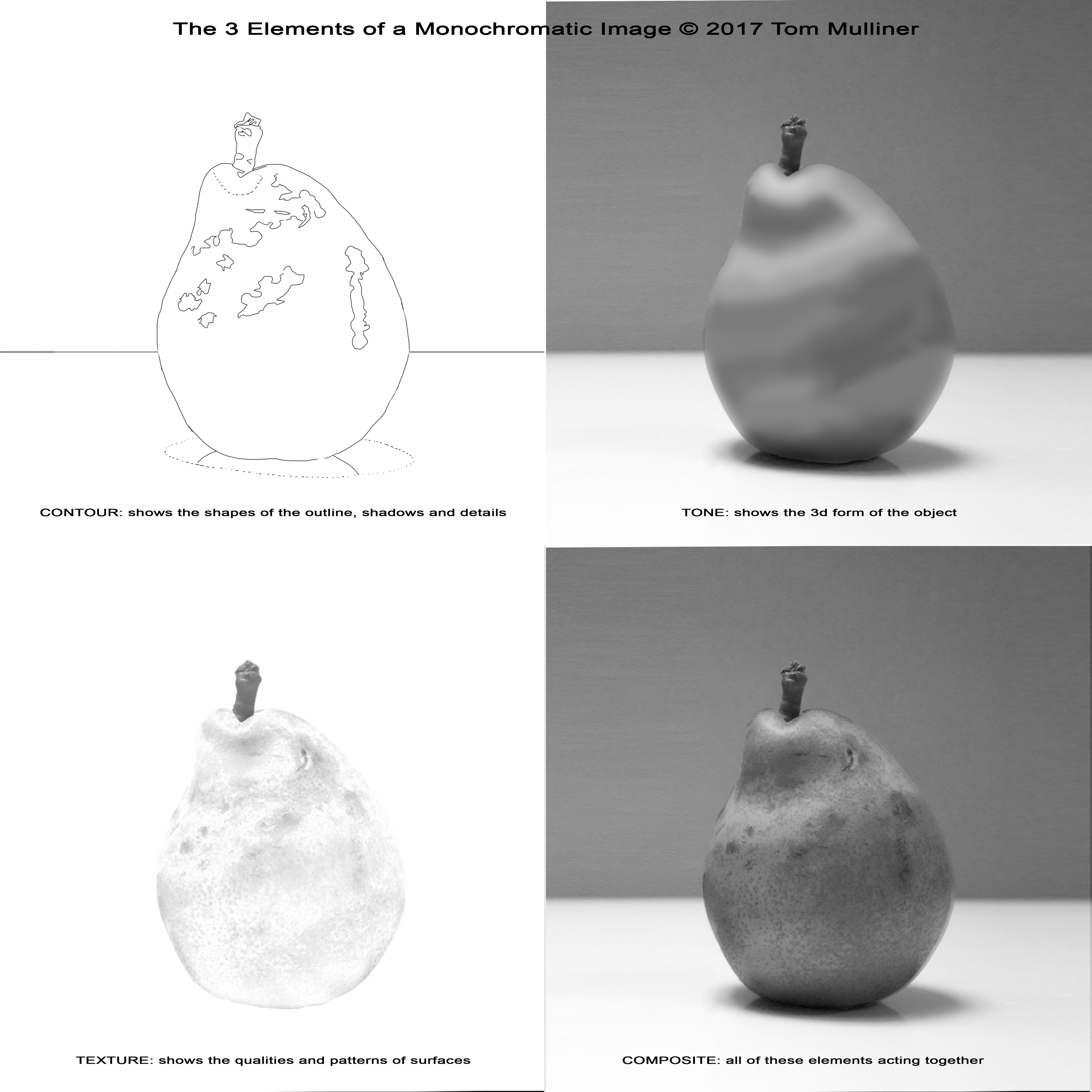
I used the image of a pear as an example. I drew out the contour lines in photoshop to replicate drawing out the lines one might need to draw the pear - simple enough. Point 1 - contour lines show us the 2d shapes that represent those found in the final image.
Next, I used photoshop to roughly draw the pear purely in terms of tone. Point 2 - tone shows us the 3d form of the object. Fine, but not realistic-looking yet.
Then in photoshop, I used a ‘difference’ filter from the second, tonal image to extract the texture from the final image. (So final image, minus tonal image = texture). Point 3 - texture tells us the surface qualities of the objects depicted. The texture on its own doesn’t look real either.
But for the fourth image, instead of using the original image as the composite of these three elements, I used MY image versions of tone and texture composited together - ie the second and third image together. I was a little surprised by the results and how realistic they looked together!!
Analysing the images - admittedly, the texture image does also contain its own tonal differences too within itself which, I’m sure helps with the final result. But it just goes to show how important the texture of an image goes towards the realism illusion AS WELL AS tonal values.