Photoshop and Imaging Basics for Artists 2024 - Class/Homework Thread

Photoshop1

Here you will find all of the information (appropriate links (including Dropbox folder links for homework), notes, reminders, etc.) for Anthony’s Photoshop 101 (Photoshop Basics for Artists) Any questions, comments, or concerns should be sent to aaawpsclass@gmail.com.

NOTE: Please respect the work, rights, and privacy of participating artists. You may view the uploaded homework efforts from the class within the Dropbox folder, but you may not download or manipulate their work in any way. Anya and I will be downloading uploaded homework or classwork images when needed/appropriate, but we will never share anyone’s images outside of the class without express permission from the author. All files in the Drobox folders will be deleted at the end of the course. In addition, please know that classes will not be recorded to respect each participant’s learning experience.

If there are files required for the week’s homework, then they will be available in a folder called “WeekX_Resources” in the appropriate week’s folder. You will need to download to files in this folder to complete the week’s homework. However, please be sure not to remove or add anything to this folder.

WEEK ONE:

Select fundamental concepts about digital images and related Photoshop image management. The resources folder for this week will contain one large example image file for personal homework use if you do not have a large file of your own. This will be addressed in class.

DROPBOX FOLDER LINK: Dropbox

Today we discussed several fundamental aspects of digital imaging. We covered the pixel, the dot, ppi, dpi, resolution, image size, image quality (compression), file size, megapixel, megabyte, and file formats (psd, tiff, jpeg, png, gif, raw, cr2.)

Some definitions to be discussed:

In computer graphics and digital photography, a raster graphic represents a two-dimensional picture as a rectangular matrix or grid of (likely) square pixels viewable via a computer display, paper, or other display medium. A raster is technically characterized by the width and height of the image in pixels and by the number of bits per pixel. Raster images are stored in image files.

The smiley face in the top left corner is a raster image. When enlarged, individual pixels appear as squares. Enlarging further, each pixel can be analyzed, with their colors constructed through a combination of the values for red, green, and blue.

IMG_0382

Pixel Values: As shown in this bitonal image, each pixel is assigned a tonal value, in this example 0 for black and 1 for white.

Vector graphics are computer images created using a sequence of commands or mathematical statements that place lines and shapes in a two-dimensional or three-dimensional space. In vector graphics, a graphic artist’s work, or file, is created and saved as a sequence of vector statements.

Here’s a number of common file formats:

ADDITIONS: Smartphone outputs:

Smartphone users may notice two new image outputs in their use of smartphone imagery: .HEIC and .HEIF. Just like JPEGs they are a form of lossy compression. (i.e., you may notice some compression degradation with these files.) HEIF (high-efficiency image file format) is a file format for storing digital images and image sequences. Its companion file format, HEIC (high-efficiency image coding), can encapsulate multiple copies of HEIF sequence data and other non-photographic media. HEIF and HEIC files are created by the camera applications of modern Android and iPhone devices and by professional-grade digital cameras. Often, when digital cameras send out HEIC and HEIF files, they are supposed to convert to JPEG, but sometimes they do not. If you encounter these files, they may need to be converted to JPEG to be utilized with some devices/software.

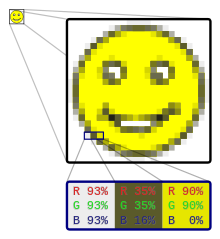
Here’s a useful infographic that communicates the basic idea of image compression:

  • MP (Megapixels)
    A pixel is the smallest addressable element of a digital picture (however, there are bits and sub-pixels we will mention briefly here.) A megapixel is 1 million pixels. A pixel is not necessarily a square, though for ease of use most photo imaging software suites will render them as such; it is more easily referenced to as a measurement of area.

The number of distinct colors that can be represented by a pixel depends on the number of bits per pixel (bpp). A 1 bpp image uses 1 bit for each pixel, so each pixel can be either on or off. Each additional bit doubles the number of colors available, so a 2 bpp image can have 4 colors, and a 3 bpp image can have 8 colors:

  • 1 bpp = 2 colors (black/white-on/off-binary)
  • 2 bpp = 4 colors
  • 3 bpp = 8 colors
  • 4 bpp = 16 colors
  • 8 bpp = 256 colors
  • 16 bpp = 65,536 colors (“Highcolor” )
  • 24 bpp = 16,777,216 colors (“Truecolor”)

But how can something like 3BPP yield 8 colors? Like this:

Color Code RGB
Black O 000
Blue B 001
Green G 010
Cyan C 011
Red R 100
Magenta M 101
Yellow Y 110
White 1 111
  • Resolution
    This is the size and number of pixels in height and width across a screen or digital image. For example, an image with a resolution of 1024 x 768 would have 786,432 pixels or 0.8 megapixels (rounded up).
  • PPI (Pixels Per Inch)
    Pixels per inch is the density of pixels over a 1-inch area. You can determine the PPI of a device by taking the resolution and dividing it by the physical width and height of the device. 300 PPI is generally the highest aimed-for density, as the human eye cannot tell the difference in image quality beyond that. Displays generally use subpixels of RGB color to generate actual pixels.

You can change the image size in a number of ways. Images can be resized or resampled. A good number of people tend to use the terms resizing and resampling as if they mean the same thing, but they don’t. There s a VERY important difference about the two. The difference between resizing and resampling has to do with whether or not you are changing the number of pixels in the image, or as Photoshop calls it, changing the pixel dimensions of the image. If you’re keeping the number of pixels in the image the same and simply changing the size at which the image will print, or in Photoshop jargon, changing the document size of the image, that’s known as resizing. If, on the other hand, you are physically changing the number of pixels in the image, that’s called resampling.

  • DPI (Dots Per Inch)
    In terms of physical printed images, dots per inch is the density of individual ink dots that a printer is able to generate. In comparative terms to PPI, you can’t really compare the two usefully in many contexts. DPI is for printed photos, and PPI is for digital displays. In terms of conversion regarding resolution, a printer can treat pixels as dots, and in such case, a higher DPI setting would result in higher quality but also in a smaller picture. Although a printer may say “Can Print up to 2400 DPI,” that doesn’t mean that you’ll actually ever print anything with that high of a density.

The measures “dots per inch” (dpi) and "pixels per inch” (PPI) are sometimes used interchangeably but have distinct meanings, especially for printer devices, where dpi is a measure of the printer’s density of dot (e.g., ink droplet) placement. For example, a high-quality photographic image may be printed with 600 ppi on a 1200 dpi inkjet printer. Even higher dpi numbers, such as the 4800 dpi quoted by printer manufacturers since 2002, do not mean much in terms of what is achievable.

Interestingly enough, there is no standard dot size or shape, so a higher DPI does not always equate to a higher-quality print. One manufacturer’s dots might look as good at 1200 DPI as another manufacturer’s dots do at 700 DPI. VERY generally speaking, books and magazines often use 150 DPI for photographic reproduction, and newspapers often use 85 DPI. If available DPI is a concern, ask the printshop or consult the printer specifications to find the appropriate DPI for your project.

We also discussed two common ppi settings relative to our focus: 72ppi and 300ppi.

In general, 300ppi at the original size is considered the minimum to reproduce the photograph well at the size of the original.”— A passage from the Federal Agencies Digital Guidelines Initiative’s Technical Guidelines for Digitizing Cultural Heritage Materials.

Keep in mind how many of these concepts are tied together. One example given today was “a 1-megapixel image (approx. 1 million pixels) taken with a DSLR camera with a 2:3 aspect ratio would be 1200x900 pixels.”

Image size via Rows, Columns, and BPP

The size of an image depends upon three things.

  • Number of rows
  • Number of columns
  • Number of bits per pixel

The formula for calculating the size is given below.

Size of an image = rows * cols * bpp

It means that if you have a grayscale image with 1024 rows and it has 1024 columns. And since it is a grayscale image, it has 256 different shades of gray, or it has 8 bits per pixel. Then, putting these values in the formula, we get

Size of an image = rows * cols * bpp

= 1024 * 1024 * 8

= 8388608 bits.

Converted to our formats discussed here:

Converting it into bytes = 8388608 / 8 = 1048576 bytes.

Converting into kilo bytes = 1048576 / 1024 = 1024kb.

Converting into Mega bytes = 1024 / 1024 = 1 Mb.

  • File Size: This is the amount of “space” that the image file takes up on a memory card or other storage media. It is often measured in megabytes (MB) (although many times kilobytes (KB).) The actual file size depends on a number of factors like image size, resolution, bit depth, and level of compression.

HOMEWORK: Due in Dropbox by Oct. 3rd. If you are not well versed in using Dropbox, you may choose to submit your homework via email at: aaawpsclass@gmail.com.

Scenario (please read carefully!!!): A popular gallery contacts you for a “high-res jpeg” image of one of your artworks for use in an upcoming feature in a magazine. In addition, they would like to add the image to their website. Their IT person is pretty busy at the moment and asked if you could make a second image ready for website upload. They request “a smaller version with a height ranging anywhere from 700 to 1000px.”

Please put the two files you would send to the gallery in this week’s Dropbox folder or email them to aaawpsclass@gmail.com. Each “correct” file submitted in time will be worth 1 point. Also be sure to use the following filename format for your submitted files:

Filename Format: First Name-Last Name_Title_size_Medium_LARGE/SMALL or PPI

for example: Anthony-Waichulis_Ideation_24x24inches_Oil_LARGE

DROPBOX LINK: Dropbox

Here you will find all of the information (appropriate links (including Dropbox folder links for homework), notes, reminders, etc.) for Photoshop 101 (Photoshop Basics for Artists) Week Two.

HOMEWORK RESULTS FROM WEEK 1 (total 2 points):

  • CH: 1
  • CY: 1
  • DD: 1
  • JJ: 2
  • JH: 2
  • JC: 2
  • ON: 2
  • RW: 2
  • TG: 1
  • TW: 2
  • SLL: 1

NOTE: Please respect the work, rights, and privacy of participating artists. You may view the uploaded homework efforts from the class within the Dropbox folder, but you may not download or manipulate their work in any way. Anya and I will be downloading uploaded homework or classwork images when needed/appropriate, but we will never share anyone’s images outside of the class without express permission from the author. All files in the Dropbox folders will be deleted at the end of the course. In addition, please know that classes will not be recorded to respect each participant’s learning experience.

If there are files required for the week’s homework, then they will be available in a folder called “WeekX_Resources” in the appropriate week’s folder. You will need to download to files in this folder to complete the week’s homework. However, please be sure not to remove or add anything to this folder.

Again, as to file naming: Moving forward, images should have the following format (where fields are appropriate):

Name_Title_Size-in-inches (height first)_Medium (if applicable)_Price (if applicable)_SMALL/MED/LARGE-or-PPI

Today we will review the homework and some info from the last class, cover a relatively new file format WebP, file naming, goals and controls (e.g., Save As/Export), the Helmholtz–Kohlrausch effect, Color Modes (RGB, CMYK, and Grayscale,) Image Resampling, and Color Bit Depth (8, 16, and 24 bit.)

Each color on top has approximately the same luminance level and yet they do not appear equally bright or dark. The yellow (second from the left) appears to be much darker than the magenta (right-most). However, when the top image is converted to grayscale, we have the image on the bottom–a single shade of gray.

Some definitions for today:

  • Image Size Resample
    This is an option in the image sizing window that, when checked, allows the changing of the actual number of pixels in the image.
  • Color Mode
    Color modes or image modes are the basis for the representation of a pixel’s color value. These modes determine how an image will be represented on screen or in print. For instance, use CMYK color mode for images in a full-color print brochure, and use RGB color mode for images in web or e-mail to reduce file size while maintaining color integrity.

Different color modes:

1. RGB mode ((Red-Green-Blue) This is a universal mode that your desktop and camera use. RGB stands for Red, Green, and Blue, so it manages colors via configurations/combinations of red, green, and blue. This mode has the largest gamut of the modes we discussed.
2. CMYK mode ((Cyan-Magenta-Yellow-Black) The next most common mode. This mode manages color in a way that is conducive to common printing processes. This mode has a smaller gamut than RGB as print media may not be able to “hit” all the colors that your computer displays can.
Fun Fact: The K in CMYK is known as the Key, because it’s the key plate that prints all the detail in a printed image. In printing, Cyan, Magenta, and Yellow plates are properly aligned with the Key plate.
3. Grayscale mode This is the most basic mode, consisting of a single channel that maps values to grays, from black to white.

WHEN CHANGING MODES:

You can change an image from its original mode (source mode) to a different mode (target mode) by going to IMAGE>MODE. Keep in mind that when you choose a different color mode for an image, you permanently change the color values in the image. For example, when you convert an RGB image to CMYK mode, RGB color values outside the CMYK gamut are adjusted to fall within the gamut. As a result, some image data may be lost and can’t be recovered if you convert the image from CMYK back to RGB.

TIP: Before converting images, it’s best to do the following:

• Do as much editing as possible in the original image mode.
• Save a backup copy before converting. Be sure to save a copy of your image that includes all layers so that you can edit the original version of the image after the conversion.
• Flatten the file before converting it, as the interaction of colors between layer blending modes changes when the mode changes. (We will get to this next week!)

  • Color Bit Depth
    Bit depth quantifies how many unique colors are available in an image’s color palette in terms of the number of 0’s and 1’s, or “bits,” which are used to specify each color. This does not mean that the image necessarily uses all of these colors but that it can instead specify colors with that level of precision. For a grayscale image, the bit depth quantifies how many unique values are available. Images with higher bit depths can encode more shades or colors since there are more combinations of 0’s and 1’s available.

Every color pixel in a digital image is created through some combination of the three primary colors: red, green, and blue. Each primary color is often referred to as a “color channel” and can have any range of intensity values specified by its bit depth. The bit depth for each primary color is termed the “bits per channel.” The “bits per pixel” (bpp) refers to the sum of the bits in all three color channels and represents the total colors available at each pixel. Confusion arises frequently with color images because it may be unclear whether a posted number refers to the bits per pixel or bits per channel. Using “bpp” as a suffix helps distinguish these two terms.

image

Most color images from digital cameras have 8 bits per channel, so they can use a total of eight 0’s and 1’s. This allows for 2^8 or 256 different combinations—translating into 256 different intensity values for each primary color. When all three primary colors are combined at each pixel, this allows for as many as 256^3 or 16,777,216 different colors, or “true color.” This is referred to as 24 bits per pixel since each pixel is composed of three 8-bit color channels. The number of colors available for any X-bit image is just 2^X if X refers to the bits per pixel and 2^X*3 if X refers to the bits per channel.

TIP: The available bit depth settings depend on the file type. Standard JPEG and TIFF files can only use 8-bits and 16-bits per channel, respectively.

HOMEWORK: Due in Dropbox by Wednesday, Oct. 9th

Homework: Locate a “high-res” color version of a favorite masterwork online and save it to your desktop. Using that file, generate two grayscale versions—one should be an “unweighted” desaturation and the other, a curated, weighted version that you feel best compensates for the loss of hue and chroma (saturation) contributions. Upload both to the homework folder as “high quality” jpegs in the ballpark of 200ppi@5x7". This is worth 4 points!!!

Bonus Scenario: You have been invited to participate in an upcoming book that explores how artists might reinterpret the value structure of their own color paintings, drawings, or photographs if they were limited to grayscale. The publishers request two images of a single work, one with a simple unweighted desaturation and one with an artist-curated, weighted desaturation. Both files should be print-ready, high-res (300ppi@8x10"), but small enough to be sent via email. Please upload the two files you would send, formatted and appropriately labeled to this week’s homework folder. This bonus is with 2 points!!!

DROPBOX LINK: Dropbox

Great question once put forward: Philippe asked, “Does it really make any difference if you save something at 5x7 inches @72ppi or 1.68 x 1.207 300ppi as they would seem to be the same?

In most cases, these files could be considered synonymous (if the pixels are exactly the same) in that if you open the two images on screen, you will see absolutely no difference between them. However, there is a difference if you try to drag and drop them into a word processor.

For example, here are two copies of my painting Paradise. One is saved at 5x7" @ 72ppi, while the other is 1.68x1.207" @ 300ppi. Either way, the pixel dimensions on both are 362x504. They are so alike that even this program discourse kept displaying the same image.

This is how they appear, though, when dragged into a Word doc:

As you can see, one becomes much smaller than the other. The issue is how some software treats the measurements. (Page-setting software like InDesign does the same thing.) In both cases, the target environment measures things in real-world units (centimeters or inches), so it uses the dpi metadata to decide how to convert your image’s pixel dimensions to real-world dimensions. For example, a 600x600-pixel image at 300 dpi will appear on the page at 2x2 inches.

By contrast, most screen-based environments (Photoshop, the web, etc.) measure things in pixels, so no conversion is needed: each pixel in your image simply occupies one pixel of your screen.

So, if you’re preparing an image for print on paper or other physical media and you’re asked for a specific dpi (which will usually be 300), you should stick to it to ease the workflow at the print end. (Of course, a page designer can always convert your 72dpi image to 300dpi without losing anything, but why make things difficult?) Note that this only ever applies if your image is going to be placed on a page (for example, in a magazine or book), which is why it so rarely makes a difference. If you’re just printing photos full-page (either on your own printer or sending them off for photographic prints), the dpi will make no difference.


Herb asked, “Is RGB in Photoshop the same or equivalent to sRGB.?”

Honestly at first I thought it would likely be the same thing but it turns out that Adobe has their own RGB mode which is simply called Adobe RGB.

While both Adobe RGB and sRGB have advantages and drawbacks, it seems Adobe RGB provides more flexibility in switching profiles thanks to a wider range of colors. The photograph taken in Adobe RGB mode can be converted to sRGB. By contrast, because they utilize a simpler color space, sRGB photographs cannot be converted to Adobe RGB.

You can learn more about the differences here:


Some software mentions:

Here you will find all of the information (appropriate links (including Dropbox folder links for homework), notes, reminders, etc.) for Photoshop 101 (Photoshop Basics for Artists) Week Three.

HOMEWORK RESULTS FROM WEEK 2 (total 6 points w/bonuses):

  • RW: 6
  • JC: 6
  • JH: 6
  • CY: 4
  • OL: 6
  • CH: 4
  • TG: 4
  • TW: 4
  • SLL: 4
  • LR: 3

NOTE: Please respect the work, rights, and privacy of participating artists. You may view the uploaded homework efforts from the class within the Dropbox folder, but you may not download or manipulate their work in any way. Anya and I will be downloading uploaded homework or classwork images when needed/appropriate, but we will never share anyone’s images outside of the class without express permission from the author. All files in the Drobox folders will be deleted at the end of the course. In addition, please know that classes will not be recorded to respect each participant’s learning experience.

If there are files required for the week’s homework, then they will be available in a folder called “WeekX_Resources” in the appropriate week’s folder. You will need to download to files in this folder to complete the week’s homework. However, please be sure not to remove or add anything to this folder.

Today we will discuss Photoshop layers!

Photoshop layers are like sheets of stacked transparent acetate. You can see through transparent areas of a layer to the layers below. You move a layer to position the content on the layer, like sliding a sheet of acetate in a stack. You can also change the opacity of a layer to make content partially transparent.

Transparent areas on a layer let you see layers below.

You use layers to perform tasks such as compositing multiple images, adding text to an image, or adding vector graphic shapes. You can apply a layer style to add a special effect such as a drop shadow or a glow.

A new image has a single layer. The number of additional layers, layer effects, and layer sets you can add to an image is limited only by your computer’s memory.

You work with layers in the Layers panel. Layer groups help you organize and manage layers. You can use groups to arrange your layers in a logical order and to reduce clutter in the Layers panel. You can nest groups within other groups. You can also use groups to apply attributes and masks to multiple layers simultaneously.

Sometimes layers don’t contain any apparent content. For example, an adjustment layer holds color or tonal adjustments that affect the layers below it. Rather than edit image pixels directly, you can edit an adjustment layer and leave the underlying pixels unchanged.

Photoshop Layers panel overview

The Layers panel in Photoshop lists all layers, layer groups, and layer effects in an image. You can use the Layers panel to show and hide layers, create new layers, and work with groups of layers. You can access additional commands and options in the Layers panel menu.

  • Marquee tool is the basic selection tool that can select your Photoshop layer in several shapes, like rectangle, ellipse, single-pixel vertical and horizontal line, square, and circle, etc. By default, the marquee tool makes the rectangular selection. But you can change to another variant of the marquee tool according to your needs.

To learn more about this tool:

https://helpx.adobe.com/photoshop/using/selecting-marquee-tools.html

In Adobe Photoshop, learn how to make selections with the marquee tools.

  • Move Tool
    The Move tool helps you position selected content or layers when customizing your work.
    Just as the name says, the Move Tool moves things around your canvas. Whether that be layers, text, or selections, this tool has you covered. It can also be used to align layers to your canvas or an active selection.

https://helpx.adobe.com/photoshop/using/tool-techniques/move-tool.html

The Move tool helps you position selected content or layers when customizing your work.

– What Can The Move Tool Move?

Entire Layers: Whether it be smart objects or a regular layer, the Move Tool can select and reposition an entire layer at once.

Text Layers: The Move Tool can reposition any text layer simply by clicking and dragging the text to a new position.

Selections: Any selection can be repositioned with the Move Tool, but the selected layer behind the selection will come with it.

  • Cut/Copy/Paste/etc
    You can use the Move tool to copy selections as you drag them within or between images, or you can copy and move selections using the Copy, Copy Merged, Cut, and Paste commands. Dragging with the Move tool saves memory because you don’t use the clipboard.
    When you paste a selection or layer between images with different resolutions, the pasted data retains its pixel dimensions. This can make the pasted portion appear out of proportion to the new image. Use the Image Size command to make the source and destination images the same resolution before copying and pasting, or use the Free Transform command to resize the pasted content.

Understanding the Copy and Paste commands

  • Copy (Ctrl-C)
    Copies the selected area on the active layer.
  • Cut (Ctrl-X)
    Removes the selected area on the active layer and adds it to the clipboard.
  • Copy Merged
    Makes a merged copy of all the visible layers in the selected area.
  • Paste (Ctrl-V)
    Pastes a copied selection into another part of the image or into another image as a new layer. If you have a selection, the Paste command places the copied selection over the current selection. Without an active selection, Paste places the copied selection in the middle of the view area.

Additional tools from today:

  • Eraser Tool
    The Eraser tool changes pixels to either the background color or to transparent. If you’re working on a background or in a layer with transparency locked, the pixels change to the background color; otherwise, the pixels are erased to transparency.
  • Transform controls
    The Transform feature allows users to alter their object or selection in a variety of ways, such as scale, rotate, distort, or flip (mirror). To use the Transform feature, select a layer or create a new selections. Got to Edit in the menu, select Transform, and select the type of transformation you wish to make. (Ctrl-T.)

Special Mention: Gaussian Blur

What is Gaussian blurring?

Named after mathematician Carl Friedrich Gauss (rhymes with “grouse”), Gaussian (“gow-see-an”) blur is the application of a mathematical function to an image in order to blur it. “It’s like laying a translucent material like vellum on top of the image,” says photographer Kenton Waltz. “It softens everything out.” A type of low-pass filter, Gaussian blur smoothes uneven pixel values in an image by cutting out the extreme outliers.

For more information on this filter:

https://www.adobe.com/creativecloud/photography/discover/gaussian-blur.html

Learn when to use Gaussian blur filters during image processing, and gain a better understanding of how they work in this learning guide.

Homework: 2 options: Please complete at least one of the following: 2 points.

1. Using the supplied hot-air balloon “for-use” image, please add an additional balloon. You must use only the digital materials available within the image. Figuring out how to change the color is up to you! (We cover that next week.) You need only submit the edited version as a jpeg which should be the same image size as the original (but not necessarily the same file size as you are changing information.)

2. Using a “high-res” landscape image—please add at least two elements that might further promote the perception of depth in the picture. The resulting image should be no smaller than 200ppi @5x7”. Please submit the original landscape image along with the edited version to complete this challenge.

Bonus Scenario (2 points.): With a show coming up on you quickly, you realize that you do not have much time for experimentation and/or exploration within your latest work in progress. However, you begin to think that the work might be significantly improved if a certain element was added. You know that if you don’t like it, the removal and “restoration” involved to get back on track will cost valuable painting hours. Luckily—you remember your Photoshop prowess and realize that you can take an image of the work in its current state and “photoshop” the element in there to see how it looks. Therefore, you need to create a variant of one of your own work images. Keep in mind that this exercise is focused on the impact to composition and spatial relationships. Stylistic appearance, consistent lighting. edgework, etc… will not be taken into account when grading this bonus challenge. Please include both the before and after image at no less than 200ppi @5x7”.

Completing all three challenges can earn you 6 points for this week! Good luck! (NOTE: please make sure to have all homework for Week Three in by Wednesday, Oct. 16th to avoid any point penalties or grading delays!)

DROPBOX for this week: Dropbox

Here you will find all of the information (appropriate links (including Dropbox folder links for homework), notes, reminders, etc.) for Photoshop 101 (Photoshop Basics for Artists) Week Four.

HOMEWORK RESULTS FROM WEEK 3 (total 6 points w/bonuses):

  • LR: 3
  • JC: 6
  • DC: 6
  • JH: 6
  • CY: 4
  • OL: 5
  • CH: 6
  • TG: 6
  • RW: 6
  • SLL: 4.5

NOTE: Please respect the work, rights, and privacy of participating artists. You may view the uploaded homework efforts from the class within the Dropbox folder, but you may not download or manipulate their work in any way. Anya and I will be downloading uploaded homework or classwork images when needed/appropriate, but we will never share anyone’s images outside of the class without express permission from the author. All files in the Dropbox folders will be deleted at the end of the course. In addition, please know that classes will not be recorded to respect each participant’s learning experience.

If there are files required for the week’s homework, then they will be available in a folder called “WeekX_Resources” in the appropriate week’s folder. You will need to download to files in this folder to complete the week’s homework. However, please be sure not to remove or add anything to this folder.

Here’s a few notes for todays class:

Making Selections! (Ctrl-D) (De-select)

Many of the selection tools in Photoshop are on the toolbar nested with similar tools.

When you choose a selection tool, more options appear across the top of the workspace. Options often include a set of icons describing how new selections will interact with existing ones. The first, a square, draws a new selection each time. The second, overlapping squares, adds to previous selections. The third, a filled and an empty square, subtracts the new selection from the previous. You can also subtract by holding the option key and making a new selection. The fourth, overlapping squares, keeps only the area shared by the new and previous selections.

In Photoshop, a selected area is bordered by ‘marching ants’.

  • Marquee tool is the basic selection tool that can select your Photoshop layer in several shapes, like rectangle, ellipse, single-pixel vertical and horizontal line, square, and circle, etc. By default, the marquee tool makes the rectangular selection. But you can change to another variant of the marquee tool according to your needs***.***
  • Lasso lets you draw freely around the object you want to select. The tool can be very imprecise without exceptional fine motor control. It is useful though when you want to make a rough selection.
  • Polygonal Lasso selects shapes that consist of straight lines. These can be more complicated shapes than just squares or rectangles. Click and drag along one edge of a shape to create a line. To turn a corner, click once. The tool freezes the line at that point and lets you change direction. Next, hold the Shift key while dragging to make a horizontal or vertical line. The selection shape completes when you return to where you started or double click.
  • Magnetic Lasso works like the Lasso. First, draw around the object that you want to select. As you draw, the line is drawn to prominent edges, like a magnet, to make a more precise selection. This tool works well when you are dealing with an object with a lot of curves.

Click one edge of the object that you want to select. Then, drag the line around the shape. Pins appear where the tool has locked onto an edge. The selection shape completes when you click on where you started or double click.

  • Object Selection was introduced in the 2019 version of Photoshop. At first, it seems to work like the Marquee tool. First, draw a rectangle or lasso around the object that you want to select. Next, Photoshop analyses the contents of the shape to find an object within. The program then refines the selection around the subject.
  • Quick Selection is a fast way of selecting a well-defined object. Click inside the object you want to select. Photoshop scans for colors and edges and expands the selection to include similar pixels. This toll is similar to a brush or eraser tool in that you can change the size, hardness, spacing, and angle of the brush stroke. Click the + icon to add to the selection.
  • Magic Wand is used to select an area via color. Click on any color in your image, and the program highlights all areas containing this color. Tolerance in the options bar changes how precise the color selection is.
  • Select Color Range can work like the Magic Wand tool. Select your entire image (dropdown or ctrl – a) and choose Color Range from the Select drop-down menu Select > Select Color Range. A new window opens. Select Sampled Colors from the drop-down menu and click on a color in your image. At higher levels of Fuzziness, similar colors are selected. You can also choose families of colors, like reds, from the drop-down menu. A thumbnail shows you a preview. White areas are selected. Grey areas are partially selected.
  • Select Focus Area selects “in-focus” areas of your image. Go to Select > Focus Area. In the window that opens, you can adjust the focus range. Move the In-Focus Range slider to relax focus parameters or select a more precise focus. You can change the preview mode and how you want to output the selection.
  • Select Subject is like the Object Selection tool–But even more “automated.” Choose the Select drop-down menu and click Select > Subject. Photoshop scans your image and selects likely subjects. Refine the selection using another tool.

Making adjustments Color (Value) - ** Remember that changes can be very destructive to the image. Always preserve an original by duplicating the layer or adding an adjustment layer.*

  • Histogram is a graphical representation of the colors and tones in your photo. The bottom axis shows the range of brightness in the image from dark to light. The side axis shows the strength a given tone has at that particular brightness. Typically you’ll hear people say that the bulk of tones should be in the middle, but that’s not exactly right. A night scene of stars will have the bulk of the tones in the dark region, with a spike at the top. Same for a dark product shot on a white background.

Auto Tone – Auto Contrast – Auto Color

The Levels panel can show you the image histogram which plots the number of pixels in the whole image that have all values of intensity, from 0 to 255. Typically a “bad” image will not have pixels that go all the way from pure OFF (=0) to pure ON (=255). In other words the histogram might not have height above the base for all values across its width. PS would see this image as bland, without the full variation in intensity range of a “good” image.

  • Auto Tone samples the entire image and assesses the color values individually. It goes into the Red layer, sets the darkest pixel as black, sets the lightest pixel as white, and redistributes all the other values in between the two. It then does the same for the Green layer, then finally for the Blue layer. Each color has been dealt with alone, and the result is a combination of the three. Each now has its contrast adjusted, essentially, and the result when you’ve changed each of these layers and combined them can often be quite dramatic because we now have a totally different combination of colors.
  • Auto Contrast samples the three color values combined rather than splitting them apart, still adjusting the darkest pixel and lightest pixel, and still redistributing a bit in between. The result should, hopefully, be that any colors that needed a little extra punch now have it.
  • Auto Color starts off the same as Auto Tone in that it splits up the colors and sets the darkest pixel to black and the lightest pixel to white, BUT rather than redistributing that remainder, it makes an attempt at getting the colors “right” by neutralizing certain midtones using a target color of RGB 128 gray and clips the shadows and highlight pixels by 0.5%. You can change these defaults in the Auto Color Correction Options dialog box.

The Brightness/Contrast adjustment lets you make simple adjustments to the tonal range of an image. Moving the brightness slider to the right increases tonal values and expands image highlights, to the left decreases values and expands shadows. The contrast slider expands or shrinks the overall range of tonal values in the image.

In normal mode, Brightness/Contrast applies proportionate (nonlinear) adjustments to the image layer, as with Levels and Curves adjustments. When Use Legacy is selected, Brightness/Contrast simply shifts all pixel values higher or lower when adjusting brightness. Since this can cause clipping or loss of image detail in highlight or shadow areas, using Brightness/Contrast in Legacy mode is not recommended for photographic images (but can be useful for editing masks or scientific imagery).

(LEGACY CHANGES ALL EQUALLY)

Levels Adjustment Panel: You use the Levels adjustment to correct the tonal range and color balance of an image by adjusting intensity levels of image shadows, midtones, and highlights. The Levels histogram is a visual guide for adjusting the image key tones.

The outer two Input Levels sliders map the black point and white point to the settings of the Output sliders. By default, the Output sliders are at level 0, where the pixels are black, and level 255, where the pixels are white. With the Output sliders in the default positions, moving the black input slider maps the pixel value to level 0 and moving the white point slider maps the pixel value to level 255. The remaining levels are redistributed between levels 0 and 255. This redistribution increases the tonal range of the image, in effect increasing the overall contrast of the image.

The middle Input slider moves the mid-tone (level 128) and changes the intensity values of the middle range of gray tones without dramatically altering the highlights and shadows.

Hue/Saturation Adjustment Panel: Hue/Saturation lets you adjust the hue, saturation, and lightness of a specific range of colors in an image or simultaneously adjust all the colors in an image. This adjustment is especially good for fine-tuning colors in a CMYK image so that they are in the gamut of an output device.

Homework (deadline Oct. 23rd) : (2 points) Just like the Balloon and Bird image task that we tackled in last week’s class, editing only the general content/information supplied within the tropical fish “for-class-use” image in the resource folder, please compose a 7x5" @200ppi image.

Bonus Belated-Halloween Challenge Scenario (3 points): A prominent skeptic magazine has put out a call for paranormal investigators to submit their best paranormal photos so as to challenge their staff debunkers. Seeing the call, you quickly realize that your Photoshop prowess allows you to rise to the challenge. Please upload your entry at a size that could go to print in the Halloween edition of their magazine if applicable.

Dropbox for this week: Dropbox

Here is the link to the photoshop and lightroom creative cloud option I spoke about last week. The price has gone up by $10 and it is now $19.99.
https://www.adobe.com/creativecloud/photography.html

Here you will find all of the information (appropriate links (including Dropbox folder links for homework), notes, reminders, etc.) for Photoshop 101 (Photoshop Basics for Artists) Week Five.

NOTE: Please respect the work, rights, and privacy of participating artists. You may view the uploaded homework efforts from the class within the Dropbox folder, but you may not download or manipulate their work in any way. Anya and I will be downloading uploaded homework or classwork images when needed/appropriate, but we will never share anyone’s images outside of the class without express permission from the author. All files in the Drobox folders will be deleted at the end of the course. In addition, please know that classes will not be recorded to respect each participant’s learning experience.

If there are files required for the week’s homework, then they will be available in a folder called “WeekX_Resources” in the appropriate week’s folder. You will need to download to files in this folder to complete the week’s homework. However, please be sure not to remove or add anything to this folder.

HOMEWORK RESULTS FROM WEEK 4 (total 5 points w/bonuses):

  • JC: 5
  • JH: 5
  • CY: 5
  • OL: 5
  • CH: 5

Here’s a few notes for today’s class:

  • Brush Tool* The Brush Tool is a primary painting tool. It works like a traditional drawing tool by applying color using strokes. It’s located in the standard toolbar, and its default shortcut is the letter B. The Brush Tool works by adding a shaped mark on a layer, and if you continue pressing the mouse button or the pen on a tablet, several marks will be added, creating a stroke, until you release the pressure. The essential options for the Paint Tool in Photoshop are Brush Tip Shape, Blending Mode, Opacity, and Flow. You must understand those concepts before moving forward with the advanced settings.

Brush tool options

Set the following in the options bar. Options available vary with each tool.

Mode sets the method for blending the color you paint with the underlying existing pixels. Available modes change with the currently selected tool. Paint modes are similar to layer blending modes.

Opacity sets the transparency of color you apply. As you paint over an area, the opacity does not exceed the set level no matter how many times you move the pointer over the area, until you release the mouse button. If you stroke over the area again, you apply additional color, equivalent to the set opacity. Opacity of 100 percent is opaque.

Flow sets the rate at which color is applied as you move the pointer over an area. As you paint over an area, while holding down the mouse button, the amount of color builds up based on the flow rate, up to the opacity setting. For example, if you set the opacity to 33% and the flow to 33%, each time you move over an area, its color moves 33% toward the brush color. The total will not exceed 33% opacity unless you release the mouse button and stroke over the area again.

  • Foreground Color is the color being applied by the brush tip and is found at the bottom of the Tools toolbar. To change the brush color in Photoshop, click on the Foreground Color and use the Color Picker to choose a new color.
  • Paint bucket Tool, as the name suggests is used to paint a selected area or white area with a color or pattern with a similar color or is used to paint an uncolored area with a color or pattern.

Paintbucket Tool options:

Fill: You can pick whether to fill with the foreground color or a pattern.

Pattern: When you choose Pattern on the Options bar, you could choose a pre-programmed pattern, lots patterns from your pattern collections, or create a pattern of your very own.

Mode: You could select a fill blending mode, also, although you’ll be better served to establish your blend mode using your Layers panel because of much better editing flexibility.

Opacity: Readjust this worth making your fill semitransparent.

Tolerance: Like the Magic wand tool, you could choose a Tolerance level (0 to 255) that defines just how similar in color a pixel have to be prior to its picked for paint.

Anti-Alias: Select this alternative to assimilate the paint smoothly with the area not filled.

Contiguous: When chosen, the paint fills up just pixels that are touching within your option. When deselected, paint fills up all pixels within the Tolerance level that you define within your choice.

All Layers: This option applies paint based on the colors in all layers that are within the selection and Tolerance degree you specify.

Keep in mind: Similar to other Tools that fill, you could protect against the Paint Bucket tool from filling the transparent pixels. Just choose the transparency symbol in the Lock area of the Layers panel.

Homework: (2 points) Unfortunately, some promotional materials created on the artist’s behalf are sometimes less than stellar. This week we take the reigns and make a general multi-use advertisement (not necessarily print-ready though) that represents our efforts appropriately. Make sure that the advert contains a base image that communicates your “bona fides”, a headshot, and a general title. Submit only the single final jpg (in the usual ballpark of 5x7"@ 200ppi.) Anya will be grading this with one with fluency and legibility in mind!

Bonus Scenario (4 points): A new educational publication company has come across your work, and being obviously impressed–they offer you a lucrative deal to produce a new instructional/educational painting, drawing, or photography DVD. To get a “feel” for how you might like to be portrayed, they ask you to create a “mock-up” of the cover so that they may send it along to the production team. The goal then is to create a DVD cover that is both compelling, communicates your desired aesthetic, and clearly communicates the focus of your content (the latter being at the very least a title and a brief, to the point description or descriptive tagline.) As the production team would like to keep all options open (including the possibility of actually using your cover), the company rep also asks you to make the mockup print-ready at the standard DVD cover size of 7.1" high by 5.2" wide. Submit what you would send to the company rep!

Homework is due by Nov. 6th! Very much looking forward to your projects!!!

Link for this week: Dropbox

Here you will find all of the information (appropriate links (including Dropbox folder links for homework), notes, reminders, etc.) for Photoshop 101 (Photoshop Basics for Artists) Week Six.

HOMEWORK RESULTS FROM WEEK 5 (total 6 points w/bonuses):

JH: 4.5
CY: 5.5
OL: 5
CH: 5

NOTE: Please respect the work, rights, and privacy of participating artists. You may view the uploaded homework efforts from the class within the Dropbox folder, but you may not download or manipulate their work in any way. Anya and I will be downloading uploaded homework or classwork images when needed/appropriate, but we will never share anyone’s images outside of the class without express permission from the author. All files in the Drobox folders will be deleted at the end of the course. In addition, please know that classes will not be recorded to respect each participant’s learning experience.

If there are files required for the week’s homework, then they will be available in a folder called “WeekX_Resources” in the appropriate week’s folder. You will need to download to files in this folder to complete the week’s homework. However, please be sure not to remove or add anything to this folder.

Here’s a few notes for today’s class:

Today’s class was focused on the concept that the representations of your work should match the experience of the work at the easel as closely as possible.

Editing/Retouching/Repairing

  • Guides and the Grid help in positioning images or elements precisely. Guides appear as nonprinting lines that float over the image that can be moved or removed. You can also lock them so that you don’t move them by accident.
  • The Clone Stamp tool paints one part of an image over another part of the same image or over another part of any open document that has the same color mode. You can also paint part of one layer over another layer. The Clone Stamp tool is useful for duplicating objects or removing a defect in an image.
  • The Healing Brush tool lets you correct imperfections, causing them to disappear into the surrounding image. Like the cloning tools, you use the Healing Brush tool to paint with sampled pixels from an image or pattern. However, the Healing Brush tool also matches the texture, lighting, transparency, and shading of the sampled pixels to the pixels being healed. As a result, the repaired pixels blend seamlessly into the rest of the image.

Both of these tools let you select a sampling point. This is the part of the image you want to keep and paint over Distractions and blemishes. The clone stamp paints a complete copy of whatever you select. However, the Healing Brush Tool keeps the Highlights and Shadows of wherever you’re painting and only paints the Color of your sampling area. This makes the Clone Stamp much more suitable for areas with defined edges since the Healing Brush will only blur the Color, and you’ll end up with messy, smudged edges.

  • The Spot Healing Brush tool quickly removes blemishes and other imperfections in your photos. The Spot Healing Brush works similarly to the Healing Brush: it paints with sampled pixels from an image or pattern and matches the texture, lighting, transparency, and shading of the sampled pixels to the pixels being healed. Unlike the Healing Brush, the Spot Healing Brush doesn’t require you to specify a sample spot. The Spot Healing Brush automatically samples from around the retouched area.
  • The Dust & Scratches Filter provides a more powerful way to remove noise from an image. This filter reduces visual noise by changing dissimilar pixels. The Raising the Threshold setting will limit the changes to areas that are similar in brightness. Drag the Threshold slider left to 0 to turn off the value so that all pixels in the selection or image can be examined. The radius defines the contextual area for relative change. In principle, a Radius of 30 tells Photoshop to replace each pixel with the median of the 900 pixels (30×30) around it. But if the Radius were only 3, then Photoshop would only be looking at 9 pixels. Try different settings on your image because a wide variety of results are possible.

We also mentioned polarizing filters and films today. Here’s a few videos on the topic:

GREAT examples of the elimination of polarized reflected light here:

Notes on Polarized Light:

What we perceive as light is an example of an electromagnetic wave, made up of oscillating electric and magnetic fields. EM waves are a type of transverse wave, meaning the field oscillations are always in directions perpendicular to the motion of the wave (as well as to each other). The direction of the electric field specifically determines what is called the polarization of the light wave. The polarization is not necessarily a fixed direction; in circular polarization, the orientation of the waves rotates around the direction of the wave.

The oscillating electric field E and magnetic field B of a ray of light are perpendicular to each other and to the velocity v of the light.

Diagram of electromagnetic wave.

Beams of light from sources like the sun or a light bulb include rays with a mix of different polarizations, and so are said to be unpolarized. If all of the light has the same polarization, then the beam is polarized. One way to produce polarized light is to pass light from a source through a polarizer, which is a device that permits only rays with a certain polarization to pass through while blocking all other polarizations.

Polarization can also occur as a result of reflection. When light shines onto a surface some of the light is reflected away from the surface, while some undergoes refraction, penetrating the surface but changing direction. The amount of light reflected versus refracted depends on the medium of the surface, as well as the angle of the light. For example, the water of a lake can appear clear from one perspective, but almost mirror-like from another.

The polarization of the light also plays a role in reflection and refraction, and in particular, the polarization of the reflected light is different than that of the light from the original source. When light shines at a certain angle, it is possible for the reflected light to become completely polarized. This phenomenon is called polarization by reflection. The extent to which polarization occurs is dependent upon the angle at which the light approaches the surface and upon the material that the surface is made of. Metallic surfaces reflect light with a variety of vibrational directions; such reflected light is unpolarized. However, nonmetallic surfaces such as asphalt roadways, snowfields and water reflect light such that there is a large concentration of vibrations in a plane parallel to the reflecting surface. A person viewing objects by means of light reflected off of nonmetallic surfaces will often perceive a glare if the extent of polarization is large. Fishermen are familiar with this glare since it prevents them from seeing fish that lie below the water. Light reflected off a lake is partially polarized in a direction parallel to the water’s surface. Fishermen know that the use of glare-reducing sunglasses with the proper polarization axis allows for the blocking of this partially polarized light. By blocking the plane-polarized light, the glare is reduced and the fisherman can more easily see fish located under the water.

If you want to understand the nature of polarized light a bit better this is a fairly easy to understand explanation (science warning! LOL!):

Homework: Using the image “Apple_Alla-Prima_Classuseonly.jpg” (apple painting on the easel) in the Week6_Resources Dropbox folder, edit the image so that it looks as similar to the “Apple_alla_prima_edited_Classuseonly.jpg” image. The final image should be the size of the original painting ready for print (Exactly-5.5 x 5.75 inches” @300ppi.) Obviously the original does not need to be uploaded. (worth 2pts.)

Bonus (you’ll have to provide your own working materials for this.) Let’s say that a gallery needs an image from you of a recent work for their website. The show is a ways off, and the painting is still wet. As such, there is a great deal of glare when facing the painting “straight on,” so a front-facing photo may be problematic. Unfortunately, you don’t have access to any specialized gear like polarizing filters and such—so your best bet is to photograph the painting at a slight angle and correct for it in Photoshop. To complete this challenge, photograph a work of yours at an angle and correct the perspective in Photoshop. Be sure to edit it conservatively so that the integrity of the original is maintained. Upload both the angled image and the corrected version as appropriate jpgs.) (worth 2pts.)

Double Super-Bonus: In the resources folder is an image titled “Alla_Prima_Apple_SCAN.jpg.” This image is one of the worst scans of an image I have seen. This is due to certain features of a scanner not being disabled (we will talk about this in a later class.) Do your absolute best to try and salvage what you can from this scan and see if you can get it as close as possible to the “Apple_alla_prima_edited_Classuseonly.jpg” (the same target as the original homework.) Keep your uploaded image size the same as the original. (worth 5pts!)

Lastly! Be sure to label all homework carefully with your name included in the filename!!!

Link for this week: Dropbox

Here you will find all of the information (appropriate links (including Dropbox folder links for homework), notes, reminders, etc.) for Photoshop 101 (Photoshop Basics for Artists) Week Seven.

HOMEWORK RESULTS FROM WEEK 6 (total 9 points w/bonuses):

LR: 6
DC: 1.5
JH: 2
CY: 8.5

NOTE: Please respect the work, rights, and privacy of participating artists. You may view the uploaded homework efforts from the class within the Dropbox folder, but you may not download or manipulate their work in any way. Anya and I will be downloading uploaded homework or classwork images when needed/appropriate, but we will never share anyone’s images outside of the class without express permission from the author. All files in the Drobox folders will be deleted at the end of the course. In addition, please know that classes will not be recorded to respect each participant’s learning experience.

If there are files required for the week’s homework, then they will be available in a folder called “WeekX_Resources” in the appropriate week’s folder. You will need to download to files in this folder to complete the week’s homework. However, please be sure not to remove or add anything to this folder.

Here’s a few notes for today’s class:

PS Basics for Artists Week Seven – Blending Modes and More Fixes

Blending Modes and Styles for Layers (The dynamics of those acetate layers!)

  • Blending mode is an effect you can add to a layer to change how the colors from the selected layer “blend” with colors on lower layers.

Note: Base Layer (Bottom Layer(s)) Blending Layer (Layer with Blending Mode applied)

  • Normal: the color is simply placed on top of the color of the layer below. “Normal” is the default Blending Mode for Photoshop layers. Opaque pixels will cover the pixels directly below them without applying any math or algorithm to them.
  • Dissolve: This mode also does not blend pixels. Dissolve only reveals the pixels below when the layer’s Opacity or Fill is reduced. The pixels below are revealed through a pseudo-random noise dither pattern whose intensity is based on the opacity of the blending layer. Dissolve shows either the blend color or the base color – never a blend of two. No anti-aliasing is used, and the result will look grainy and harsh.
  • Darken: The Darken Blending Mode looks at the luminance values in each RGB channel and displays either the base color or blend color depending on which is darker. This Blending Mode does not blend pixels; it only compares the base and blend colors, and keeps the darkest of the two. If the blend layer and the base layer color are the same, then there is no change. It simple terms it compares the colors of the blending layer and the base layers, and keeps the darker colors.
  • Multiply: This Blending Mode multiplies the luminosity of the base color by the blend color. The resulting color is always a darker color. White produces no change, while the black pixels remain. Multiply is a great Blending Mode for darkening images or adding color to shadows.
  • Color Burn: Named after the photography film development technique of “burning” or overexposing prints to make the colors darker, this blending mode darkens the colors and increases the contrast of the base colors, then blends the colors of the blending layer.
  • Linear burn: decreases the brightness of the base color based on the value of the blend color. The result is darker than Multiply but less saturated than Color Burn. Linear Burn also produces the most contrast in darker colors than any of the other Blending Modes in the “Darken group.”
  • Darker Color: very similar to Darken, and also not blending pixels, it compares the base and blend colors, and keeps the darkest of the two. The difference here is that Darker Color looks at the composite of all the RGB channels, whereas Darken looks at each RGB channel individually to come up with a final blend.
  • Subtract: subtracts the color of the blending layer from the base colors, resulting in a darker color.
  • Lighten: compares both the base and blend colors, and it keeps the lightest of the two. If both colors are the same, then no change is applied. As with the Darken Blending Mode, Lighten looks at the three RGB channels separately when blending the pixels. In simple terms, the base colors and the colors of the blending layer and compared keeps the lighter color.
  • Screen: inverts the base colors and multiplies with the colors of the blending layer. This creates the opposite effect of the Multiply mode. The resulting colors will be brighter than the original colors. Black produces no change as it becomes transparent while the brighter pixels remain. Screen can produce many different levels of brightening depending on the luminosity values of the blend layer, making Screen a great Blending Mode for brightening images or creating highlights.
  • Color dodge: lightens the colors of the base layers and reduces the contrast. This results in saturated mid-tones and blown out highlights…
  • Glow dodge: creates a stronger effect than the Color dodge mode.
  • Linear Dodge (Add): produces similar but stronger results than Screen or Color Dodge. This Blending Mode looks at the color information in each channel and brightens the base color to reflect the blend color by increasing the brightness. Blending with black produces no change. In more simple terms, the mode adds the color information of the base layers and the blending layer. In digital terms, adding color increases the brightness.
  • Lighter Color: very similar to Lighten, and also not blending pixels, it compares the base and blend colors, and it keeps the brightest of the two. The difference is that Lighter Color looks at the composite of all the RGB channels, whereas Lighten looks at each RGB channel to come up with a final blend.
  • Overlay: uses Screen at half strength on colors brighter than 50% gray. And the Multiply at half strength on colors darker than 50% gray. 50% gray itself becomes transparent. Note that “half-strength” does not mean, Opacity at 50%. Another way of thinking about Overlay is by thinking of shifting mid-tones. Dark tones shift the mid-tones to darker colors, and light tones shift the mid-tones to brighter colors. One difference between Overlay and the other Contrast Blending Modes is that it makes its calculations based on the brightness of the colors in the base layer. All of the other Contrast Blending Modes make their calculations based on the brightness of the blend layer.
  • Soft light: very much like Overlay. However, while it also applies either a darkening or lightening effect depending on the luminance values, it does so in a much more subtle way. You can think of Soft Light as a softer version of Overlay without the harsh contrast.
  • Hard light: combines the Multiply and Screen using the brightness values of the Blend layer to make its calculations. Overlay uses the base layer. The results with Hard Light tend to be intense, and in many cases, you will have to reduce the Opacity to get better results. Hard Light sounds like it would have something in common with Soft Light, but it does not. It is much more closely related to Overlay.
  • Vivid Light: You can think of Vivid Light as an extreme version of Overlay and Soft Light. Anything darker than 50% gray is darkened, and anything lighter than 50% gray is lightened.
  • Linear Light: uses a combination Linear Dodge (Add) on lighter pixels and a Linear Burn on darker pixels.
  • Hard Mix: applies the blend by adding the value of each RGB channel of the blend layer to the corresponding RGB channels in the base layer. The resulting image loses a lot of detail, and the colors can only be black, white, or any of the six primary colors: red, green, blue, cyan, magenta, or yellow. The results are extreme, and you will often need to reduce the intensity to get a more pleasing result.
  • Difference: subtracts the colors of the blending layer from the base colors, keeps the resulting value and combines it with the original base colors. More specifically, It uses the difference of the base and blend pixels as the resulting blend. White inverts the colors of the base layer. Black Produces no change, while dark grays apply a slight darkening effect**. This blending mode can be extremely useful for aligning layers with similar content.** When two pixels are the same, the result will turn black.
  • Exclusion : in a process very similar to Difference, blending with white inverts the base color values, while blending with black produces no change. However, Blending with 50% gray produces 50% gray.
  • Subtract: subtracts pixel values from the base layer. This Blending Mode drastically darkens pixels by subtracting brightness. Black has no effect. Only as the blend values get brighter does the result get darker. Subtract produces the opposite effect as Divide.
  • Divide: all colors are turned into a percentage. Blending with the same color results in white because any number divided by itself is 1, or 100%. Black (0%) gives you black because diving by zero is undefined. No change occurs. White has no effect. Only as the blend values get darker does the result get brighter. Dark areas of the blend layer produce bright colors, while the light areas of the blend layer produce a very small change. Divide produces the opposite effect as Subtract.
  • Hue: keeps the blend colors’ hue but preserves the base colors’ luminosity and saturation. Hue will not apply a change if the base layer is a neutral gray. The Hue Blend Mode could be used to change hues in a layer while maintaining the tones and saturation of the original.
  • Saturation: applies the blend colors’ saturation to the base colors’ hue and luminosity (details). Saturation will not apply a change if the base layer is a neutral gray. A black-and-white blend layer will turn the result black-and-white because none of the pixels have saturation.
  • Color: applies both the hue and saturation of the blend colors to the luminosity (details) of the base colors. The Color Blending Mode is ideal for colorizing monochromatic images.
  • Luminosity: applies the luminosity (detail) of the blend colors to the base color’s hue and saturation.

Double/Multi Exposure Photography:

What is Double or Multi-Exposure?

Double exposure is a technique that combines two different exposures or images that are layered on top of each other. The image overlaid is less than full opacity so a bit of both images can be seen producing an almost ghost-like image.

For digital photography, multiple or double exposure can be created in-camera or with editing programs like Photoshop. If you’re using actual film, the photographer would have to expose the same part of the film twice, where the second image is being superimposed on the first one.

Homework: (3 points) Create one double or multi exposure image by using the Blending modes as well as any of the tools that we have covered thus far. The final image itself should be around our usual 5x7” @300ppi. An extra bonus point will be added is there can be a discernable message communicated with the inherent juxtaposition.

Bonus Homework: (4 points) If possible, share a before and after fix to remove unwanted information (usually generated by material topography issues.) While you CAN use any of the smaller targeting tools we have used before (e.g., heal and clone stamp), be sure to try and use a blending mode to do the “heavy lifting.” Also, try and keep the submitted “pre” and “post” image large enough so that the level of fix can be reasonably appreciated.

As always, very much looking forward to your projects!!!

Link for this week: Dropbox

Here you will find all of the information (appropriate links (including Dropbox folder links for homework), notes, reminders, etc.) for Photoshop 101 (Photoshop Basics for Artists) Week Eight.

HOMEWORK RESULTS FROM WEEK 7 (total 8 points w/bonuses):

LR: 8
DC: 3
JH: 4
CY: 8

NOTE: Please respect the work, rights, and privacy of participating artists. You may view the uploaded homework efforts from the class within the Dropbox folder, but you may not download or manipulate their work in any way. Anya and I will be downloading uploaded homework or classwork images when needed/appropriate, but we will never share anyone’s images outside of the class without express permission from the author. All files in the Drobox folders will be deleted at the end of the course. In addition, please know that classes will not be recorded to respect each participant’s learning experience.

If there are files required for the week’s homework, then they will be available in a folder called “WeekX_Resources” in the appropriate week’s folder. You will need to download to files in this folder to complete the week’s homework. However, please be sure not to remove or add anything to this folder.

Here’s a few notes for today’s class:

Layer masking is a nondestructive way to hide parts of an image or layer without erasing them. They’re great for making image composites, modifying background colors, removing or cutting out objects, and targeting your edits so they affect only certain areas, rather than the entire layer.

Using a black and white photograph as a mask:

  1. Create a layer mask on the layer to be masked by selecting the layer, and then pressing the “Add Layer Mask” Button at the bottom of the layers palette.
  2. Select the layer contents (not mask) that you wish to turn into the mask.
  3. Press Ctrl+a (Mac: Cmd+a) to select the contents of the photo in their entirety (or SELECT>ALL)
  4. Press Ctrl/Cmd + c to copy those contents. (or EDIT>COPY)
  5. Press Alt (Option) and click on the layer mask thumbnail. This let’s you view the mask by itself (large) so as to make changes to it.
  6. Press Ctrl/Cmd + v to paste the copied image into the mask. (or EDIT>PASTE)
  7. Click on the pic or any other layer and you should see the mask applied.

ALSO: Here’s an animated gif showing how we used a layer mask and dust filter to fine tune the removal of small specular reflections:

ezgif-4-7fa9340729

Homework (required): (2 points) Create one double/multi exposure image by using the Layer Mask. Content is totally up to you but the final image itself should be a jpg around our usual 5x7” @300ppi.

Homework (Level 1 minimum required): (3 points-LEVEL 1). Scenario: You have just been commissioned to create a portrait for a lucky client. Unfortunately–the client has supplied a “subpar” photograph to serve as the reference. Fortunately—you are quite skilled in photoshop, so you are sure you can pull off some quality digital restoration that will leave you with some great source material to work from. Upload a “restored version” of any of the supplied damaged photographs included in the Week8_Resources folder in the Dropbox. Supplied photographs are labeled with a difficulty level (1-3.) Level one is worth 3 points, Level 2 is 6 points, and Level 3 is 9 POINTS!!!

This means that with the required multi-exposure layer mask image completed, a level 3 success can leave you with 11 points for this week!!!

One last tip that I would like to mention here is my practice of slightly lowering exposure when a reference image might look as though it is “lacking” information that might be useful to me. I do this exposure tweak through the camera raw filter.

Camera Raw Filter is a subset of Adobe Camera Raw which processes raw data from cameras and allows more control over how the camera data is interpreted into an image.

Camera Raw Filter provides tools to repair images: adjusting exposure, color, granularity, vignetting, optics, sharpness, white balance, red-eye, spot removal, and geometry. It also has a detailed histogram showing color clipping (maximum brightness/saturation.)

As always, we are very much looking forward to your projects!!!

LINK for this week: Dropbox

Here you will find all of the information (appropriate links (including Dropbox folder links for homework), notes, reminders, etc.) for Photoshop 101 (Photoshop Basics for Artists) Week Nine.

HOMEWORK RESULTS FROM WEEK 8 (total 11 points w/bonuses):

JC: 8
CY: 11
TG: 8

NOTE: Please respect the work, rights, and privacy of participating artists. You may view the uploaded homework efforts from the class within the Dropbox folder, but you may not download or manipulate their work in any way. Anya and I will be downloading uploaded homework or classwork images when needed/appropriate, but we will never share anyone’s images outside of the class without express permission from the author. All files in the Drobox folders will be deleted at the end of the course. In addition, please know that classes will not be recorded to respect each participant’s learning experience.

If there are files required for the week’s homework, then they will be available in a folder called “WeekX_Resources” in the appropriate week’s folder. You will need to download to files in this folder to complete the week’s homework. However, please be sure not to remove or add anything to this folder.

Here’s a few notes for today’s class:

What are Layer Styles or Effects?

A layer style is one or more effects applied to a layer or layer group. You can apply any preset styles in Photoshop or create your custom style using the Layer Style dialog box.

The layer effects icon appears to the right of the layer’s name in the Layers panel. You can expand the style in the Layers panel to view or edit the effects that compose the style. You can apply multiple effects in a single-layer style. Also, more than one instance of some effects can comprise a layer style.

There are several effects in Photoshop that incorporate Global Light. These effects are those that require a simulated light source such as Drop Shadow. When Global Light is changed, any effect on any element which has this Global Light capability will be changed. This is very powerful as the effects on multiple elements can be updated by simply changing the Global Light setting in any effect.

The Layer Style Dialog Window

When you first open the Layer Style window, you will see the Blending Options. Here you can adjust the Blend Mode and layer Opacity, as well as some more advanced blending effects.

A layer style can have one or more different layer effects. To apply a layer effect, check the box beside it. Be sure to enable the Preview option so that you can see your changes in real-time. To quickly preview what your layer style looks like, there’s a thumbnail on the right side of the window to help remind you.

Layer Styles/Effects: (Also pay attention to the order as it will impact what is visible.)

Drop Shadow Layer Effect

The Blend Mode allows you to blend the shadow into the background in different ways (Multiply, Overlay, etc.). Lower the Opacity to increase the shadow’s translucence. The Angle option of your drop shadow will affect the direction it drops when the Distance is set to 1 pixel or higher. If the Distance is set to 0, the shadow will spread equally around the layer’s contents. Spread allows you to make the shadow thicker/denser. The Size is how big or small the drop shadow will be on each side of the object. Changing the Quality set of options enables you to add noise to your shadow and alter the contours of your shadow.

Inner Shadow Layer Effect

The Inner Shadow effect is very similar to the Drop Shadow. In fact, it’s just the inverse in that it’s applied inside the object instead of the outside of it.

All of the options are the same as Drop Shadow. You may notice, however, that Spread has been replaced with Choke – the higher the Choke value, the thicker the shadow.

Outer Glow Layer Effect

Glows are very similar to shadows in concept. Outer glows are often used to create subtle effects when an outer edge of an object needs a bit of a boost to get it to stand out from its background. Outer glows usually work best on dark backgrounds. Like shadows, you can adjust the Blend Mode, Opacity and Noise of your glow, as well as the Spread and Size of it.

An option you have with glows that isn’t available with shadows is the Technique option, which can either be Softer or Precise. Softer gives the edge of your glow a softer and more subtle edge, whereas Precise makes your glow stronger and bolder. The Range option of your glow allows you to change its thickness — the lower the number, the thicker. Setting this at 1%, for example, will actually make your glow look like a stroke rather than a glow.

Inner Glow Layer Effect

Like the Drop Shadow versus Inner Shadow, the Inner Glow versus the Outer Glow is similar, they are just the inverse of each other. All the options are the same as Outer Glow, with one additional option: Source. The Source allows you to make your glow appear from the Edge (default setting) or the Center.

Bevel and Emboss Layer Effect

The Bevel and Emboss gives an object a raised (Bevel) or depressed (Emboss) look. The effect has two sub-effects, Contour and Texture. Contour allows you to make your bevel/emboss sharper or softer. Texture gives you the option to add a pattern to your object. The higher the Depth, the sharper the structure. The higher the Size, the more center your bevel/emboss will be. The Shading set of options allow you to increase the Opacity of both the highlights and the shading, and also allows you to change the Angle (the source of light).

Satin Layer Effect

Satin is one of the more obscure settings within Photoshop Layer Styles, but if you know how to use it, you can create a few different effects. In addition to creating a silk or satin look, it can also be used to add additional depth and even more realistic detail to glass and metal effects. The Satin options are very simple, and similar to the others we have already looked at.

Color Overlay Layer Effect

Color Overlay is an incredibly simple layer style, allowing you to completely cover the layer’s contents with a color. There are three settings: the Blend Mode, the Color, and the Opacity — they are pretty self-explanatory. This is a useful effect for quickly changing colors and is often used in web design variations, when alternative colors of things like text is desired**.**

Gradient Overlay Layer Effect

The Gradient Overlay does the exact same thing as a Color Overlay, apart from that it overlays your objects with a color gradient rather than a color. The Style of the gradient can be Linear, Radial, Angle, Reflected or Diamond. The Scale of the gradient makes it smaller or bigger with respect to the size of your layer objects. There is also a Reverse option, which allows you to quickly reverse the orientation of your colors, saving you from having to recreate a new gradient. Clicking on the Gradient option presents the Gradient Editor where you can set your gradient’s colors and type.

Pattern Overlay Layer Effect

Like the other overlay effects, the Pattern Overlay works in almost the same way. This is actually very similar to the Texture setting we used under the Bevel and Emboss effect. You can select from various built-in Photoshop patterns or create/install your own.

Stroke Layer Effect

The stroke effect simply places a border around your object. The options are similar to the ones we’ve discussed earlier and are pretty self-explanatory (at least by now). The Position option, which indicates where you want the stroke to be made, can be Inner, Outer, or Center. The size of your stroke determines how thick it is — you can adjust this in pixel units. The default is 3px, but the most common is probably 1px. The Fill Type allows you to fill your stroke with different elements; you can either choose from a solid color, a color gradient, or even a pattern. The default Fill Type is Color.

Homework: (3 points) Please create one piece of promotional material which features “Layer Style/Effect” text. Try to make your customized text emphasize that which you are setting out top promote!

Bonus Homework: (4 points) Scenario: A prominent gallery has just put out a call for artists, and you being the talented visual master you are, decide you will heed the call. Unfortunately, the prospectus states that your entry image must show the piece framed and hung on a blank wall. You remember that the actual piece is already at another gallery, and the only image you already have of it has a horrible glare. As such, you will need to digitally “reconstruct” the framed piece for submission. Please upload one drawing or painting in its frame hung on the “wall” provided in the resources folder. The uploaded image should be a jpg in the ballpark of the size of the wall image provided.

Link for this week: Dropbox

Here is a link to the video about the Polarizing filter and its affect on reflective light. This painter is using a variable polarizing filter.
https://www.instagram.com/p/DC7UsRqsNDA/

1 Like

I had a polarizing filter ages ago…maybe I need to replace it. I remember turning it to change the level of polarizing. Thanks for the reminder.

2 Likes

Here you will find all of the information (appropriate links (including Dropbox folder links for homework), notes, reminders, etc.) for Photoshop 101 (Photoshop Basics for Artists) Week Ten.

HOMEWORK RESULTS FROM WEEK 9 (total 7 points w/bonuses):

DC: 6
CY: 6
JC: 6

NOTE: Please respect the work, rights, and privacy of participating artists. You may view the uploaded homework efforts from the class within the Dropbox folder, but you may not download or manipulate their work in any way. Anya and I will be downloading uploaded homework or classwork images when needed/appropriate, but we will never share anyone’s images outside of the class without express permission from the author. All files in the Dropbox folders will be deleted at the end of the course. In addition, please know that classes will not be recorded to respect each participant’s learning experience.

If there are files required for the week’s homework, then they will be available in a folder called “WeekX_Resources” in the appropriate week’s folder. You will need to download to files in this folder to complete the week’s homework. However, please be sure not to remove or add anything to this folder.

Here’s a few notes for today’s class:

PS Basics for Artists Week Ten- The Scanning Option

What are scanners?

The basic principle of a scanner is the capturing of an images from materials like photographic prints, posters, magazine pages and similar sources for computer editing and display. Scanners work by converting the image on the document into digital information that can be stored on a computer. This process is carried out by a scanning head, which uses one or more sensors to capture the image as light or electrical charges.

Types of Scanners:

  • Flatbed scanners also called desktop scanners, are the most versatile and commonly used scanners.
  • Sheet-fed scanners are similar to flatbed scanners except the document is moved and the scan head is immobile. A sheet-fed scanner looks a lot like a small portable printer.
  • Handheld scanners use the same basic technology as a flatbed scanner, but rely on the user to move them instead of a motorized belt. This type of scanner typically does not provide good image quality. However, it can be useful for quickly capturing text.
  • Drum scanners are used by the publishing industry to capture incredibly detailed images. They use a technology called a photomultiplier tube (PMT). In PMT, the document to be scanned is mounted on a glass cylinder. At the center of the cylinder is a sensor that splits light bounced from the document into three beams. Each beam is sent through a color filter into a photomultiplier tube where the light is changed into an electrical signal.
  • 3D scanners are a bit different than traditional scanners in that they collect distance point measurements from a real-world object and translate them into a virtual 3D object.

Scanner resolution refers to the number of pixels captured by the scanner sensor and is measured in dots per inch (dpi). The higher the dpi, the greater the scanner’s ability to capture detail.

For example, a scanner with a resolution of 1200 dpi can capture 1200 pixels per inch of an image.

Very high-resolution image scanners are used for scanning for high-resolution printing, but lower-resolution scanners are adequate for capturing high-quality images for computer display.

The scanner’s resolution is determined by the number of sensors in the scanning head.

Specifics that you do not necessarily need to dive into:

The core component of the scanner is the CCD array. CCD is the most common technology for image capture in scanners. CCD is a collection of tiny light-sensitive diodes, which convert photons (light) into electrons (electrical charge). These diodes are called photosites. In a nutshell, each photosite is sensitive to light – the brighter the light that hits a single photosite, the greater the electrical charge that will accumulate at that site.

Here are the steps that a scanner goes through when it scans a document:

The document is placed on the glass plate and the cover is closed. The inside of the cover in most scanners is flat white, although a few are black. The cover provides a uniform background that the scanner software can use as a reference point for determining the size of the document being scanned. Most flatbed scanners allow the cover to be removed for scanning a bulky object, such as a page in a thick book.

A lamp is used to illuminate the document. The lamp in newer scanners is either a cold cathode fluorescent lamp (CCFL) or a xenon lamp, while older scanners may have a standard fluorescent lamp.

The entire mechanism (mirrors, lens, filter and CCD array) make up the scan head. The scan head is moved slowly across the document by a belt that is attached to a stepper motor. The scan head is attached to a stabilizer bar to ensure that there is no wobble or deviation in the pass. Pass means that the scan head has completed a single complete scan of the document.

The image of the document is reflected by an angled mirror to another mirror. In some scanners, there are only two mirrors while others use a three mirror approach. Each mirror is slightly curved to focus the image it reflects onto a smaller surface.

The last mirror reflects the image onto a lens. The lens focuses the image through a filter on the CCD array.

The filter and lens arrangement vary based on the scanner. Some scanners use a three pass scanning method. Each pass uses a different color filter (red, green or blue) between the lens and CCD array. After the three passes are completed, the scanner software assembles the three filtered images into a single full-color image.

The filter and lens arrangement vary based on the scanner. Some scanners use a three pass scanning method. Each pass uses a different color filter (red, green or blue) between the lens and CCD array. After the three passes are completed, the scanner software assembles the three filtered images into a single full-color image. However, most scanners today use a single pass method.

Another imaging array technology that has become popular in inexpensive flatbed scanners is contact image sensor (CIS). CIS replaces the CCD array, mirrors, filters, lamp and lens with rows of red, green and blue light emitting diodes (LEDs). The image sensor mechanism, consisting of 300 to 600 sensors spanning the width of the scan area, is placed very close to the glass plate that the document rests upon. When the image is scanned, the LEDs combine to provide white light. The illuminated image is then captured by the row of sensors. CIS scanners are cheaper, lighter and thinner, but do not provide the same level of quality and resolution found in most CCD scanners.

Resolution, Sharpness, Bit-Depth:

Scanners vary in resolution and sharpness. Most flatbed scanners have a true hardware resolution of at least 300x300 dots per inch (dpi). The scanner’s dpi is determined by the number of sensors in a single row (x-direction sampling rate) of the CCD or CIS array by the precision of the stepper motor (y-direction sampling rate).

For example, if the resolution is 300x300 dpi and the scanner is capable of scanning a letter-sized document, then the CCD has 2,550 sensors arranged in each horizontal row. A single-pass scanner would have three of these rows for a total of 7,650 sensors. The stepper motor in our example is able to move in increments equal to 1/300ths of an inch. Likewise, a scanner with a resolution of 600x300 has a CCD array with 5,100 sensors in each horizontal row.

Most scanners have a scan area that is either letter size (8.5x11 inches, 21.6x27.9 centimeters) or legal size (11x14 inches, 27.9x35.6 centimeters).

Sharpness depends mainly on the quality of the optics used to make the lens and the brightness of the light source. A bright xenon lamp and high-quality lens will create a much clearer, and therefore sharper, image than a standard fluorescent lamp and basic lens.

Resolution terms you many encounter:

Optical resolution: This is the actual number of pixels read by the CCD which measures the intensity of the light that is reflected from the image to be scanned, and converts it to an analog voltage. If a scanner has a resolution of 600 x 2400 dpi, its optical resolution is 600 dpi, which means that it can resolve 600 bits of data per inch.

Hardware resolution: Using a precision stepper motor to double-step or quadruple-step the carriage, the scanner’s sub-scanner resolution can be increased. For example, a scanner can have an optical resolution of 1200 dpi, but a hardware resolution of 1200 x 2400 dpi (because it double-steps the carriage to increase the vertical resolution).

Of course, many scanners proclaim resolutions of 4,800x4,800 or even 9,600x9,600. To achieve a hardware resolution with a x-direction sampling rate of 9,600 would require a CCD array of 81,600 sensors. If you look at the specifications, these high resolutions are usually labeled software-enhanced, interpolated resolution or something similar. What does that mean?

Interpolation is a process that the scanning software uses to increase the perceived resolution of an image. It does this by creating extra pixels in between the ones actually scanned by the CCD array. These extra pixels are an average of the adjacent pixels. For example, if the hardware resolution is 300x300 and the interpolated resolution is 600x300, then the software is adding a pixel between every one scanned by a CCD sensor in each row.

Another term used when talking about scanners is bit depth, also called color depth. This simply refers to the number of colors that the scanner is capable of reproducing. Each pixel requires 24 bits to create standard true color and virtually all scanners on the market support this. Many of them offer bit depths of 30 or 36 bits. They still only output in 24-bit color, but perform internal processing to select the best possible choice out of the colors available in the increased palette. There are many opinions about whether there is a noticeable difference in quality between 24-, 30- and 36-bit scanners.

On your computer, you need software, called a driver, that knows how to communicate with the scanner. Most scanners speak a common language, TWAIN. The TWAIN driver acts as an interpreter between any application that supports the TWAIN standard and the scanner. This means that the application does not need to know the specific details of the scanner in order to access it directly. For example, you can choose to acquire an image from the scanner from within Adobe Photoshop because Photoshop supports the TWAIN standard. Fun fact is that TWAIN is not an acronym. It actually comes from the phrase “Never the twain shall meet” because the driver is the go-between for the software and the scanner.

Ok, back to practical stuff:

General tips/info and link to scanner I use most often:

Again—It is very important to have a scanner in which you can TURN ALL ENHANCEMENTS OFF!!!

Something like Image type options will usually configure settings (auto exposure, resolutions, etc.) that would best serve the average scan of that type. Consider that any selections with scanner software (like a Marquee) may reinitiate auto-enhancements.

Always select somethin akin to ”Professional Mode” in the Mode list if applicable.

Document “Type” options usually fall under the headings of Reflective (for scanning documents or photos) or Film (for scanning film or slides).

  • Gutter distortion is a term that most often describes an issue with scanning books in which the book’s gutter (the space down the center of an open book where the pages are bound together) causes a page to scan to be slightly skewed. However, I use this term often to describe distortions that can happen due to noticeable imagining variations that occur at the outermost edge of the glass plate (often when a warpable material (like paper) slightly skews at the scanning “well edge.”

In Photoshop:

The Photomerge™ command combines several photographs into one continuous image. For example, you can take five overlapping photographs of a city skyline, and then merge them into a panorama. The Photomerge command can assemble photos that are tiled horizontally as well as vertically.

Tips for a successful PS Photomerge (Mostly for Photography):

Overlap images sufficiently

Images should overlap by approximately 40%. If the overlap is less, Photomerge may not be able to automatically assemble the panorama. However, keep in mind that the images shouldn’t overlap too much. If images overlap by 70% or more, Photomerge may not be able to blend the images. Try to keep the individual photos at least somewhat distinct from each other.

Use one focal length

If you use a zoom lens, don’t change the focal length (zoom in or out) while taking your pictures.

Keep the camera level

Although Photomerge can process slight rotations between pictures, a tilt of more than a few degrees can result in errors when the panorama is assembled. Using a tripod with a rotating head helps maintain camera alignment and viewpoint.

Stay in the same position

Try not to change your position as you take a series of photographs, so that the pictures are from the same viewpoint. Using the optical viewfinder with the camera held close to the eye helps keep the viewpoint consistent. Or try using a tripod to keep the camera in the same place.

Avoid using distortion lenses

Distortion lenses can interfere with Photomerge. However, the Auto option adjusts for images taken with fish-eye lenses.

Maintain the same exposure

Avoid using the flash in some pictures and not in others. The blending features in Photomerge help smooth out different exposures, but extreme differences make alignment difficult. Some digital cameras change exposure settings automatically as you take pictures, so you may need to check your camera settings to be sure that all the images have the same exposure.

Homework: (2 points) Join the scanned pieces of the large still-life drawing in the resources folder and adjust as you see fit. Submit the joined/edited jpg.

Homework (Part Two-required) (2 points): Please do your best to “correct” the small scanned image provided. Submit the edited jpg.

Bonus Homework: (4 points): If possible, please try to scan one of your own works. Correct as needed and upload a jpg that does not exceed 2MB.

Link for this week: Dropbox

Here you will find all of the information (appropriate links (including Dropbox folder links for homework), notes, reminders, etc.) for Photoshop 101 (Photoshop Basics for Artists) Week Eleven.

HOMEWORK RESULTS FROM WEEK 10 (total 8 points w/bonuses):

JC: 4
DC: 4
JH: 4
CY: 4

NOTE: Please respect the work, rights, and privacy of participating artists. You may view the uploaded homework efforts from the class within the Dropbox folder, but you may not download or manipulate their work in any way. Anya and I will be downloading uploaded homework or classwork images when needed/appropriate, but we will never share anyone’s images outside of the class without express permission from the author. All files in the Dropbox folders will be deleted at the end of the course. In addition, please know that classes will not be recorded to respect each participant’s learning experience.

If there are files required for the week’s homework, then they will be available in a folder called “WeekX_Resources” in the appropriate week’s folder. You will need to download to files in this folder to complete the week’s homework. However, please be sure not to remove or add anything to this folder.

Here are a few notes for today’s class:

PS Basics for Artists Week Eleven – Some Useful Tools…

Smart Object:

  • Smart Objects are layers that contain image data from raster or vector images, such as Photoshop or Illustrator files. Smart Objects preserve an image’s source content with all its original characteristics, enabling you to perform nondestructive editing to the layer.
  • Raster (or bitmap) images are described by an array or map of bits within a rectangular grid of pixels or dots.
  • Vector images are described by lines, shapes, and other graphic image components stored in a format that incorporates geometric formulas for rendering the image elements.

Smart Object advantages and disadvantages

With Smart Objects, you can perform non-destructive transformations.

You can scale, rotate, skew, distort, perspective transform, or warp a layer without losing original image data or quality because the transforms don’t affect the original data

Work with vector data, such as vector artwork from Illustrator, that otherwise would be rasterized in Photoshop.

You can perform nondestructive filtering. You can edit filters applied to Smart Objects at any time.

Apply a layer mask that’s either linked or unlinked to the Smart Object layer.

Try various designs with low-resolution placeholder images that you later replace with final versions.

You can’t perform operations that alter pixel data—such as painting, dodging, burning, or cloning—directly to a Smart Object layer unless it is first converted into a regular layer, which will be rasterized. To perform operations that alter pixel data, you can edit the contents of a Smart Object, clone a new layer above the Smart Object layer, edit duplicates of the Smart Object, or create a new layer.

Creating a 2D transparency tool for checking drawings or contours::

First, make sure to have good contrast and convert to black and white.

Here are tools you can use:

(Under Stylize)

  • Trace Contour Finds the transitions of major brightness areas and thinly outlines them for each color channel for an effect similar to the lines in a contour map. Note: Lower outlines where the color values of pixels fall below the specified level, and Upper outlines where the color values fall above.
  • Find Edges Identifies the areas of the image with significant transitions and emphasizes the edges. Like the Trace Counter filter, Find Edges outlines the edges of an image with dark lines against a white background and is useful for creating a border around an image.
  • Threshold: The Threshold filter converts grayscale or color images into high-contrast, black-and-white images. You can specify a certain level as a threshold. All pixels lighter than the threshold are converted to white, and all pixels darker are converted to black.
  • Posterize: Posterize is an image effect available in Adobe Photoshop that reduces the number of colors in an image. The effect is named for its similarity to the printing process called “posterization,” in which a limited number of colors are used to produce an image

Photocopy, Note Paper, and Stamp are great simplification/abstraction tools however Photocopy is my go-to for generating contour transparencies

Creating a Printable Grid

Fortunately, artist Rodney Davis has created a great walkthrough for this here:

Homework: (3 points) Create a transparency for the basket still life for the supplied still-life image. Keep the transparency in place, as demonstrated in class, and reduce the transparency layer to 50% so that we can see alignment. Upload the flattened image.

Homework: (5 points) Create a printable 1x1” white grid over the supplied still-life image. Upload the flattened image.

Homework BONUS: (10 points) Let’s say that you have been tasked with teaching a Photoshop class for traditional painters. Every now and then, when trying to explain some subtlety regarding a certain effect or tool—the printed explanation seems inadequate. One such issue did arise in regard to the Trace Contour filter with its upper and lower settings relative to the level. As such, you decide that you will create a single graphic, using Trace Contour, that can clearly show the difference between these two settings with the SAME LEVEL. Please upload your solution to this dilemma.

LINK for this week: Dropbox

Here you will find all of the information (appropriate links (including Dropbox folder links for homework), notes, reminders, etc.) for Photoshop 101 (Photoshop Basics for Artists) FINAL WEEK!!!

HOMEWORK RESULTS FROM WEEK 11 (total 18 points w/bonuses):

JC: 18
CY: 17.5

NOTE: Please respect the work, rights, and privacy of participating artists. You may view the uploaded homework efforts from the class within the Dropbox folder, but you may not download or manipulate their work in any way. Anya and I will be downloading uploaded homework or classwork images when needed/appropriate, but we will never share anyone’s images outside of the class without express permission from the author. All files in the Dropbox folders will be deleted at the end of the course. In addition, please know that classes will not be recorded to respect each participant’s learning experience.

If there are files required for the week’s homework, then they will be available in a folder called “WeekX_Resources” in the appropriate week’s folder. You will need to download to files in this folder to complete the week’s homework. However, please be sure not to remove or add anything to this folder.

Finals week in-class project scenario: An exceptional collector/client of yours (Affluent Anya from Russia) has approached you with a commission proposal. She has always been quite taken with seascapes. One of her favorites, titled Stage Fort across Gloucester Harbor, is a mid-19th century painting by American artist Fitz Henry Lane. Frustrated that the Metropolitan Museum would not sell her the original, she has decided to commission you, her favorite artist, to create a copy (with a few personalized edits.)

First, in an effort to build up the number of drawings in her collection, she would like this new piece to be done in charcoal and white pastel. Second, Affluent Anya would like her family’s sailboat integrated into the piece (as she’s quite fond of it.)

Anya then provides the following reference material:

  1. A 3811x2281 pixel digital image of the Fitz Henry Lane piece. (25.407x15.207 inches @150ppi.)
  2. An 7908x5272 pixel image of her family’s sailboat. (26.36x17.573 inches @300ppi.)

Glancing at these specs, you inform Anya that based on the available reference material properties, the piece will likely have to be much smaller than the original piece (96.5 cm × 152.4 cm (38.0 in × 60.0 in)) as well as the roughly 25x15” image size @150. You let her know that you will need to get the image to 300ppi to really get the best image quality that you can. With a small sigh, she states that it is fine as long as you can make it all look great! (as she takes another pretentious puff of a cigarette at the end of a ridiculously long cigarette holder.)

Affluent Anya also requests seeing a digital mockup to approve prior to starting. She requests seeing two different placements of the boats FULLY INTEGRATED into the achromatic image so that she may choose what she likes best. She, too, knows her way around Photoshop and asks that the boats be able to be “toggled” on and off so that she can judge which placement she may like better without having to switch between different images altogether.

Lastly, since you will have the file open anyway—you might as well create the togglable grid that you plan to use to draw out your cartoon. A 1x1” grid should suffice.

To complete the course, upload your digital mockup for Affluent Anya at the generally ideal maximum size you can draw the commission without losing necessary information, along with two toggleable fully integrated boat placements and a toggleable 1x1” grid.

Link for this week: Dropbox