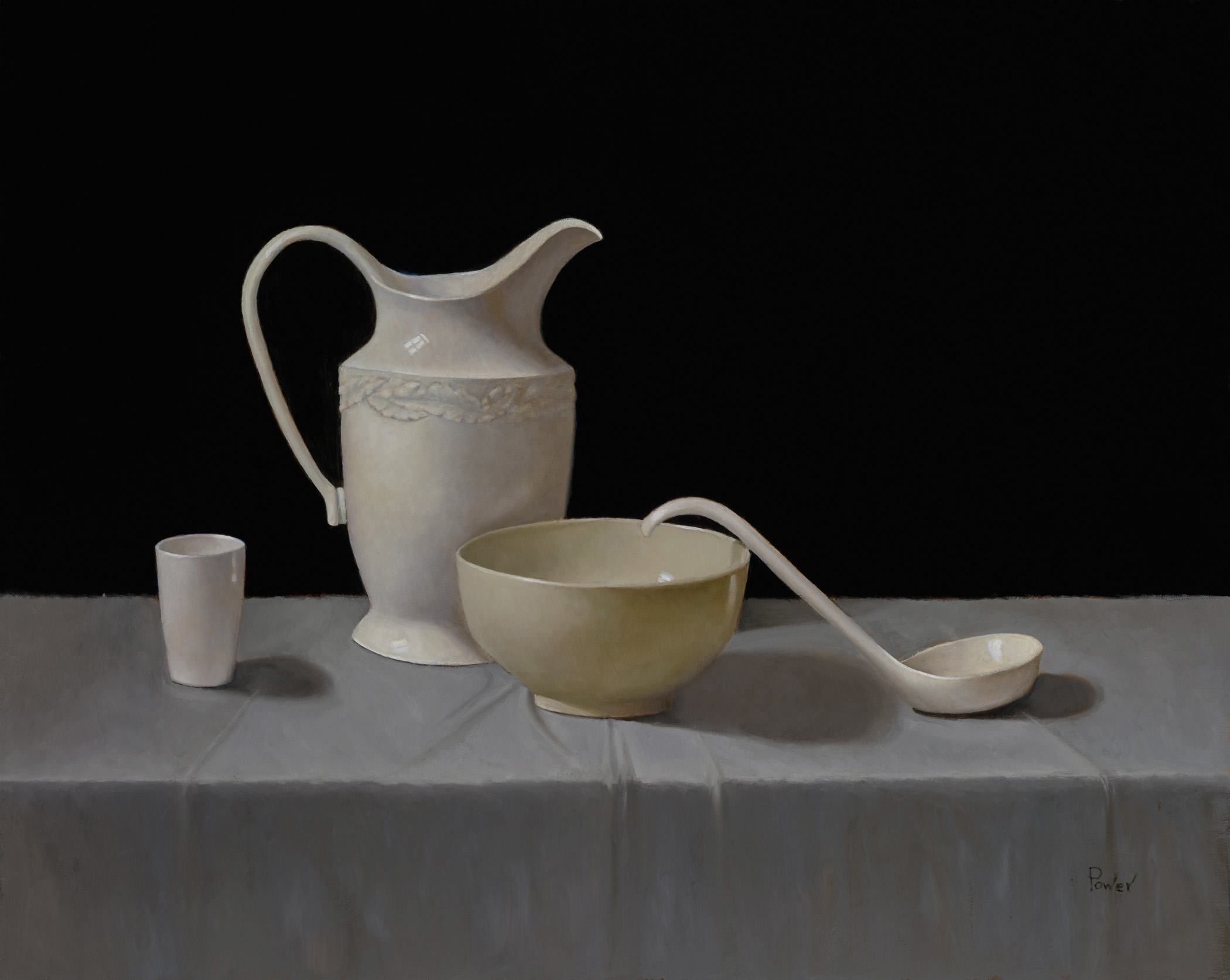
I have had very positive feedback on this painting, but it worries me a bit. It seems to lack nuance or mood, a bit too in your face… more like a poster. Sometimes I like it and sometimes I don’t. What am I missing? I would be grateful for your honest opinions.
Thanks,
Sandra
7 Likes
Thank you for sharing Sandra! I think that as we grow more and more intimate with an image during its creation we become habituated to the impact and aesthetic qualities (mood) that it may indeed hold for viewers. With that said, I would like to put together an image analysis for you though that might be even more helpful. Give me some time and I will put it together today for you. 
BTW—it’s a beautiful piece.
–Anthony
2 Likes
Wow! How generous of you to volunteer your time and knowledge. I’ll look forward to your comments.
Wish I had found this amazing site sooner…I am so grateful, thank you.
Sandra
1 Like
Good morning Sandra,
I could absolutely believe that you have had wonderful responses to this piece. It is truly lovely. Unfortunately, it is difficult for us to suss out what is the right “mood” for a piece as the concept/term is so nebulous. However, I do have some considerations for you that might help you better strategize to more effectively elicit certain aesthetic responses that we might define as “mood”: fluency, prediction and ecological valence (regarding color). I’ll explain:
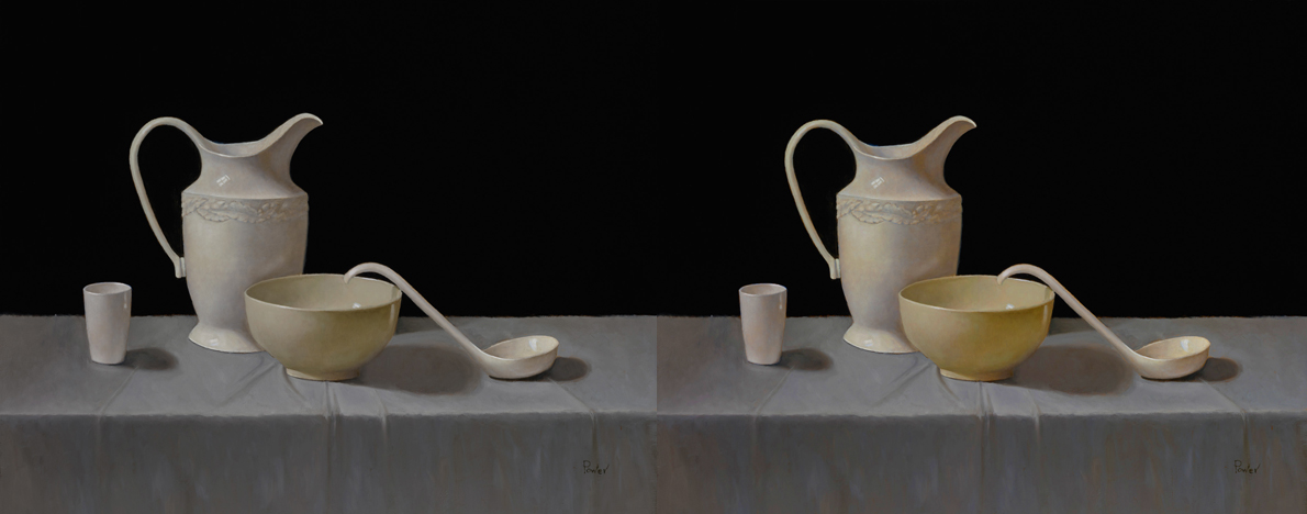
First, we need to understand that our visual perception system seeks out contrast(s). We look for disparity and change while holding little interest in homogeneous surfaces or gradual change (the latter tends to be far less information bearing.) Generally speaking, they way in which we deploy contrast(s) may significantly affect how easily as image is processed or even understood (this can be described as how “fluent” the image is.) While we may intuitively feel that this factor is more about communicative efficacy (rather than aesthetic quality), the level of ease in which the visual information can be effectively processed or understood does generate an aesthetic response—thus influencing what we might understand as “mood”. Let’s look at change in the general contrast of the piece as see how it alters the feel of it:

Next, we can consider prediction. The concept of prediction is one of the great governing factors in how we engage with an image. We invest great resources in attempting to predict what will happen from moment to moment thus alleviating some of the cognitive workload that we might require for successful behavior in an uncertain environment. This indeed carries over into our experience with imagery. When we engage with a frozen percept (like a photograph, painting or drawing) we instantly begin to consider what might happen in the moments that might follow the one we can observe. When there is enough visual information that we feel that we can predict that what may follow is of no danger to the status quo of the percept we tend to find the image more “comfortable.” However, if we alter factors to increase the potential for the unknown—it begins to raise tensions (and yes, this goes for everything from figure work to still life.) Let’s look at what happens when we alter the lighting to increase the impact of less-illuminated areas. Does it become more or less tense/dramatic?

The third consideration that may be of service is that of Ecological Valence Theory (EVT). This concept hypothesizes that our responses to color are born from the object-color associations that we create from real world experiences. For example, if we find a clear blue sky aesthetically pleasing—we may respond somewhat in kind to that color if it is employed in an image. Now this might not be useful when one is trying to predict individual tastes–but rather can be helpful when considering the responses from the species as a whole. For example, we may be attracted to bright colors as would be found in a fruitful, lush forest but easily off-put by the colors we might associate with a rotting carcass (sorry for the visual but it was necessary). As such, playing up or playing down certain colors may also affect the overall “mood” of a piece.
So hopefully these considerations might help you to better manifest the mood that you are trying to capture. Again, the piece is beautiful as it is so again, I understand the responses you have been getting for sure.
Happy Painting!
8 Likes
Anthony, you have given me so much to think about! I will read and reread and study the changes that you made with their resulting effects. Amazing how seemingly small adjustments in value and color can make a significant difference.
I love the theory of EVT and will consider the concept in future compositions. I feel a victim of my environment. I work from natural light under a north window. The greys of the north west skies satisfy me in some indefinable way and I find that response influences my color palette. Huh! Just realized that that is exactly what EVT is…my color associations are a result of my current experience. When I lived on the East coast my paintings were full of color.
Again, your generosity stuns me. You have given me some of your precious time and I am so grateful.
Sandra
3 Likes
It’s an absolute pleasure Sandra!!! Look forward to seeing more of your work. Happy Holidays!