2024 Online Alla Prima Challenges Resource PART I

2024 Online Alla Prima Challenges Resource PART I

Second Annual Online Alla Prima Challenges

20 live painting alla prima sessions over 20 weeks (plus an introductory orientation) beginning on: January 12

WHEN: Thursdays – 2 pm to 3 pm EST. starting January 18th, 2024

Welcome to the official Smartermarx thread for the 2024 Online Alla Prima Challenges. Sessions will be carried out each Thursday at 2 pm EST. Each session will last about 1 hour, which includes 30-45 minutes of painting time (depending on the challenge for that week) and 15-20 minutes of discussion about the goals of the exercise and some tips to make the effort more successful. After each session, participants will have one hour to share a photograph of their effort in a shared Dropbox folder that will serve as a private learning gallery for all participants. Links to the folder will be made available in an email like this one that precedes the session.

Prior to the first painting session, I will be hosting an “Orientation” session on January 18th. This will serve as an introduction to the challenges, a walkthrough of the primary goals, what is needed to participate, the role of the Dropbox gallery, and a general Q&A to ensure everyone is ready to go on January 25th!

TO REGISTER: Please complete and submit the appropriate email sign up form on Anthony Waichulis’ website on this page: Online Classes and Events | Art and Articles

If you are interested in learning about each challenge ahead of time, you can see the full schedule here: Alla Prima Challenges. Also, if you are interested, Smartermarx has additional info on the general strategies that I often use to approach the alla prima (specifically the SNAG concept – Survey, Notan, Anchors, and Gradations.) If you wish to join us, please sign up today! (You can unsubscribe from the list at any time.) Please forward any additional questions to my administrator, Anya Dribas, at aaaw.anyadrs@gmail.com.

JANUARY 18: ORIENTATION

Here you will find all of the information (appropriate links (including Dropbox folder links for image sharing), notes, reminders, etc.) for The 2024 Online Alla Prima Challenges.

NOTE: Please respect the work, rights, and privacy of participating artists. You may view the efforts in in the following Dropbox folders from the sessions for educational purposes, but you may not download or manipulate their work in any way. All files in the Drobox folders will be deleted 2-3 weeks following each session. In addition, please know that live sessions, including questions and contributions from participants, will not be recorded to respect each participant’s experience.

Certain files may be included for participant usage (provided by Anthony or Anya and may be downloaded.) Such files will be indicated during the relevant live session.

Key points from Jan 18th orientation session:

  • Please keep yourself muted during session unless you are part of an active conversation. Here’s 2 tips for quick muting/unmuting during zoom sessions:
  1. While muted, press and hold down SPACE when you want to talk. This unmutes you temporarily.
  2. Keyboard hotkeys for toggling mute:
  • • Mac: Command(⌘)+Shift+A
  • • Linux: Alt-A
  • • Windows: Alt-A
  • The primary goal with the sessions is illuminate the consequences of the fundamental components (concepts and actions) of your process by utilizing timed, narrow-focus challenges that can provide fast feedback and useful insights.
  • Sessions are not intended to be a demo series. This is a group activity that works best for both the group and the individuals when participants engage with the activity in concert. In addition, the series is not intended to instruct anyone to “paint like me,” but rather to analyze the fundamental components that make up YOUR process with short, controlled challenges.
  • While “I’d like to watch first then try it on my own–on my own time!”, may sound intuitively advantageous, in my experience, such a practice often leads to diminished returns. Again, the sessions are not designed to teach people to do something like I do it (although I am elated if any aspect of my process proves useful to you.) rather, this is about analyzing your own output, generated with adaptations of your own process, in a context that has been demonstrated to yield productive feedback.
  • If you are not sure exactly how to approach a specific aspect of the alla prima—don’t worry—just give it your best shot (using even a “best guess” if necessary.) We need to make mistakes or even an outright mess to find meaningful development. Avoiding experience will get you nowhere. Additionally, I find that it is often far more effective (in a learning context) to try and “modify,” add or delete a component of an existing process when the experience of the process and the relationship to the resulting product are fresh in your mind. Remember that experiences (especially what you might deem mistakes, errors, frustrations, etc.) will also cultivate the most useful questions for you that I hope we can answer together. (I’ve referred to this practice as “building an experience database.”
  • You should be ready to paint right when the session starts with you subject matter arranged and illuminated, your palette and brushes at the ready, and have the criteria for the session in mind.
  • When selecting, arranging, and lighting your subject matter, keep in mind the guiding principle in this context:

RECOGNITION MUST SURVIVE ABSTRACTION!

  • Regarding pre-mixing rules: What this means is that you are forbidden from mixing locals or other observable “color notes” perceived within or around your subject. Such mixing should be done “on the fly” (i.e., as part of your painting time.) This limitation pushes you to exercise your intuitive or heuristic -based understanding of color dynamics. Pre-mixing limitations can also push one to experiment in a more cavalier manner with buffer or step colors (or chromophages) (which are colors that are added to a particular painted passage or transition to appear closer to the perceived transitions within your subject (often generated by illumination or reflectance properties.) It is very important to acknowledge and remember that observed transitions with your subject do not often map to a simple mixture of the obvious categorical components that may define the poles or anchors of the transition. For example, a transition that may be observed to evolve from a fairly bright yellow to black will likely not be matched by simply mixing a black and yellow paint. More colors will need to be involved.

  • Additionally, the pre-mixing limitation may push you to explore means of hitting certain perceived color notes with an analog application dynamic, surface topography, etc. that may move beyond what we would expect with simple pigment mixing.

  • SWITCH COSTS: One can find incredible advantages in efficiency and effectiveness with minimizing “switch costs” during their process. Simply speaking, switch costs are the time, mental and physical costs incurred when switching between different tasks. For example, I highly recommend that that palette arrangement is made consistent to avoid “hunting for colors”, making sure you have enough paint out to avoid stopping to replenish the palette, and keeping all required brushes within arms reach so you don’t have to break from your work time to retrieve them, etc… These things can aggregate to seriously impact a 30-minute exercise putting you at a great disadvantage. (This is a great example of how a 30-minute alla prima challenge can illuminate something that may be plaguing your day-to-day painting practices.)

  • PROXIMITY: I urge everyone engaging in these exercises (or any observational representation for that matter) to consider the subject’s proximity to the representation target (canvas, panel, etc.) As we observe our subject, we attend to the things that we feel may best serve our end goal. However, as we turn from our observed subject to observe the target surface—the information garnered from the subject begins to fade from our iconic and short term visual memory and becomes subject to compensation or enhancement from our long terms memory which is incredibly imprecise. Iconic memory is the visual sensory memory register pertaining to the visual domain and a fast-decaying store of visual information. Iconic memory is described as a very brief (<1 second). Visual short term memory (VSTM) is a memory system that stores visual information for a few seconds so that it can be used in the service of ongoing cognitive tasks. Long-term memory (LTM) is the memory store that can hold informative knowledge indefinitely. However long-term memory is by far the most abstract and imprecise.

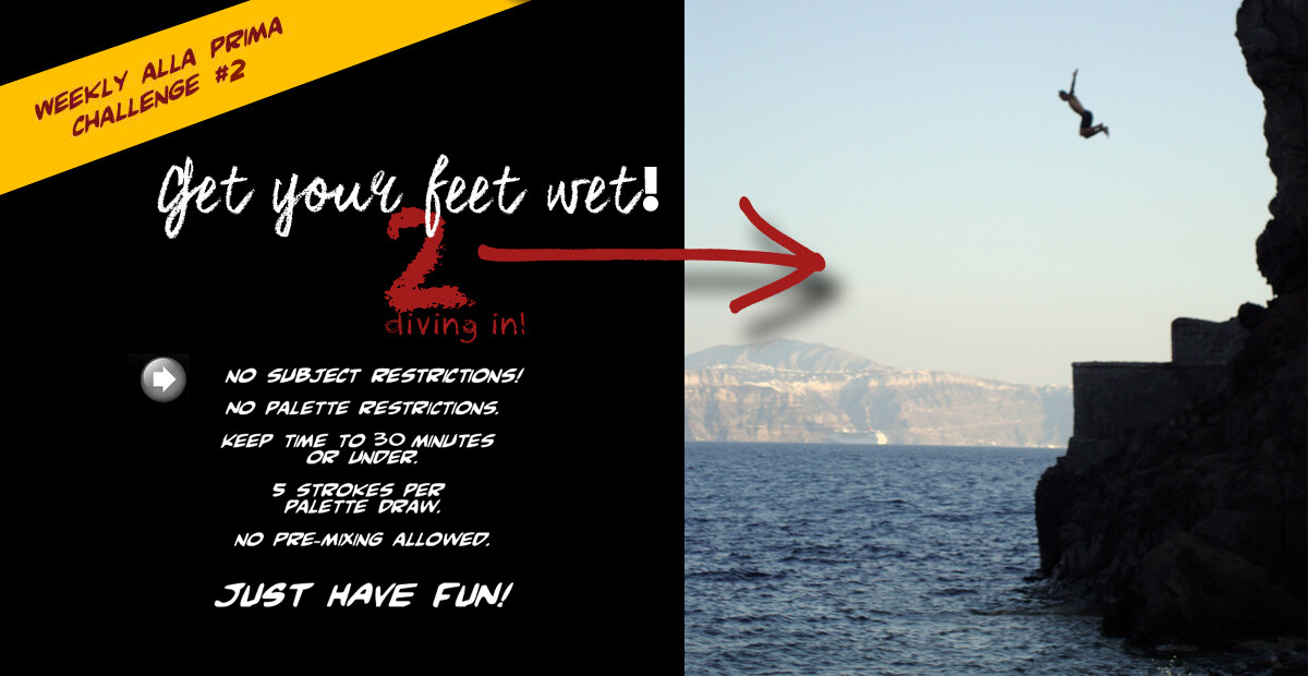
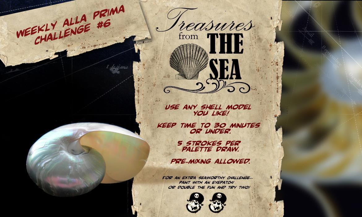
  • The palette draw rule means that after a certain number of brushstrokes you must pull more paint from the palette (reloading the brush) or you may void the brush altogether. This is done to ensure that you are not over-modeling the study relative to the challenge (i.e., unwarranted surface manipulation that leads to value/color contamination or excessive “blending” without drawing development or material application.) For example, a 5 stroke palette draw rule means that you can only apply five strokes before you must wipe and/or reload the brush—thus encouraging the artist to think more “economically” and deliberately about brushwork. Additionally, the stroke rule should not be seen as a “minimum” number of strokes you must make prior to making a change to the brush—but rather, a maximum. Lastly, large homogenous regions, scrubbing, and early line work are all exceptions to the stroke rules unless otherwise stated (as they do not usually carry an immediate overmodeling or contamination threat.

  • A reminder newsletter will be issued via email each Monday with the Zoom link for the following session, along with a description of the challenge so that you may acquire the subject needed as well as any other pertinent info.

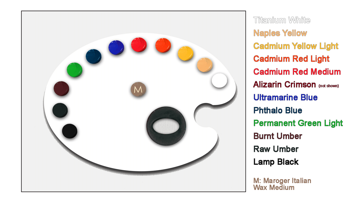
Anthony’s Palette is based on, or adapted from a traditional double-primary configuration:

NEXT SESSION: JANUARY 25th

image

ALLA PRIMA GALLERY FOLDER FOR CHALLNAGE #1:

1 Like

NEXT SESSION: FEBRUARY 1ST:

Challenge #2

Congratulations to everyone who survived the first challenge and is already looking forward to next Thursday. As with the last session, a reminder email will be issued on Monday with links to this thread as well as the Drobox gallery from Challenge #1.

IMPORTANT NOTICE: As it turns out, I’ve learned that many had issues with Dropbox. No worries, starting next week, you will have the option of uploading to Dropbox yourself or simply emailing your image to allaprimachallenges@gmail.com, and we will upload it for you. Again—I’d rather you focus your energy on painting instead of trying to cope with Dropbox!

Also, you may have noticed that I did not “close” access to the Dropbox (DB) after 2 hours, as previously stated. With all of the issues people were having in uploading to DB, I decided to simply leave the folder open. I think I may just leave it open from here on out. Don’t forget, though—in an effort to avoid needlessly taking up anyone’s storage space (if they are synced to save everything), I will be deleting the Challenge #1 Folder the day before Challenge #2 begins (Wednesday). A new folder link will appear below these notes this coming Wednesday. That will be the Dropbox gallery for Challenge #2. (Again, don’t forget that you can choose to simply email it in if you like to the aforementioned address.)

Ok, about this week’s challenge: Get your Feet Wet 2 Diving in!

The criteria for this week are identical to last week, with the implication that you can feel free to challenge yourself even more if you like. Many people ask me why the first two challenges are the same. This has to do with exploiting that “experience database” I mentioned in the orientation. From your first experience, I would bet that you identified a number of things you might like to do differently. The second challenge is basically identical to the first so that you may test out some of those changes without having new scenario criteria that may lessen your ability to assess the success or functionality of those changes.

ANALYZE AND STRATEGIZE:

To make the most of these exercises, it is important to try and spend some time studying your own work and the efforts of the others in the group to build a strategy for growing success. Here are a few topics to think about when studying the efforts of Challenge #1 and strategizing for Challenge #2.

1. Small changes. When you are analyzing your work and planning for the next session, I would recommend limiting the number of changes you might make to your approach/process. I find, in general, 2 or 3 changes to your approach are more than enough to bring about a significant difference. If you start to change too much at once, assessing the impact of any one factor can become more difficult. In addition, in my experience, when people start to get frustrated, they tend to “run home to Mama.” This means that they will likely default to whatever they have been comfortable doing in the past and toss out everything new. These exercises absolutely have stress built in. Don’t overtax yourself on top of it.

2. Right tools for the job. Consider how your tools served your goals here. Were you battling with the palette? The brushes? The lighting? Do you have a plan to address or alleviate such factors? The most common observation that people were messaging me about was, indeed, brush sizes. In the orientation, I offered up the heuristic, “Use the biggest brushes that you reasonably can.” Many found that the brushes they chose were far too small. Let’s look at a few reasons why a “too small” brush can be problematic here.

First, consider the level of resolution that you are abstracting to. Higher levels of abstraction mean less information and likely more “large” statements. Smaller brushes may give us an intuitive sense of greater control, but they actually can make your job far more difficult in this context. For example, let’s say you are laying in a relatively homogenous middle tone (with slight variation as light moves toward the shadow.) This might be communicated relatively simply with a few strokes done with a larger brush. However, the same task with a smaller brush can quickly introduce far more variations than what is desired. Additionally, the 5-stroke rules can put small brush users are a greater disadvantage as the same area covered in 5 strokes with your average size 6 bristle filbert might take 3 or 4 times that with a size 2.

Second, it is also important to acknowledge that smaller strokes push the artist to make smaller distinctions which can sometimes work against the effort to abstract. Believe it or not, I would argue that the size of the brush dictates, at least in part, the resolution of the observations being made. Simply speaking, put a small brush in your hand, and you will attend to small bits of information. Put a large brush in your hand, and you will attend to larger bits of information. So if you are engaged in significant abstraction, you are likely to find more success (generally speaking) in attending to larger, more global attributes than smaller (with exceptions, of course.) For better or worse—size matters here.

3. Lose that Notan; you’ll likely lose your form. Most representations begin with a simple separation of general light and dark. Many squint down at the subject, limiting incoming information to better observe this separation. A good example of a binary separation can be seen in the Japanese art of the “Notan.” Introduced to American art by Arthur Wesley Dow (1857 – 1922), among whose students was Georgia O’Keeffe, “notan” is a Japanese word for the interaction between dark and light. In 1899 Dow published a book, Composition: A Series of Exercises in Art Structure for the Use of Students and Teacher, that presented design as founded on three principles: line, color, and notan (notan meaning the massing of dark and light areas in a composition.)

Like the traditional Notan, the development stage that often follows the survey, outline, cartoon, or envelope involves a simplification of the subject by assigning different areas as either belonging to “light” or “shadow.” One tends to indicate shadows with a generally darker mass-in, while the exposed ground serves to indicate the light.

These two areas are then populated with additional values and colors that are intended to bring the representation into a closer kinship with the observed subject. However, this stage (following the notan-like separation) is where we can often betray our initial observed separation. Without going into to much detail about the “why,” I would just like to say that at any given time during the development of your subject—you should be able to squint and see the same general notan-like separation of light and dark that you may continue to observe in your subject. If you cannot squint and see it–you likely damaged the relationship by adding colors/values into the light that moved it closer to the dark or vice versa.

One common issue related to this is when the artist blocks in a general average or “local” color/value for the light or shadow and then adds or subtracts too much in one direction. To understand what I mean, imagine that you are painting an apple. You squint down and observe a general averaged “light” region that you indicate accordingly. Later, you want to add some indications of the surface texture by adding some strokes to indicate the light freckles on the apple that pepper the surface. However, when you start adding the light bits, you are changing the average of the initial averaged local, thus changing the relationship you indicated in the first place. If you start with an “average,” and you wish to increase resolution, you must do so by balancing light and dark additions to keep the average so it holds its relationship with other elements. If this sounds confusing, I can expand on the concept before we start painting on Thursday. Just let me know!

4. A Compositional Boundary Box. Artist Julie Beck asked me to share the reasons that we push artists to “square off” a composition for the challenges rather than just allowing unchecked vignetting. The main reason for this is to increase attention toward the importance of contextual information. I cannot stress enough that contextual information has an enormous impact on how we perceive colors, values, forms, and even entire subjects. Your subject and its surround go hand-in-hand. Unfortunately, for some, this context is sometimes viewed as little more than a decorative afterthought leaving the majority of the attention placed within the subject’s contours. By promoting a boundary box for a composition that includes subject and contextual surround, one is more likely to assign increased attention to the surround that may serve to significantly improve the way in which the subject is communicated.

Ok, I think that’s enough info for this week. Take some time to consider these points and decide if any are applicable moving forward. Again, don’t try to change too much with what you are doing so as to overwhelm your process and derail your overall productivity. In addition, don’t be afraid to ask about any of this during the next session. It’s important to me that these concepts are well understood.

NEXT SESSION: FEBRUARY 8,:

Challenge #3

Congratulations to everyone that survived the first two challenges and is already looking forward to the next one. This next session brings a great number of challenging restrictions, but for very good reasons (that I will address here.) Some have referred to this week as “The Dreaded Lemon” (not to be confused with the “Apple from Hell” from my Photoshop and Digital Imaging 101 course.) As with the last session, a reminder email will be issued on Monday with links to this thread as well as the Drobox gallery from Challenge #2.

IMPORTANT NOTICE: For those that would rather not upload to Dropbox themselves, remember that you can email your image to allaprimachallenges@gmail.com, and we will upload it for you. Again—I’d rather you focus your energy on painting instead of trying to cope with Dropbox!

Ok, let’s look at this week’s challenge: Triple Threat Thursday!

While the first two sessions were nearly identical in criteria so that you may better appreciate and evaluate the effectiveness of any procedural or conceptual changes that you wanted to implement, this week really shifts criteria gears–so be prepared for some potential “turbulence.” The name for this week’s challenge comes from the number of restrictors that will define the session (along with the fact that we often took part in the challenges on Thursdays here at the Academy.) Triple threat Thursday parameters: 1. The composition must include a relatively high-chroma yellow against a reasonably “black” background. (Lemons are most often used for this exercise as biomorphic subjects (like vegetables or fruit) do not often bring too much taxing geometry to be drawn.) 2. Standard restrictions remain: 30-minute time limit/No premixing. 3. DOWNWARD vertical strokes only with the 5-stroke palette draw rule in effect.

So you might be asking yourself, what is the benefit of an exercise with so much restrictive criteria? Well, the standard time limit, palette draw rule, and premixing rules have been explained in detail already. So allow me to address the yellow/black combination and directional stroke restriction:

  1. Yellow subject on with black surround. This restriction forces us to consider quite a bit–including some things that we might otherwise gloss over in our day-to-day work. First, we have to think about the behavior of the actual paints themselves. What does the black do to the yellow when intermixed and vice versa? Most people have had rather unfortunate experiences when trying to make yellow darker or weaving something yellow into something black. There’s a perceptual issue that compounds the “mixing” issues with a dark yellow that I won’t bore you with here other than to say that the identity of a dark yellow for us often becomes a categorical brown or green. Therefore, a mixture of the two can immediately yield a product with a hue that, in context, just might not seem to belong. Even a slight mix is often immediately noticeable and challenging to correct, and this can be very advantageous in an exercise when one is looking to build greater precision/control and aiming to grow application strategies. For example, in the context of this exercise, we will need to be extremely deliberate with where and how our paint is applied. The risk of contamination will be very high throughout most of the session. You will need to find advantage in the placement and pressure of your brushstrokes, the order in which colors are applied, and you’ll need to keep very good track of what brushes have been contaminated with what colors. (I’ve seen way to many people grab the wrong brush and start a cascade of color contamination that led right to “mud town.”

So what are some things that the partitioner can do to find success aside from carefully placed brushstrokes? Well, first, we would think about which pigments we will use and the order in which specific colors are laid down. We will need to carefully consider the mixing impact of each color, starting with the marks that will define the survey/cartoon. Ask yourself what color might be ideal to draw with so that it has either a minimal impact on subsequent paint or serves some mixing purpose. It is here that I like to rely on a chromophage (a color that “eats” an unwanted cast.) Since most yellow and black mixtures will elicit an appearance of something “greenish,” I’d likely start my drawing with something “reddish” so that it may contribute to canceling out the “greenish cast.”

Next, what actual colors should we use to communicate our yellows or blacks? For example, we often think of a general or canonical black as a single dark entity. However, a colloquial black can have a good number of compositional variations that may not be noticed in the combined result but may have a significant impact on mixing dynamics. Often, when I am painting, and I see an area that needs to be represented by the darkest dark (or something colloquially black), I think about what contextual paints are nearby and how this “black” will need to interact to decide what components my black should hold. I can use any number of black paints to produce very different results. Look at this illustration from Aaron Westerberg’s site demonstrating the differences between Ivory Black (Bone Black, PBk9), Lamp Black ( Carbon Black, PBk6), Mars Black (PBk11), Payne’s grey, and Perylene Black (PBk31).

For more on this illustrations please visit Aaron’s site here:

www.aaronwesterberg.com

Oil Painting Blacks

Do you think that each of these will impact your yellow paints of choice in the same way? The answer is a resounding no–not at all. In addition, there are many more “black” paints, along with many mixtures that can be described as “chromatic black.” You can learn more about mixing your own chromatic black here: Chromatic Black - Gamblin Artists Colors

So, forcing a composition with these two colors in this context provides us with the opportunity to look closer at the composition of our colors, how they might interact with other paints, and strategize about the manner and order of application.

  1. Downward strokes Only. This restriction does a great deal to compound the focus of the yellow/black restriction. Limiting one to only downward brushstrokes forces even the most experienced painters to focus on some of the most basic attributes of a single brushstroke—and that’s really the name of the game here. (Some have asked why there isn’t a horizontal strokes-only challenge, and the reason is that strokes that lie perpendicular to a semi-raking light source (like what is often found with an easel) lead to little more than overwhelming glare.)

In addition, many artists often attempt to enhance volume or form communication by deploying brushstrokes that “follow” a form. In other words, their strokes might be configured similarly to a wireframe scaffolding for the form or volume they are attempting to communicate. The downward brushstroke restriction stops that, pushing the artists to increase focus on using deliberate color and value-thus, again compounding the aspects of the yellow/black challenge listed above.

Ok, I think that’s enough info for this week. As before, don’t be afraid to ask about any of this during the next session. It’s important to me that these concepts are all well understood.

For those posting their efforts to social media—if you want to see the efforts and social media posts related to this series consolidated please use the following hashtag: #allaprimapocalypse

NEXT SESSION: FEBRUARY 15:

Challenge #4 Week 5

Congratulations to all on the successful completion of yet another challenge. I hope you are all looking forward to next Thursday, as with it comes the freedom to use any stroke directions you want. LOL! Don’t get too relaxed, though. This upcoming challenge does bring some interesting aspects to consider.

REMINDER: For those that would rather not upload to Dropbox themselves, remember that you can email your image to allaprimachallenges@gmail.com, and we will upload it for you. Again—I’d rather you focus your energy on painting instead of trying to cope with Dropbox!

Before we delve into the specifics regarding the upcoming challenge, I want to take a quick moment to reiterate something that I mentioned during the last session regarding the nature of these exercises. While it is true (and useful) that we all view success for each one of these challenges as a product that “looks good,” remember that painting a pretty picture is not the end goal with these exercises. They are about exploration, analysis, experimentation, and experience. They offer a very controlled arena in which we can examine much about our basic assumptions, conceptualizations, and procedural components. While we strive to make deliberate, economical marks chasing abstraction against the clock–we can find GREAT success in what we learn, what we think to question, and what new possibilities open up to us from the experience. Keep this in mind when evaluating your efforts. Each one of these challenges constitutes a metaphorical “spin class” for painters: We exercise hard (cognitively and physically) and build the resources and skills that we come to rely on every time we approach the easel.

Ok, let’s look at this week’s challenge: Flower Power!

After a grueling week that held a frustrating limitation or two—we are given back the freedom to choose subjects of any color and engage in any stroke directions we like. WHEW! AT the very least, the experience from last week’s stroke limitation should give you a new appreciation for some of the brushwork that you may often take for granted. Moving forward, I recommend that you try to think about your brushwork with as much focus as you did when you were limited to the downward vertical.

Just a quick note on challenge order: As a curriculum designer, I invest a good amount of time in the sequencing of any serial activity. I try to ensure that the order and context in which things are done are aimed at providing the richest experiences as well as the greatest chances for meaningful insight and skill development.

So why is the floral subject next? Well, thus far (and with my recommendation, of course), many have stuck to relatively simple biomorphic subjects. And again, by simple biomorphic subjects, I mean simple living forms found in nature (like vegetables, fruits, etc.) With such forms, we have a good amount of wiggle room with our drawing so as not to get mired in difficult or time-consuming geometries or other complexities at this time–allowing practitioners to focus more on other fundamental aspects of the exercise. However, flowers, while still technically biomorphic, do start to usher in slightly more complicated forms, color relationships, and even a few geometries that can call for increased precision in drawing and paint application.

So get ready! Grab a flower (or two) that you feel will be an ideal subject for Flower Power! Oh, and as before, don’t be afraid to ask about any of this during the next session. It’s always important to me that the concepts I share are all well understood.

NEXT SESSION: FEBRUARY 22:

Challenge #5 Week 6

Congratulations to all on the successful completion of yet another challenge. I hope you are all looking forward to next Thursday, as it comes with PRE-MIXING!!!. LOL! Don’t get too relaxed, though. As you know, these challenges are designed to be just that…a challenge!

(As with the last session, a reminder email will be issued on Monday with links to this thread and the Dropbox gallery from Challenge #4.)

REMINDER: For those that would rather not upload to Dropbox themselves, remember that you can email your image to allaprimachallenges@gmail.com, and we will upload it for you. Again—I’d rather you focus your energy on painting instead of trying to cope with Dropbox!

Before we delve into the specifics regarding the upcoming challenge, I want to take a quick moment to share some thoughts on the exercises for those that are coming at these sessions from a “tight” painting background:

This week, we will already be 25% of the way through the Online Alla Prima challenges series. Yep—we will hit challenge 5 of 20 this Thursday. As such, I thought I’d share a little bit about why this series of challenges can be incredibly useful for painters—even if they don’t “regularly paint this way.”
Many of you have likely come across the idea of “stepping back to see the big picture.” This phrase is often used to describe the practice of changing one’s orientation to a subject, thus altering the perspective so as to appreciate broader aspects. This change in perspective moves our focus from the “part” to the “whole,” compressing the “whole” down into the visual space that previously held the “part.” From this new perspective, we can see issues that may have been very difficult to detect in close proximity.

(It’s important to note that this stepping back, or change in perspective, doesn’t mean that you can see your efforts any “better,” but rather that the perspective can offer access to new or different information that may provide great advantage in the pursuits of your goals.)

Overall, this “stepping back” is a great metaphor for a major aspect of our Alla Prima challenges. When we are engaged in our normal processes (which may stretch over days, weeks, or even months), it may be difficult to appreciate all of the ways in which some concepts or actions may be impacting our overall efforts.

By compressing your process down into a 30-minute exercise, soup to nuts, you can gain a new perspective on, and thus a new appreciation for, many aspects of your own conceptual framework and procedural components. This amplified, almost caricatured, view of your concepts and actions in this context can offer invaluable insights that may not be readily available from your “normal” perspective.

Ok, let’s look at this week’s challenge: Decadent Desserts!!!

Challenge 5 follows in the footsteps of Challenge 4 as it lifts yet another restriction for those who love their pre-mixing. That’s right; you can pre-mix as many colors as you like prior to the painting session. You will notice that restrictions get lifted and return from time to time so that you may better appreciate how certain factors may be contributing to your outcomes. (Before you get too excited, though—remember that the 5-stroke tule and the time limit will still be in effect!)

So get ready! Grab a dessert (or ten) that you feel will be an ideal subject for Decadent Desserts! Oh, and as before, don’t be afraid to toss out any questions during the session. It’s always important to me that the concepts we are exploring are all well understood.

NEXT SESSION: FEBRUARY 23:

Congratulations to all on the successful completion of yet another challenge. And to be clear—Premixing is allowed again this week!!!

For this week, Challenge 6, we turn to the sea for our inspiration!

REMINDER: For those that would rather not upload to Dropbox themselves, remember that you can email your image to allaprimachallenges@gmail.com, and we will upload it for you. Again—I’d rather you focus your energy on painting instead of trying to cope with Dropbox!

Ok, let’s look at this week’s challenge: Treasures from the Sea!!!

While challenge 6 allows up to keep our premixing, it potentially tosses a new level of complexity into the mix with the shell subject (or other appropriate bit of nature from the ocean.) Once again, we will be facing a 30-minute time limit and the 5-stroke palette rule remains in effect.

BTW—here’s a bunch of cool facts about seashells for inspiration:

  • Shells are the protective outer layer–aka external skeletons–of mollusks.
  • There’s an entire beach of shells in Western Australia that’s over 74 miles long and more than 32 feet deep…in shells! It’s called, appropriately, Shell Beach.
  • Shells that open to the left are very rare. In fact, many estimates claim that 9 out 10 shells open to the right.
  • People have been collecting shells since way, way back in the day. A shell collection was even found preserved at Pompeii.
  • It’s unknown how many seashell species exist, but there are as many as 200,000 different species of mollusks.
  • Shells were once used as currency.
  • The perfect holes you sometimes see in shells were most likely made by predators who tried to drill their way in.
  • Shells range in size, color, shape and texture, and often for good reason–to ward off predators.
  • Pearls are a pretty miraculous feat. According to The Telegraph, “A finished pearl takes 15 to 20 years: that’s why a ton of oyster might yield as few as three pearls, and the chances of them being perfect spheres are, literally, one in a million.” Well done, pearls!

So with this inspiration, get ready! Grab a treasure from the sea and start prepping those colors! Oh, and as before, don’t be afraid to toss out any questions during the session. It’s always important to me that the concepts we are exploring are all well understood.

NEXT SESSION: MARCH 7:

Congratulations to all on the successful completion of yet another challenge. I know that some of you may have loved the last two weeks of hedonistic premixing—but this week, we will finally lose it (and lose it with a vengeance we will!) In fact, this week, our palette dwindles down to just four paints. Eeeeek!

For this week, Challenge 7, we turn to an old and quite common conceptual hierarchy of color to explore how the restriction will impact our general “navigation” of color as well as our overall painting strategy.

Challenge 7: Primary Prowess with Secondary Subjects, tasks us with creating a representation of three “traditionally secondary” subjects (subjects with a colloquial green, orange, and purple local) with only four paints on our palette—namely the “traditional primaries” (a categorical red yellow, and blue (plus black and white!)).

I use the term “traditional” above to refer to the three colors that rose to prominence during the 17th century as the foundational colors from which all others can arise (red, yellow, and blue.) “Modern color theory” addresses the issues with this simple concept. And–If you want to dive into the rabbit hole of how the concept of traditional “primary colors” are problematic, you can read David Briggs’ Dimensions of Color site below as well as the robust Handprint site created by Bruce MacEvoy.

LINKS:

Dimensions of Color: The Dimensions of Colour, modern colour theory

Handprint: handprint : colormaking attributes

In reading these articles (and others like them) that aim to tackle the problems with using traditional primaries in color mixing strategies—I would argue that the most important point is often overlooked, if not outright ignored. And that point is this:

“Primary colors are not a structural identity—they are a functional one.”

What this means is that the label “primary” describes how a specific colorant is used in a mixing strategy—it is not describing some context-independent aspect of the physical properties of a colorant (a position that some adopt in their arguments.) Therefore, you can dub any colors as “primary” if they serve to function as an effective foundation for one’s color mixing.

For example, let’s say you created a successful representation using one yellow and one green paint as well as the colors generated from their mixing. Yellow and green can be said to be your primaries here. It does not mean that these primaries could mix every possible perceived color in color space. BUT, they did serve as the foundational colors for all of the colors that you used in your work.

So, we are going to use the traditional primaries (giving us a decent gamut) but you must decide WHICH red, yellow, and blue is going to give you the greatest advantage in your efforts. Again, we will be adding white to the mix—but you will be mixing your own darks and, if needed, a chromatic black. Keep this in mind when filling your categorical color roles. Think of the hues, chromas and values that you will be able to deploy.

Can’t wait!

DROPBOX LINK:

NEXT SESSION: MARCH 14:

Congratulations to all on the successful completion of yet another challenge. While I’m sure that some are still reeling from the severe color restriction last week—you can rest easy as this week brings back your beloved “pre-mixing.” That’s right, people, Operation Plein Air has two parts—one week WITH premixing and one WITHOUT! So enjoy it while you can! :heart:

For this week, Challenge 8, we look to one of the most popular activities for representational painters: The Plein Air painting. Although artists have long painted out of doors to create preparatory landscape sketches or studies, before the nineteenth century finished pictures would not have been made in this way. The plein air approach was pioneered by John Constable in Britain c.1813, but from about 1860 it became fundamental to Impressionism. The popularity of painting en plein air increased in the 1870s with the introduction of paints in tubes (resembling modern toothpaste tubes). Previously, painters made their own paints by grinding and mixing dry pigment powders with linseed oil, a much more laborious and messy process.

If interested, you can learn much more about the history of En Plein Air painting here:

In the early 19th century, painting outside, or en Plein air, became increasingly popular amongst Impressionist painters. This painting practice allowed Impress

Est. reading time: 17 minutes

As with our previous challenges, we have some parameters to address: 1. The subject must be a landscape. If possible, try and get yourself outside and engage in the traditional En Plein Air approach. However, if this is not possible, you may paint from a photograph or your computer screen. 2. 30-minute time limit. 3. Pre-mixing is allowed!!! 4. 5-stroke palette draw rule in effect.

If you haven’t gone out on location to paint before, there are some wonderful resources online to make sure you are properly prepared for the exercise. Here’s a link to Barry John Raybould’s Virtual Art Academy’s Tips for the activity. He has some great checklists included to make sure you have everything you need!

Plein Air Painting Techniques: 16 Tips For Success

Here is a guide to my basic plein air painting technique: the six-step alla prima process. Plus 16 tips to make your plein air painting experience more successful, and tips on plein air painting equipment.

Here’s 16 Plein Air Painting Techniques and Tips from from his Virtual Art Academy:

Travel light. The most important thing is to travel light so that you can more easily get to places and be comfortable. Remove everything you don’t really need from your pack and keep only the essentials.
Simplify your palette. A really basic plein air painting technique when you are first starting out is to use a smaller number of colors. A limited palette or warm/cool primary palette is a good choice. See my palette color advisor tool.

Don’t carry paint tubes. The only paint tube I bring with me on painting trips is white. I pre-prepare my palette with generous amounts of paint before I leave my studio, loading up my palette with enough paint for the day. This has two benefits. It saves a tremendous amount of weight from carrying heavy pigments that you will never use. And secondly, it lets you concentrate more on your painting, rather than having to keep stopping to squeeze out tubes of paint.

Use a wet panel carrier or drying box to carry your wet panels. You can buy or make simple systems for carrying wet panels so your paintings do not get damaged. There are two basic types: the frame type with a rabbet. And the slotted box designs. Some Pochade Boxes can also have places to store paintings.

Wear neutral colors. Sunlight reflecting off your clothes onto your canvas can affect your perception of color. For this reason it is best to wear neutral colored clothing.

Wear neutral colored sunglasses while painting. Many people say do not wear sunglasses at all while painting. This is because it can affect your color perception. However, prolonged exposure to excessive sunlight UV radiation can damage your eyes over the long term. So you may want to take that into account. However the sunglasses will affect both your view of the scene, and your perception of the colors on your palette to the same degree. So they effects will cancel out. However tinted sunglasses might take out one hue from the spectrum so you can’t see that hue. It is better therefore, if you are wearing sunglasses to use neutral colored lenses.

Wear a hat. This protects your eyes, and stops glare that prevents you seeing colors accurately.
Don’t hold your palette in your hands. It is best to use a palette support such as an easel butler or leder easel to support your palette. This keep your hands free to change brushes or use a rag.
Use fresh colors. Working with partly dried pigment makes painting more difficult in a situation in which speed is important because of the changing light . Color that isn’t fresh also does not adhere very well to the canvas. I use a special technique for preventing my oil paints from drying out.

Use notan sketches. Do a few notan sketches to ensure your composition is going to work in advance before you waste a few hours on a composition that can never work. You will often find that a scene looks good when you first see it, but when you start to paint it, you run into problems. Notan sketches are great for selecting the best scene, or part of a scene that will give you the best composition.

Use an imprimatura on your canvas. To keep your paintings fresh here is a useful plein air painting technique: put a brushstroke down and leave it. If you don’t have an imprimatura on your canvas you will have small spots of distracting white canvas showing between your brushstrokes. An imprimatura also helps you judge values outdoors more easily.

Keep your medium clean. Working with dirty medium can contaminate your colors.
Prepare for wind by using a sturdy plein air easel or pochade box. If you do not have a sturdy plein air easel or pochade box/tripod combination, the whole setup can blow over in the wind.

Use lightweight painting supports. I use gatorboard panels from New Traditions Art Panels for paintings measuring from 8×10 inches to 24×30 inches. I use Claessens oil-primed linen, style 12 or 13, for smaller works and style 15 for larger works. Gatorboard does not warp like wood panels in humid environments.

Use an umbrella. Use a good umbrella to shade your artwork and your palette, and preferably you too. I recommend Artwork Essentials for a good plein air umbrella to attach to your plein air easel or tripod. However if you are working near a car, it is best to use a much larger umbrella that mounts on a device you fix to the ground. I use an earthworm umbrella stand. This has a spiral screw that you screw into the earth. If you don’t have an umbrella your perception of temperature is thrown off and the color often does not look good when you bring your painting home. Also you tend to paint far too dark if you are working in direct sun.

Plan the changes in light. The direction from which the light is coming from affects the shape of cast shadows in your composition, and which planes are in the shade and which are in the light. So as the sun moves the shapes you designed as part of your composition could completely change and ruin your initial design concept. Also even if you are comfortably in the shade now, you could end up being roasted in the open sun in an hour or so and find yourself too uncomfortable to paint. So before you start to paint, a good plein air painting technique is to see which direction the sun is moving, and estimate how long you have before your composition changes drastically. You can then decide to either move or paint the part that will change first. Once you have committed to a certain light condition, if the light changes, either stick to your original idea, or stop for today and come back tomorrow to the same place and at the same time.

Additionally, here’s a link to some of Mr. Raybould’s work which includes some wonderfully simplified landscape works.:

NEXT SESSION: MARCH 21:

image

Congratulations to all on the successful completion of yet another challenge. I know this past week was definitely a rough one, and this coming week’s premixing restriction will make it a little bit rougher. Just like our first two sessions, Challenges #8 & #9 are nearly identical (with the addition of a premixing restriction in the latter.) Hopefully, you can take what you gleaned from last week’s Landscape effort and apply it to this week’s session.

So to be clear: We will be tackling the Plein Air Landscape again for this week with only one parameter changing: Premixing!

Parameters for Operation Plein Air II: 1. The subject must be a landscape. If possible, try and get yourself outside and engage in the traditional En Plein Air approach. However, if this is not possible, you may paint from a photograph or your computer screen. 2. 30-minute time limit. 3. Premixing is NOT allowed!!! 4. 5-stroke palette draw rule in effect.

For those venturing outdoors for some authentic Plein Air work, keep in mind that last week’s notes have many tips that you might find useful!

NEXT SESSION: MARCH 28.

Congratulations to all on the successful completion of yet another challenge. Also—a BIG congratulations to everyone that has made it this far as we officially meet the full series “halfway point” this Thursday! WooHoo!!! Challenge #10 (Skull Candy) brings with it not only some cool subject matter but also a 15-minute time limit bonus to celebrate reaching Challenge #10. That’s right-we get a 45-minute time limit this week!!! So as always, choose your subject carefully with the following parameters in mind:

Parameters for Challenge #10, Skull Candy: 1. The subject must be bone. Even though the Challenge is titled "Skull Candy,’ you do not have to use a skull, as any bone subject will suffice. In addition, if you do not have access to something made of bone for your reference, just as with Operation Plein Air I & II, you may paint from a photograph or your computer screen. 2. 45-minute time limit!!! 3. Premixing is NOT allowed! 4. 5-stroke palette draw rule in effect.

Skulls have been used as art and decoration for centuries. As far back as 7200 B.C., evidence suggests that skulls were displayed in homes in the Middle East, yet since that time period predates writing, there is no way of knowing the symbolism behind the displays. As recently as 300 A.D., skulls of defeated warriors were displayed as trophies by Aztecs. At about the same time, Mexicans began using skulls as symbols to celebrate the Day of the Dead. By the 1300s, Europeans were decorating chalices and churches with skulls and bones. However, it wasn’t until the 1920s that American artists began experimenting with skulls in art. There are many sites and articles online to learn more about the use of skulls in visual art. Here are a few resources:

Looking forward to seeing you all this week!

I am unable to access Part II in Smartermarx

1 Like

Hi Barbara!

There isn’t a Part II published for 2024 yet. It will be published next week starting with Challenge 11.

PLEASE NOTE: The remainder of the 2024 Alla Prima Challenge Notes will be found on the 2024 Online Alla Prima Challenges Part II thread.