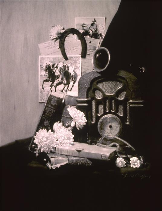
One of the amazing talents of the AniArt Academies is to consistently pump out students capable of producing such a high quality of charcoal drawing that they perennially outclass the other drawings on show in the Art Renewal Center Salons, despite the fact that these other drawings themselves are already of a very high standard. This work from Helen Crispino epitomises this excellence.
So the question is, why are they so good and why are they so realistic. Here’s some reasons I could think of:
-
The reference scene/photo is always under what I would call chiaroscuro lighting, and this helps hugely with realism, depth and general wow factor.
-
Darkness in and of itself, seems to me to be a huge helping factor in creating the illusion of ‘realism’ and all these drawings are very dark.
-
Perhaps this is the same point as 2, but when a scene is dark, you can start to merge regions of the artwork, borders become less visible and this, I think, adds to the realism.
Other than these two/three aspects, related to the composition itself, I presume everything else is a matter of technical excellence acquired by studious repetition of the Language of Drawing exercises.
However perhaps there is a further point which is related to the fact that the use of charcoal and white pastel leads to a greater range of contrast between lights and darks.
This brings me onto the next main question of this post which is, can the same standard of work be achieved only using pencil, along with maybe carbon and black coloured pencil?
The reason this question is important to me is that I find charcoal an incredibly difficult medium to work with, whereas I love pencil. I feel skilled as a pencil artist and therefore wish to work in dry media. However, if I want to attain works comparable to those put out by the AniArt academy, this would require putting in some serious hours with charcoal. So I don’t know whether to stick or twist.
If I decide not to bother with charcoal there are some alternatives to it that can provide you with some nice blacks. These are:
Carbon Conte pencils: I find Carbon to be generally a lot more workable than charcoal whilst still possessing that rich, glowing quality. Points can be difficult though.
Staedler 8B: This is a coloured pencil. It’s very easy to use, though you can never quite get a sharp point. But it lacks that rich glow that charcoal has.
Kimberley’s 9XXB: This is a form of graphite, I think, but it does not produce a sheen like graphite does. Lacks the rich allure of charcoal though.
**
The above possibilities then are a way of mimicking the black of charcoal. The other issue we might consider is that of imitating the white pastel.
This is where it’s hard to make an analogy with the language of Drawing techniques that produce the AniArt charcoal drawings. This is where I think there is a definite lack of kinship between Charcoal/Pastel Drawing and Graphite Drawing.
In pure pencil art the whitest white is prescribed by the whiteness of the paper on which you work. There are issues with this. First, it can be difficult to keep it clean.
Second of all, this white fails to have the glowing properties of white pastel.
But maybe the most important issue is the blending issue. Because charcoal/pastel is a fluid medium, you can take the black charcoal and the white pastel and blend them to create anything in between. The neutral zero tone, the colour of the paper, is in the middle.
With graphite there seems to be two jumps. A jump between the darkest graphite grey and the black produced by one of the three black pencils listed above; and a jump between the lightest graphite tone and the white of the paper.
The transition from pure whiteness to low tone grey or indeed the transition from dark black to white can be difficult to handle and lead to discontinuities that shouldn’t be there.
**
I always think that a pencil drawing, without employing very black tones in certain places, lacks zip and pop and wow factor. Then again, look at these drawings from Paul Cadden.
They are pure graphite (more or less I think??). There is a part of me that wonders if the tone just needs to be blackened up in certain areas. But by and large I feel that they are incredible artworks and that so much can be achieved in graphite alone.
EDIT: I think it’s become clear to me now that graphite and charcoal are simply two different mediums. And that it’s folly to think that the bright glowing properties apparent in charcoal and pastel artworks can be achieved also in pencil.
Nevertheless, pencil drawings can still be highly attractive in their own right.
Incidentally here is Anthony’s article on the difference between the two mediums and why the AniArt Academy chooses to work with charcoal instead of graphite: http://anthonywaichulis.com/charcoalpastel-vs-graphite-as-a-precursor-to-oil-painting/
