So I started painting phase 2 scales using french ultramarine. I stopped because I thought I was using the wrong color only to find out it was exactly the right color. It seemed very dark and blotchy so I switched to the next color in phase 2 which was cadmium yellow light. I painted 2 scales and again I’m thinking something was wrong because it came out slightly green. Since when does black and yellow make green? Very interesting!

1 Like
I recall this yellow + black = green phenomena too.
Forgive me if I’m wrong, but from what I remember from the LOP series there was an oft repeated statement that for certain colours you might need to ‘augment a difficult transition’ using another colour (can’t recall which one).
Personally I quite liked the green colour produced so didn’t let it concern me, only noting the possible remedy for later use.
1 Like
It’s interesting to think that we don’t “have” a dark yellow. Our biology is laid out in such a way that dark yellow is often perceived as green, red, or brown. Even trying to imagine a dark yellow is extremely difficult for many. You see, the experience of yellow is what happens when BOTH the middle AND long cones are highly excited–near their peak sensitivity without with little-to-no short wavelength cone activity. This is the biggest collective excitement that your cones ever have, aside from seeing pure white. Thus, as we move away from this “bright” peak–yellow seems to lose it’s identity. For painters, mixing a yellow pigment with black will often produce something quite greenish (with results/severity depending on the pigments of course.)
It is here in the yellow pressure scales that I sometimes introduce the idea of a buffer color. A buffer color is an additional color, or color mixture, added to a transition (often at a specific region) to contend with an unwanted color arising from the original transition. Here’s a rather subtle example.
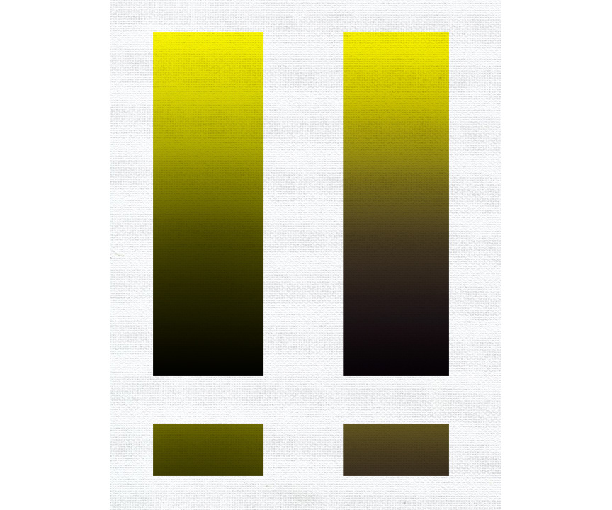
The scale on the left is straight yellow to black. You can notice the green cast emerging around the center of the transition. The scale on the right has a warm reddish buffer color added to attenuate the green. You can see samples from the mid-sections below.
You don’t have to address the green here in the scales—but it is a good arena to practice contending with it before variables compound later.
3 Likes
Thanks Anthony, very interesting! I was digging around the internet and found some fascinating info on color, cones, etc
I got drawn into an article related to the average number of colors we can see. 2-3% but only women have “super vision”! Here’s a little blip from it…THATS CRAZY!!
Its an interesting article and a quick read down below in the post gazette
The accepted number of hues an average human can differentiate between is one million. Based on the same math, a functioning tetrachromats with ‘super color vision’ could see 100 million colors. - post-gazette.com
1 Like
Black and yellow often does make green!
We all have some mental model of how paints mix together. Usually we start out thinking that paints mix together in logical ways. If we translated this to some kind of spatial metaphor, you could say we tend to imagine that paints mix together in something like straight lines. For example, I started out assuming that white just made colors lighter, or moved them “straight up” in value without affecting any other characteristics of the color. However, paints actually mix together with some surprising shifts, although they’re not completely unpredictable. In the spatial metaphor, you could say that colors tend to mix together in curves. There’s some general direction to the curve that’s predictable, but often it will lean this or that, which you wouldn’t guess without some experience.
Check out these diagrams from David Briggs’s excellent Dimensions of Colour site. They show the mixing paths of a pigment mixed with several other pigments mapped through a mathematical color space based on human perception:


(from http://www.huevaluechroma.com/061.php)
You can see that nearly every line curves to some degree. Further, many of them curve in different ways. (David Briggs calls the pattern made by all the paths an “inverted octopus”  ). Because nearly every line curves and the exact shapes of the curves vary so much, it’s fair to expect that most colors mixed with another will have some kind of slightly illogical hue or chroma shift. This includes mixing a color with black or white. The exact curve depends on the pigments involved and a few other factors like transparency, but I’ve found that Ivory Black tends to shift things slightly towards blue-purple. This is what turns yellow paints towards green when mixed with black (although I do think Anthony’s point about how yellow is processed by the visual system is also at play). It’s also what makes Ivory Black mixed with white turn slightly blue-purple instead of perfectly neutral. If you ever look at the pigments on a tube of a truly neutral gray paint, there will be some sort of brown and/or yellow along with black and white.
With experience, you can learn which pigments tend to do what, and how to compensate. In a lot of ways, that’s enough. But I think it’s also valuable to have a slightly more sophisticated mental model. For me, a really useful one is to conceptualize paint mixtures as moving in curves through the 3D color space of hue, value, and chroma. I don’t find I need to be super accurate about it, but it helps explain what’s going on and what to do about it. I’m sure there are other conceptualizations that also work.
4 Likes
This has opened a new door in art for me. I never NEVER thought I would have any problems or concerns with colors but now with what’s been said color is so much more than mixing “this” to get “that”. A Decade ago I read a book from Jeannie Dobie "Making Color Sing, great book when used with watercolor, also with 15 years of mixing paint for my faux finishing business I feel like color is all new too me once again haha. Thanks for the input! I look into all that much more deeply
1 Like
Great post Tim! Very helpful here—. 
2 Likes

Getting better Dan! 
1 Like
Well thank you very much! After this sheet I’m “paintin da blues”.
1 Like

Looking WAAAAY better Dan!
1 Like
Gradation block #6 completed and the 2nd attempt hit it “right on”! I’m feeling a tad bit more comfortable now that I have a few under my belt. Onwards and upward!!

1 Like
Nice!!! Looks great Dan!
I started this last night and stopped because of a lack of confidence in finishing this gradation. I feel like I had a good start at one point but then everything fell apart, contamination galore! Is this something that I should go back to and clean up? Is it salvageable? Thanks!!

2 Likes
Yes–it is definitely salvageable Dan. I often tell my students here that unless it’s actually on fire–you can probably fix it. LOL! Moving forward, I would ask that you try everything to “fix” an exercise before starting anew. Such scenarios are wonderful learning and experiementation opportunities and should prepare you for “bumps-in-the-road” on more involved creative efforts.
Keep us posted Dan!
2 Likes
Ok I’m wrapping this one up. I reworked it a few times over and glad I did, not perfect but much better than I expected. I learned a lot by reworking it and frankly didn’t know it could be so forgiving! I’m starting to get it now and piecing it all together. I’d love to get your critique on this or anyone else’s critique.

1 Like
Not bad Dan but I think that the top gradation still needs more work as far as darker halftones and a more even gradation.
I looked at it this morning with a fresh set of eyes and I totally see it…It’s crazy how the next day shows all imperfections lol!! Thanks!
